Stigma and the City

New York is like a hot girl in high school. One that’s easy to love, easy to hate, and easy to pretend that you don’t care about at all (since she does not notice you anyway). New York is beautiful, ugly, cruel and kind — all at the same time. They are both high  maintenance and high rent.

My high school experience was surprisingly non-traumatic. I never tried to pretend to be someone I’m not, to hide my geekiness and foreignness.  Strangely enough  that made me feel like I actually fit in, even though  I probably did not.  And while I “missed my chance” in high school, my love affair with New York City is going strong.

Side Note: my high school’s only famous alumni is Larry David, creator of Seinfeld and the inspiration for the character of George Costanza.

Tourists to New Yorkers are what geeks and nerds are to jocks.  This highly insensitive sign in front of the currently inaccessible to the public lobby of the Woolworth Building.

Tourists are not permitted

I spent the last 14 years in New York, but to this day I have not lost the feeling of being a tourist. I constantly carry a brick of a camera with me (mostly in my bag, but often on a strap around my neck) and  gawk at the skyscrapers. Most of my co-workers avoid Times Square like the plague because of all the slow moving tourists. I, on the other hand, feel at home there.

If the tourist is the lowest of New York’s inhabitants, there’s even more gradation. New York is not just Manhattan. There are 4 other boroughs plus Long Island and New Jersey, denizens of which can only reach Manhattan via a bridge or a tunnel and are collectively known as “the bridge and tunnel crowd” .  The moniker is not precise —  there are four other ways to reach the city the I know of:  ferry, water taxi, helicopter taxi, and Roosevelt Island Tram.  I am a proud bridge and tunneler as well.

One of my first jobs in Brooklyn was circular delivery — those annoying little advertisement newspapers that you find wedged into your door or mailbox.  I spent a lot of time methodically crisscrossing  Brooklyn’s street grid, visiting many different neighborhoods.  I used to mark the street map that I visited to make sure that I covered the area that I was supposed to cover. I wonder if they use GPS to insure that the delivery men cover their area now. There are few things that I like more than walking Manhattan’s streets, watching people and arhitecture and taking pictures.

I am thinking of two projects. First – visiting every single street in Manhattan with the help of GPS. I believe that this was done already, as well as my ongoing (but mostly unpublished NYC Tarot photography project). But secondly, I want to take a series of photographs from the middle of Manhattan’s street intersections – there’s something about the view of NYC’s streets from the intersections that fascinates me, and it’s a view that few people explore.

The Russian Tea Room Syndrome


“Man told me,” He said, “that these here elevators was Mayan architecture. I never knew that till today. An I says to him, ‘What’s that make me– mayonnaise?’ Yes, yes! And while he was thinking that over, I hit him with a question that straightened him up and made him think twice as hard! Yes, yes!”

“Could we please go down, Mr. Knowles?” begged Miss Faust.

“I said to him,” said Knowles, ” ‘This here’s a research laboratory. Re-search means look again, don’t it? Means they’re looking for something they found once and it got away somehow, and now they got to re-search for it? How come they got to build a building like this, with mayonnaise elevators and all, and fill it with all these crazy people? What is it they’re trying to find again? Who lost what?’ Yes, yes!”

“That’s very interesting,” sighed Miss Faust. “Now, could we go down?”

Kurt Vonnegut, “Cat’s Cradle

The Russian Tea Room, once a popular restaurant created by ballerinas and danseurs (aka male ballerinas) of the Russian Imperial Ballet for themselves and their friends. Later it became an expensive restaurant for the Manhattan high society. In 1996 the new owners closed it down for 4 year and $36 million renovations. In 2002 the restaurant closed, and the owners were bankrupt. In the aftermath, one of the chefs, M.D. Rahman, can be found on 6th avenue and 45th street selling some of the tastiest street food in Manhattan. I bet he’s making more than he did back at the Russian Tea Room now with his little cart.

In the parlance of the Internet this is known as a “redesign” or a “relaunch.” If you are making a living out of web development, like I do, chances are that you participated in a vicious cycle of web site redesigns. They usually happen like this: managers decide to do it and get funding, a lot of meetings follow, specifications are written (or not), arbitrary deadlines are set, designers create graphical mock-ups, then coders swarm and engage in what’s referred to as “death-march.” Managers change their minds about the look and feel a few times during the death-march for an extra morale boost. Finally, a redesigned website launches. Managers start planning the next redesign right away.

In the olden times the CEO’s nephew often got the web design job. Well, these days the nephew grew up, he has a consulting agency. “This is old and busted, let me redesign this mess and you’ll get new hotness” – he says. Pointy-haired bosses everywhere nod and say – “yes, yes, new hotness”, and the cycle keeps on going, redesign after a redesign.

There are a few different types of redesigns. Firs of all, there’s changing the look. In the simplest and best form, this is a very quick deal, especially if the site is properly architected for quick changes. It’s like taking your plain vanilla cellphone, buying a snazzy faceplate, one click – instant new hotness. I have nothing against this sort of redesigns.

The only thing you have to look out for here is what I call the “Felicity effect.” A television show Felicity had a famous redesign failure – the actress Keri Russell cut her trademark long hair. One might argue that she is hot no matter what, but the show suffered a huge drop in ratings. You have to keep in mind that a new look rarely attracts new customers, but often upsets the old ones. For instance, I like Keri’s new look, but I would not start watching that show.

The second type of a redesign involves changing the underlying technology of the site. One might change the content management engine, database engine, rewrite the site in a different language, make it run on a different web server, different operating system, etc. These usually turn out to be the most disastrous and costly of redesigns.

Joel Spolsky wrote about “… the single worst strategic mistake that any software company can make: … rewrit[ing] the code from scratch.” In the web publishing world these kinds of rewrites cause a lot of grief and devastation. A huge technology change always requires a lot of debugging and fixing afterwards, and as soon as most of the bugs are fixed, a new redesign comes around, because, see, ASP.NET 2.0 C# is “old and busted” and Vista Cruiser Mega Platform D## is “new hotness.”

I am not talking here about replacing a technology simply because it does not work or is dangerous. But redesigns are rarely aimed at fixing things – they are done in search of hot technologies and hot looks. By the way, amongst pointy-haired web execs fixing things is less glamorous than perusing new technologies, and that is less glamorous than changing the looks.

A building superintendent I know was in a middle of a huge project – repairing three old and unsafe elevators as well as fixing the crumbling facade of the building. Although the repairs were crucial, they did not earn him the love of the tenants that the old superintendent enjoyed. The old super, instead of fixing broken things, engaged in an almost constant painting projects, changing the color of the paint every time just a little bit. And when he wasn’t repainting, he would leave out the paint bucket and a brush on some rugs in the lobby.

The web execs often go for the best of both worlds – equivalent to changing the foundation of the building (and not the old one was sagging), as well as painting it a new color at the same time. The full Monty web redesign is what the pointy-haired want.

Let’s take a look at the sense that such redesigns make from a capitalist point of view in an area that I know well — web publishing. Web publishing businesses work just like any other. You take some money (aka capital), you spend that money to produce something and you hope that that something makes you even more money one way or another. In economics this is known as Marx’s general formula for capital: Money-Commodity-Money.

Another thing that I faintly remember from my economics class is a rather disturbing concept called “opportunity cost“. See, when you invest money in something you instantly incur this cost. Why? because you can’t invest your money twice, and there always seems to be something you could have invested in that would give you a better return. Let’s say it’s 1995 and you are an editor in, oh, Random House or HarperCollins. You have a budget to publish some children’s books and there’s a pile of proposals on your table. You pick a few. They make money, win awards, etc. Yet, the opportunity cost on every one of those books is about a kajillion dollars, as in that pile there was a certain book by a woman named Joanne Rowling.

In theory, any web executive’s first objective should be to make, and not lose money. Also they should look to minimize the opportunity cost whenever possible. This is of course not the case for many of them. They are thinking: hey I have this fat budget – I can do a big redesign, or …. hmm, what else can I do with that money so it will make me more money?

So how would one go about increasing profits? In the web publishing today content is once again king because of the maturing web advertising, vast improvements in hosting costs and google-inspired web indexing and searching. This was not the case in the earlier days of the web, but now you can directly convert “eyeballs” into profits. The process is rather simple: you create web pages, users visit them, you show users ads (for which you are paid). The relationship is linear – more users = more ad impressions = more money.

So, first of all, you might produce more pages. With search engines like Google, even pages that are hidden in archives of your website will still produce pageviews. The more pages you add, the more revenue you’ll get. In fact, pages with useful information, once placed online become something very dear to a capitalist’s heart – an income generating asset, the very thing that the author of Rich Dad, Poor Dad is so excited about. They are like the geese that lay golden eggs.

The cost of producing more pages comes from three sources: the cost of content – you need to pay someone to write, take pictures, etc; the cost of placing it online – “web producers”, the people who write html, create hyperlinks and optimize images draw a salary; and the cost of hosting/bandwidth – if you are hosting huge videos you costs might be more than what you can get from advertising, but if it’s just text and pictures you are golden. As you surely don’t expect the Spanish Inquisition, there’s the fourth cost: the opportunity cost of showing this content for free, instead of asking for subscription money. The main thing to remember, once the content/feature is created, the costs to keep it online and generating money is trivial.

Besides producing more content, there are other ways of making more money. One might improve the relevance of ads on your pages. If you have a third party ad system, you are pretty much can’t do that. But if you have your own, you might create mechanisms for serving super-relevant ads. Sometimes you might add e-commerce capability to your content website. For instance, if you have a gadget review site, injecting opportunities to easily and cheaply buy the gadgets that you are writing about will likely bring in more more money than machine generated dumb ads.

One might create content that is more valuable to advertisers. For instance, keywords such as “mesothelioma lawyers”, “what is mesothelioma” and “peritoneal mesothelioma” generate ridiculous costs per click on Google’s AdSense. If creating content about “form of cancer that is almost always caused by previous exposure to asbestos” that is so popular with lawyers is not your piece of cake, you can create content about loans, mortgages, registering domain names, etc.

Then we enter the murky waters of web marketing, and especially “SEO” – search engine optimization. In short, if you get other websites to link to your pages, you will get more vistits, partially from those links, and even more importantly, because search engines will place your pages higher in their results. The hard, but honest way to do this is to produce unique, interesting and timely content. No body’s interested in that. Encouraging the readers to link by providing urls that never change and even “link to us” buttons is not in vogue: most web execs prefer non-linkable flash pages. Another way is to pay for links – in the best case for straight up advertising, in the worst case – to unscrupulous “link farm” owners that sell PageRank. Then comes the deep SEO voodoo – changing the file names, adding meta tags, creating your own link farms and hidden keyword pages. At the worst, there’s straight up link and comment spamming. Unethical methods of promoting your business work: Vardan Kushnir who spammed the entire world to promote his “Center for American English” had enough money for booze and hookers, but not many people shed a tear for him when he was brutally murdered (maybe even for spamming). In corporate world the equivalent is the PageRank ban from Google.

So, you could spend your money on all of these things that I described, and hopefully make more money. On the other hand, redesigning a website from top to bottom to make it “look good” or “more usable” will not bring in more “eyeballs”. A redesign of a large site takes several months for the entire web staff. The possible positive aspects of the redesign are these:

1) Faster loading pages
2) Easier to read text
3) More straightforward navigation
4) Cleaner look
6) Bug fixes
7) Switching from a more expensive software and hardware to cheaper

Existing users will probably like you better, but will new ones all of a sudden descend onto the redesigned site? Not likely. In fact, some think that the ugliness of MySpace design is an asset rather than a drawback. People want something from websites. Be it news, funny links, videos, naked pictures, savings coupons or product reviews, design does not matter too much to them. If they can click it, read it and (for the valuable geeks with blogs and websites) link to it – users are generally satisfied.

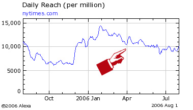
Here’s an example of a well executed major redesign of a high profile website, the New York Times. NYT always had a well designed website, and the new one is pretty nice too. But is there a lot of new traffic? Here’s an Alexa graph.
At the worst redesigns bring:

1) Broken links (sometimes every single url changes and all links from outside break)
2) Heavier graphics, proliferation of Macromedia Flash
3) Slower loading pages
4) Loss of features and content
5) New bugs
6) New software and licensing costs, more expensive servers

Often this is all that they bring. Broken links hurt the search engine positioning. New software costs money. It takes a long while to work out the bugs.

Here’s an Alexa graph of another major redesign on a website, which name I’d like to omit. Just as the traffic recovered after a big redesign in 2000, a new one hit in 2003. It seems to be recovering again.
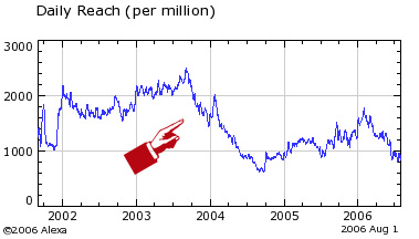
The thing is, many businesses are very robust and the disastrous effects of web redesigns do not kill them. Pointy-haired bosses make their buddies rich, while getting kudos for the redesigns. Everyone stays busy, and software companies get to sell a lot of server software.

Japanese Convinience

In one of the stories of the late genius science fiction writer Robert Sheckley, the main character needs crazy and exotic items to cast a spell. Bat wings, eyes of newt, etc, etc. Seemingly hard to find items, yet the character did not have any problems finding them. Why? Because he lived in Manhattan. You can find the most obscure, impossible to locate items in New York. Dried parasitic fungus that feeds on caterpillars? I had no trouble finding it.

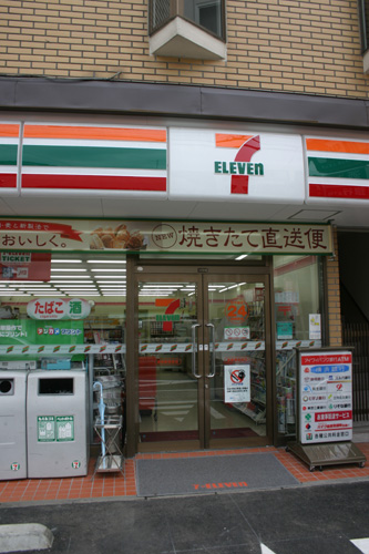
A couple of days ago I made a happy discovery. It looks like Manhattan has it’s own chain of authentic Japanese “konbini” – convenience stores. When I visited Japan, I really liked konbinis. They have 7-Eleven, just like we do, but also Ministop, Lawson, Sunkus and FamilyMart.

So, what’s different in a Japanese konbini? The variety and quality of junk food that they sell is a lot better. They are stocked with a humongous variety of snacks. Dozens of types of dried squid and fish for beer, Japanese sweets, nuts, edamame, sashimi quality fish, japanese pickles like umeboshi. The variety of soft drinks and genki drinks. They also have Japanese shampoos and skincare products. In short, they are stuffed with Japanese goodness of overpowering variety.

I’ve been to SAM BOK store at 127 West 43rd Street before. It was nice but not the same as the real Japanese kombini. Also there’s a big Chinese supermarket in my are which has a lot of Japanese stuff. Not the same either. But then I found JAS MART. It even has 3 locations!

35 St. Marks Place, (Bet 2nd & 3rd Ave), NYC
212-420-6370
Sun – Thur: 11:00 AM – 11:00 PM
Fri & Sat: 11:00 AM – 12:00 AM

34 East 23rd Street, (Bet Park & Madison Ave), NYC
212-387-8882
Mon – Fri: 9:00 AM – 9:00 PM
Sat & Sun: 10:00 AM – 9:00 PM

2847 Broadway, (Bet 110th & 111th St), NYC
212-866-4780
Mon – Sun: 10:00 AM – 10:00 PM

They even have genki drinks and Coffee Boss coffe! I’ve been to the one on 23rd street and promptly loaded myself up with goodies. Unagi eel, unagi sauce, roasted rice tea, sencha tea, several types of dried ika and fish, umeboshi, edamame. It’s a little expensive, but hey – beats buying tickets to Japan.

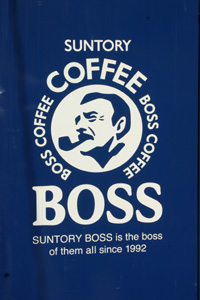
Coffee Boss is a brand of Japanese canned coffee drinks with a J. R. “Bob” Dobbs-look alike mascot. They are sold in Japanese style soda machines which look rather different from the US Coke/Pepsi machines. They can serve the cans hot or cold. I wonder why somebody doesn’t bring some of these to Manhattan – it looks like the design of soda machines hasn’t changed much in the last 20 years!

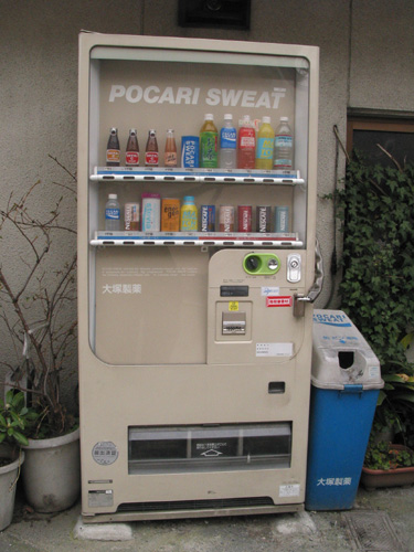
Pocari Sweat is a brand of Japanese sports drink, and despite the name rather tasty I might add. Notice the recycling can next to the machine – apparently the Japanese etiquette requires you to finish drinking your soft drinks next to the machine and not walking around with them. Almost every machine sold unsweetened green tea, in many cases Coke or Pepsi-branded.

Top of the Rock

I have been looking forward to the opening of the “Top of the Rock” for a long while. As soon as the online ticketing system became available, I got the tickets for the first day, and the first sunset that this observation platform became available to regular shmoes like me.

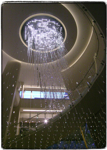
The entrance, which is located in the underground concourse is decorated with this fancy Swarovski Crystal chandelier. Top of the Rock chose two somewhat strange marketing alliances – with Swarovski and with Target.

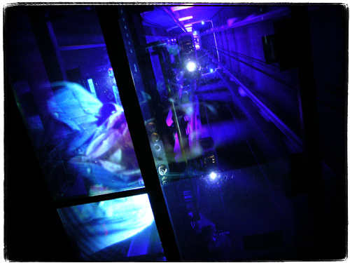
The elevator ride to the observation platform features a ceiling-projected movie of cheesy historical images and newsreels. Though that you can see exposed and lighted elevator shaft which is much more impressive.

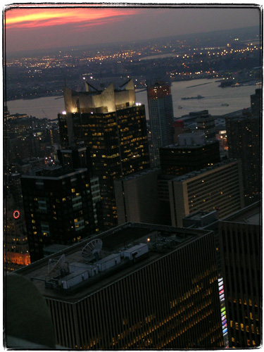
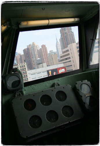
Once you get to the multistoried observation platform, you start to notice and and photograph hundreds of interesting things otherwise unseen from the ground. The rooftop of the building where you work.

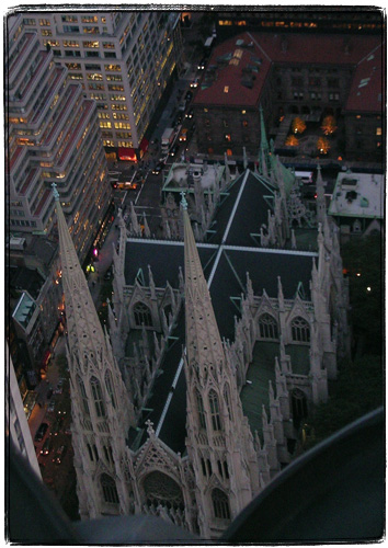
The cross of St. Patrick’s Cathedral.

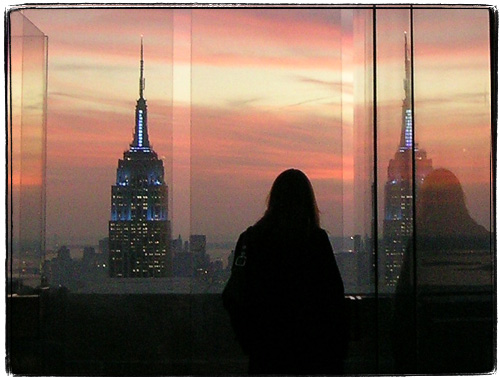
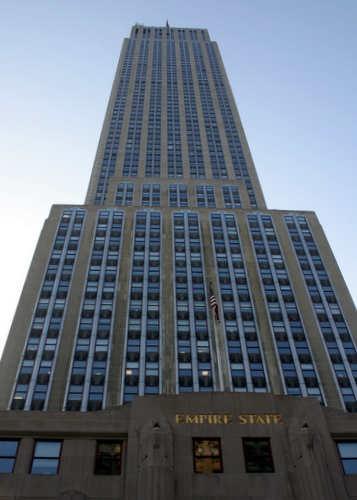
You get to stand basically face to face, on the same level with the spire of the Empire State Building, only separated by the annoying bulletproof glass. The spaces between panes allow you to take decent pictures, and the top setbacked platform does not even have the glass. That’s where you can entertain your superhero daydreams – by quietly standing there, of course, and not by jumping off of it.

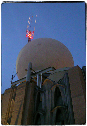
Besides the glass and the loud tourists, the only annoyance that I can name is a little bit of sewage smell. I am pretty sure that came from the plumbing vent that you can see in this picture.

Overall, I have to say that the whole experience was superior to the Empire State Building observatory. Online ticketing interface allows you to buy tickets for specific time, avoiding lines (the guy who coded the ticketing system even dropped me an email on my previous entry). You get to see the Empire State Building itself, as well as views of Central Park. The top deck without the glass is very cool.

Unfortunately I forgot my own camera and had to borrow co-worker’s Nikon, so I’ll be back with my own gear, the long lens and possibly a tripod. One unsettling thing about Top of the Rock, though, is that the ticket (but not the website) states that you are only allowed to take pictures for non-commercial purposes. That’s not very nice. I did see a lot of people with tripods and fancy cameras though – hopefully they are not going to hassle me.

Why Was I Not Informed Earlier

A certain typographically exuberant poet wrote these lines about an Irish bar that I was recently taken to by a co-worker.

I was sitting in mcsorley’s. outside it was New York and beautifully snowing.

Inside snug and evil. the slobbering walls filthily push witless creases of
screaming warmth chuck pillows are noise funnily swallows swallowing revolvingly
pompous a the swallowed mottle with smooth or a but of rapidly goes gobs the
and of flecks of and a chatter sobbings intersect with which distinct disks of
graceful oath, upsoarings the break on ceiling-flatness

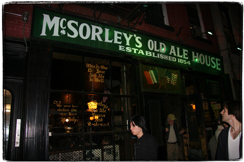
The bar, McSorley’s (15 E. Seventh St) turned out to be one of the most famous and unique bars in New York. And it’s not like New York is short on old or famous establishments frequented by poets. In fact, even though McSorley’s Old Ale House started operating in 1854 (or 1862 by some accounts) , Bridge Cafe at 279 Water has it beat hands down by going back to 1794. There are also Pete’s Tavern (1864), Landmark Tavern (1868) , PJ Clarke’s (1870s) and a few others in the Century Club.

What makes McSorley’s stand out is that it operated continuously through the Prohibition, keeping renovations and changes in customs to the absolute minimum.

The traditions and customs are especially strong in this Irish bar that can proudly tell anybody, even the 124 year old Zabani Khakimova of Chechnya: “we were here before you were born.” Another McSorley’s old slogan, ” No wine, no whiskey, no women” is only partially true. In 1970 New York State passed “McSorley’s Law” that disallowed discrimination in public establishments. I’ve heard that it’s still possible to have a gender specific private club still, but it has to have less than a certain number of members to be considered such.

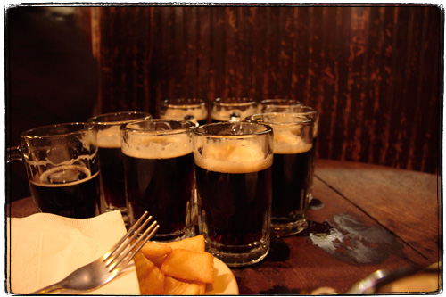
These days, a man or a woman, when you walk into one of the two rooms at McSorley’s and sit down at a WWII vintage table continuously soaked with beer, you’ll find that you only have three choices of alcoholic beverages. A dark, a light or a “one and one”. The dark ale or the light ale always come in two little 8oz mugs. You can have one mug of light and one mug in the same round.

The food is only slightly more varied, but just as old fashioned. The daily specials might include liverwurst sandwiches, burger and fries, shepherd pie and “cheese and crackers”: a package of saltines in cellophane, some cheese and cut onions.

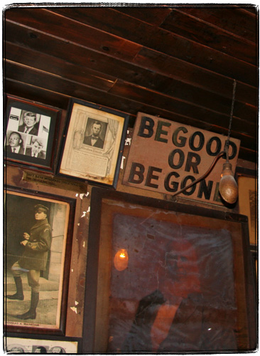
“Begood or Begone” is yet another slogan of this institution. Don’t drink too little, don’t be troublesome when drunk. “distinct disks of graceful oath” are Ok.

The waiters are both gruff and friendly at the same time. If you don’t want to begood, they won’t begood either and there’s no doubt that they’ll make you begone quick.

Here’s E.E. Cummings’ biographer’s description of the place:

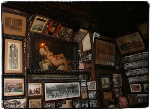
“It has two rooms, each with its individual admonitory sign, “Be Good or Be Gone.” The walls are crowded with photographs and lithographs in which a vanished city dwells, and dead, buxom ladies and derbied men. The room in front has the bar, but the room in back boasts a famous lady of smooth and beautiful nudeness. . .”

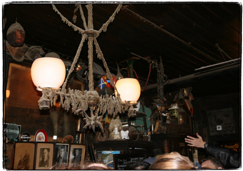
The place is truly “snug and evil”. It smells funky, the ceiling is ancient and low, the floor is covered in sawdust, the glasses are clinking and the ale is flowing. Cummings got it so right, it’s ridiculous.

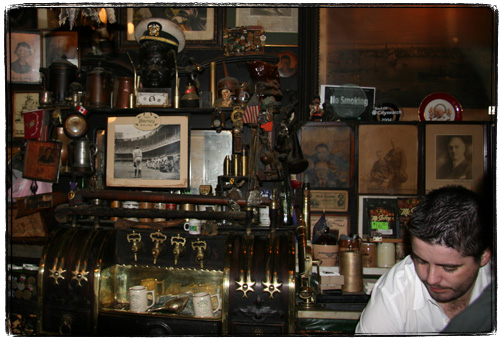
With the exception of smoking prohibition and admission of women, McSorley’s did not change too much. In E.E. Cummings’ time one of the two kitchens was already converted into a bathroom with Art Deco/Sanitary Style urinals (these days there’s a women’s bathroom too). But the walls and the bar are still crowded with patron-donated artifacts, prints, paintings and photographs. Unlike the crap-o-la encrusted restaurants, the artifacts and images are authentic and full of meaning.

There’s an old gas lamp converted to electricity over the bar. A group of regulars being shipped out to WWI placed wishbones on the lamp with the intention to remove them when they come back. Those that were not removed continue hanging over there collecting gobs and gobs of dust.

Any attempt to touch the almost century-old wishbones will surely get you a lifetime ban and probably a good beating.

There are a few other interesting artifacts, like a pair of handcuffs that either belonged to one of the owners who was a retired NYPD detective, or to Harry Houdini. The helmets over the bar range from 1911 firefighter’s to the 9/11.

“I was sitting in the din thinking drinking the ale, which never lets you grow old … Darkness it was so near to me,i ask of shadow won’t you have a drink?”

My only regret is that it was not snowing outside this time. Also, the cat that is said to live at the bar did not make an appearance.


Crass Commercialism:

They sell McSorley’s-style mugs over here

Yet Another Logo Post

I don’t want the Freedom Tower. I want the Twins back. This is a somewhat controversial opinion – some feel that the Twins are gone forever, together with the lives of the people on the planes, in the towers and those who came to help them.

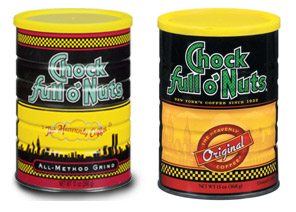
To use M. Diddy’s expression, in Corporate America controversy is not considered “a good thing”. Chock Full O’ Nuts, for instance, removed the towers from its logo.

On the other hand, many other companies still use their old skyline logos that feature the Twin Towers. I have a much bigger collection of these logos, but it’s a little hard to find all of them.

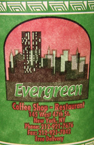
The person who designed Evergreen Diner’s cup either chose an unusual viewpoint or just drew random boxes to represent skyscrapers around WTC.

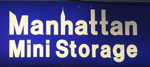
Manhattan Mini Storage even got the positions right – Citicorp then Empire State then the Twin Towers (if you look from the park towards Brooklyn).

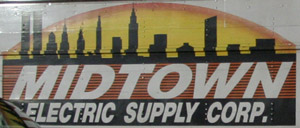
Midtown Electric‘s view is from Brooklyn.

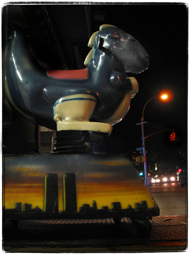
The painter who worked on this kiddy ride did not strive for accuracy, but I guess for the 10 or so years that I’ve seen that particular kiddy ride around I bet nobody was confused about which particular skyline was depicted there. Can any of the Freedom Tower designs do that? Because every time I am looking at the rendering with the Freedom Tower proposals I am thinking – holy crap, that’s Philadelphia (and it looks like I am not alone in that particular opinion).

Architectural Pain in the Ass

I have to apologize for this cringe inducing intro wherein I attempt to translate an old kindergarten joke from Russian into English. Sorry, but I really can’t find a better way to do this.

So, in an enchanted forest a wolf catches a rabbit. A talking rabbit, apparently, as the rabbit says — look, how about this — I’ll give you two puzzles to solve, and if you do, I’ll take you to the place where my friends and family hang out. If you can’t solve them — you let me go. The wolf agrees. The first puzzle is : “Two rings, two ends and a bolt in the middle.” The wolf does not know. “It’s scissors” – says the rabbit. OK, then, the second one. “No doors, no windows, house full of guests.” “No idea” – says the wolf. “It’s a cucumber” says the rabbit, and the wolf lets him go. Next day a bear catches the wolf, and the wolf makes a similar deal with the bear. OK, what is it – “no doors, no windows, ass full of cucumbers?”

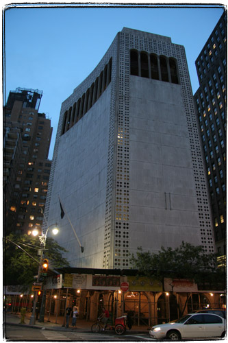
Every time I pass 2 Columbus Circle that’s what I am thinking about. An ass full of cucumbers. (I shudder to think about where this page is going to be located in Google search results).

Edward Durrell Stone created this perforated windowless museum that looks like a Soviet-era public bathroom on crack. In fact, I am pretty sure that’s what Mr. Stone was smoking. Well, actually according to Great Fortune by Daniel Okrent he was a hardcore drinker during his earlier years and later quit. So I guess he either drank too much or not enough.

Unsatisfied with uglification through regular soulless International Style this architect came up with a whole new kind of ugly. He took the starkness of modernism and combined it with unnecessary and non-functional ornamentation. For his own house he took a normal 19th century brownstone and paced a perforated grille over it. Funnily enough, even though he raped the creation of a Victorian architect, his own widow could not undo the concrete monstrosity that he wrought — together with other brownstones his house is now protected as a landmark.

2 Columbus Circle is thankfully not considered a landmark. There are some people out there though that think that it should be. Even they agree that Stone’s building is ugly and useless. But they like the fact that it’s a challenge, a slap in the face of architects who built beautiful and/or useful buildings in Manhattan.

I remember seeing Edward Durrell Stone House while passing it by in a cab and immediately turning my head around and going “WTF!??”. None of the hundreds of good looking brownstones in New York ever evoked this reaction from me. They mostly make me count along these lines as I walk by: “2 million, 4 million, 6 million, 8 million, 9.5 million, 12 million and a carriage house – so let’s say 12.5 million worth of brownstones on this street in Brooklyn”.

Stone reminds me of another architect who also created some terribly ugly and uninspired buildings, in one of which I spent many years. Wallace Harrison spent most of his entire life building terrible International Style buildings. Actually, he started his career together with Stone, working as one of the architects working on the Rockefeller Center design. Rockefeller Center was severely criticized while it was being constructed, but later on became an almost immediate favorite of both critics and laypeople, becoming one of the most celebrated architectural landmarks of New York. His later creations were mostly in International Style. He designed the 6th avenue Rockefeller Center Extension which mixed Deco and International style, and then a horrible row of International style nightmares.

I absolutely love the quote from Grea Fortune: “”The new buildings, with their broad plazas, generous promenades. and underground concourse system… are an exciting integral extension of Rockefeller Center in design, concept and philosophy.” But this was like saying that nuclear war is an integral extension of Quakerism …”

Interestingly enough, Harrison, after being rejected by critics and his patron, Nelson Rockefeller, became very bitter and disillusioned with International Style as evidenced by this rather homophobic quote (also from Grea Fortune):

“His late life, he claimed was “ruined … by the German Bauhaus and its groups of friends who have had a disastrous effect on American architecture.” Elsewhere he characterized the proponents of the International Style as “homos who found it a good public relations [sic] to hang their hats on” “.

Well, I think that homosexuals (yeah, blame it all on them, right) have nothing to do with Harrison’s and Stone’s solidified nightmares. It’s just that they were horrible architects.