Yume

The walls in my apartment are mostly bare. The only hanging pictures I have right now are posters from the Transit Museum store. These are pretty cool, but having the same art in my home and my train is a little depressing.

I was browsing through eBay, looking for — what else — Japanese prints to replace the posters. Since I was little, I wanted to own a real Japanese woodblock print. Not a reproduction. A real print.

When I was working as a porter in a Manhattan building, I once had to help an old lady move a piece of furniture. On her walls hung several small woodblock prints, which to me, looked exactly like the Utamaro reproductions that I’ve seen in a book. They definitely looked old. I asked the old lady about them, and she mentiontioned that she bought them many years ago in an auction for next to nothing.

Now I understand that I overestimated the value of the prints. Ukiyo-e prints were made by tens of thousands even during the lifetime of the authors, not counting the contemporary bootleg copies. The publishers retained the woodblocks and made even more prints later. They still continue to do so today.

It’s true that the museum-quality prints of famous printmakers can cost into hundreds of thousands. But luckily for people like me, collectors of Japanese prints are very similar to the stamp and coin collectors: they put a lot of premium on the condition of the print and its rarity, leaving a wide spectrum of less than perfect, but much more affordable material, which is still impressive as hell. For instance, my research shows that an early edition of a print by a household-name artist like Hokusai or Hiroshige in an average condition can cost as little as a cheap digital SLR camera. With the worsening of the condition the pricing moves into digital point-and-shoot camera price range. But unlike the camera, a real Hiroshige is not likely to diminish in value or become obsolete. Later editions and reprints can be had for the price of a restaurant lunch.

I need to do a lot more research before I’ll buy some prints, probably from an offline dealer, but meanwhile I came upon something interesting on eBay. A hanging calligraphy scroll, the type for hanging in a tokonoma, caught my eye. It had a single kanji, Yume. Yume literally means “dream.” The kanji representing it looked like a person leaping in dance to me. I did not win a bid on it, and went looking for another one like that. To my surprise, the second calligrapher’s “dream” looked like a spooky bird. I did not win that auction either, but I wonder what a whole collection of these would look like on a wall…

I particularly like the brush streaks.

Design Out of Reach

One of my favorite coffee shops, Joe The Art of Coffee, recently opened a new branch in an Alessi showroom at 130 Greene Street in Manhattan.

Alessi is one of those funny companies that sell expensive “design”. There are really three approaches to selling “design”. You can go the Ikea way: hire really good designers, mass-produce their designs, use cheap materials and sell them cheaply. On the other end of the spectrum is stuff like the concept pieces, like the magnetically floating bed that recently got all the gadget blogs very excited. The scale model will set you back over 100K euros, and the real one is so fricking impractical that it’s not even built. You can’t deny the coolness aspect though.

There’s the middle way that is tread by companies like Design Within Reach and Alessi. While a more proper description would be “Design Just Outside Most People’s Reach”, they do have a few items that are a relatively good value even for not particularly rich people like myself.

For instance, I really want an Alessi steam pitcher. But while a perfectly well made knockoff costs 35 bucks, a genuine item costs 114. Ouch. I have the knockoff, and it’s my favorite steam pitcher right now.

But when it comes to something that I use constantly, there’s really no alternative to getting the real thing. A Herman Miller Aeron chair is significantly better than most knockoffs that I’ve seen and usually sells only for 1/2 as much.

There’s another chair that I really want, the Eames “Time-Life Chair”. Manufactured and sold by Herman Miller, it was created for the lobby of the Time-Life building in Manhattan (where I used to frequently have lunch in the company cafeteria before they stopped letting in people from other Rockefeller Center buildings). The chair was made famous by Bobby Fisher who required it as one of his numerous conditions when he played in the world chess championship against Boris Spassky. These days it cost about $2,500 new (about $1000 for a vintage one on eBay). Back then it used to cost about 700 bucks, and made all the newspapers whine about Fisher’s expensive tastes. I really don’t see a reason why someone who earns his living while sitting down does not deserve an expensive chair. Dot com companies got a lot of flack for purchasing Aeron chairs – but those were probably the most prudent investments they’ve made. Putting computer programmers in cheap chairs will literally cripple them, while the chair’s resale value is still pretty good.

Eames Executive Chair made famous by Bobby Fisher / Time-Life Building

Another “high design” item that I really salivate over is the Bestlite lamp. Bestlite was made famous by Whinston Churchill who had one on his desk. While the price finally went down on the floor model from $748 to $349.95 at Levenger, it’s still out of reach for me.

Bestlite lamp

I see a lot of companies putting famous Barselona® chairs in their lobbies. These are pretty expensive at $3,499 a pop (a friend of mine slept on two of these during the big blackout of 03. Anyway, these chairs are classy, but are becoming a cliche. Wouldn’t a Frank Gheary living room set look much cooler? It’s also much cheaper – the sofa is “only” $1200.

But the item that really made me scratch my head is the Philippe Starck-designed fruit juicer sold by Alessi. It costs about 80 bucks. I really don’t know what to think here.

The juicer is definitely cool-looking and original (well, unless you count T4 Bacteriophage Virus, lunar lander and Spaceship Moya, etc) which resulted it being featured as a prop in several movies.

Interestingly enough, it usually ends up in the bedroom somehow. Here it is, masquarading as a lamp in the infamous puppet sex scene from Team America World Police:

Team America World Police Juicy Salif Lamp

I really don’t have 80 bucks to trow away on a Philippe Starck design, the question that bothers me is this: are all of those who say that the juicer is impractical right? From the looks of it, the juicer should work just fine and even be ergonomic. Also, is “Salif” even a word? And if so, what does it mean?

Japanese Brooklyn

Victorian Brooklyn is amazingly beautiful. In Victorian times skilled labour and land was cheaper than it is today and wealthy people were able to build really elaborate and architecturally significant residences rather than Mc Masions of today.

In a big lot of old postcards that I picked up on eBay I found this – a postcard featuring “The Japanese House, Flatbush, N. Y.” It looks like this wasn’t the only time this house was featured on a postcard: here’s another one.

Don Wiss of the Brooklyn photo store photo fame graciously allowed me to use his picture of the Japanese House, which turned out to be
Frederick S. Kolle House at 131 Buckingham Road.


Here are Don’s notes, mostly gleaned from the AIA Guide to New York City.

I did a little bit more digging and found a New York Times article, which somehow is fully available.

The house was built by a developer in order to promote Prospect Park area.

Alvord advertised the house in Country Life in America in the summer of 1903, calling it ”a faithful reflection of the dainty Japanese art from which America is learning so much.” But the house was ”thoroughly practical,” the ad continued, with a ”porcelain Roman bathtub, also needle and shower baths,” and a 22-minute commute to Park Row. It was offered at $26,500.

According to this calculator that translates to somewhere between 600K if you use Consumer Price index to 12 million if you use the relative share of GDP. Stupid Zillow is showing values in $1 million range, which is of course very wrong. I suspect that the current value of the house is much closer to the GDP share range :)

The NYT article goes on to say that Dr. Kolle, the first owner of the house was a pioneering radiologist. It seems like he purchased the house on the cheap after the unusualness of it did not attract many bidders. Also, in 97 the house used to belong (and probably still does) to the director of Flatbush Development Corporation who bought the house in the 70s.

The following quote made me drool:

“Except for the kitchen, the ground floor interior of the Fischers’ house is completely intact, with dragon figures in the stained-glass windows, Japanese decorative detail around the fireplace and a definite feeling of thinness to the partitions — there are leaded glass windows between the sitting and dining rooms. The Fischers have furnished the house with an eclectic mix of furniture and artwork, from Belter to Bauhaus, as well as memorabilia from the Kolle family.”

Apparently the Flatbush Development corporation is holding a Victorian House Tour, that at least in 97 featured the Japanese House as one of the stops. I wonder if they still do – I’d love to see it.

Looking at the butt-ugly condos and renovation in McMansion syle that I see all over, I can’t help but think – will they build houses that are postcard-worthy again in Brooklyn?

New Billboard Day Effect : How to Advertise More Effectively on Your Blog

Advertising. “The Engine of Commerce”. Ideally, it should work like it does in the Simpsons episode 2F12 “Homer the Clown”:

“In the middle of driving down the highway, Homer skids to a halt in front of a billboard.

Homer: [gasps] It must be the first of the month: new billboard day!

Homer: [reading] “This year, give her English muffins.” Whatever you say, Mr. Billboard! [skids off]
[stops suddenly at another billboard for barbeque sauce]
[cars collide behind him and explode]

Homer: [reading] “Best in the West.” Heh heh heh, that rhymes!
[looking at the next one] “Clown college”? You can’t eat that.

At the power plant, Homer piles his purchases (including MSG, “Best in the West”, and English muffins) at his work station. “Well, I got everything I was supposed to get. I’m not going to enroll in that clown college, though…that advertisement had absolutely no effect on me whatsoever. In his daydream, he imagines himself sleeping and dreaming of himself eating a sandwich. The billboard for the clown college batters its way into his thoughts. The Krustys on the billboard start dancing to circus music.”

Of course, Homer enrolls in the clown college. Having never enrolled in a clown college because an ad told us to, we all go on thinking: “advertisement had absolutely no effect on me whatsoever.” It can’t possibly be true: bajillion dollar industries, such as advertising don’t simply exist if they are not effective.

During the dot com bubble even large companies mostly failed to earn much from banner ads. Even the heaviest online ad campaigns did not seem very effective and suffered horrible clickthrogh rates. Online ad companies escalated the war for clickthroughs by inventing obnoxious popunder, popover and floater ads. The more the ad was like a flash-bang grenade mistakenly used by NYPD on an elderly woman, the better. For instance, many sites started using larger sizes of vertical banners known as “Skyscraper.” That was not enough though – extreme, flash-driven skyscraper ads with movies and sound, capable of crashing browsers and known as “Godzilla” and “Pagekiller” started to appear.

The founders of Google decided to address this issue, and as a result, made bazillions of dollars. As a former googler remembered:

” Besides, Larry and Sergey hated these kinds of advertising. In fact they hated most kinds of advertising as inefficient, dishonest and a total waste of people’s (meaning their) precious time.”

We all know that AdWords and AdSense, Google’s advertising programs managed to earn so much money through unobtrusive, mostly text ads. The winning strategy was “relevancy”. Google’s server would read in the page where the ad were to appear, and serve up a relevant ad.

For instance, after parsing pages on chupaqueso.com, a site dedicated to a cheese snack invented by web cartoonist Howard Tayler, in theory shows ads about cheese. And after reading about chupaqueso’s cheesy goodness, I might indeed be in the mood to buy some cheese online.

On the other hand, the AdSense algorithm is not too efficient. On some pages in the abovementioned site it serves ads like this:

Yes, indeed, amongst Howard Tayler’s readers there are a lot of computer geeks. I know I am not a typical web user, but I am a pretty typical web developer. And I have zero desire to “Boost XML app performance.” I also have all the “ODBC drivers” that I need.

Many of you, my readers, are bloggers or have regular web sites with AdSense ads. Look at them. How many you’d say are “inefficient, dishonest and a total waste of people’s … precious time”?

I say – about 99.5%. And clickthrough ratios are pretty horrible. People try to tweak them by playing around with ad types, look and feel, positioning and excluding advertisers, but it’s all rather ineffective.

Google’s ads only pay if people click on them. In the TV, billboard, magazine and the type of advertising that people tattoo on their bodies there’s no such things as clicks. You get paid depending on how many people see the ad. It works really well if you need to make people remember your company’s name or logo.

Side Note:
When I was little, in Odessa ( Ukraine, Not Texas) somebody scribbled in almost every public phone booth “[Some girl’s full name] is a whore.” In a city of about a million people this worked like a charm. The mindshare that that advertisement delivered must have been off the charts.

These 99.5% of unclickable ads can be divided into two categories: a) ad campaigns that build brand’s awareness almost for free and b) those that indeed waste everyone’s time and money.

I don’t think I ever clicked on any Vonage ads, even though I’ve seen thousands of them. They worked without any clicks — if I did not also know that their customer service sucks and reliability is horrible, I’d have their VOIP service now.

The ads that nobody ever cares about still do get some clicks. When people come by a useful and interesting site, they tend to click on random ads so that the site owner would get some revenue. This is the untraceable portion of a much scarier phenomenon called click fraud. I am not even going to address this here.

In short, I feel that even though Google’s ads are a step in the right direction, AdSense sucks, especially for a blog with a smallish audience, such as mine. The useless, stupid ads that clog AdSense are a waste, even though they might generate a few “pity clicks.” Only half of my ad revenue for the site came from AdSense last year. The rest came from my experiment that I think will be of great interest to everyone.

My thinking went like this: I want to serve ads that are extremely relevant to my blog posts and interesting to my audience. Even more importantly, they must be selling something that I would be interested in. Ads I’d click on.

When you have limited advertising space, the problem with AdSense is that it often tries to sell things that your readers don’t want. What you want to do is advertise things that people aready want. As an example of such salesmanship, let me direct you to a post on the very popular waiterrant.net, where The Waiter describes selling dessert to calorie-conscious women:

“”Ladies,” I say sweetly, “We have some excellent desserts tonight.”

“Oh, nothing for me,” Bubbly Blonde replies.
“No dessert,” Severe Brunette says, holding up her hand.
“Me neither,” Lawyer Babe says firmly.

The fourth woman, a Soccer Mom type, looks at her companions and sighs. She wants dessert.

I see the longing for chocolate in Soccer Mom’s eyes. She’s my weak link. My in.

“Would anyone like some coffee?” I ask. Suggesting coffee is the first stage in selling dessert to calorie resistant ladies.”

“The ladies pay the bill, tip well, and leave. As I watch them go I think about how I got them to order dessert. To be a good salesman you have to have a seductive quality about you. Don’t believe me? Look at pharmaceutical reps.”

That’s what I want to do! This means that I need to find something that will be the equivalent of selling chocolate dessert to Soccer Mom types.

I believe that my 1000 readers are a lot like myself. And what do I spend a huge amount of money on every year? Books, movies, cds and gadgets. Also I purchase some rather esoteric items on eBay too, but the majority of my spending happens squarely at Amazon.com. My wishlist there is humongous, and in fact, I spent my advertising revenue there.

Luckily, Amazon has a pretty generous associate program. You can link to any of the products they sell and get a cut of the sale price, if the sale happens as a result of your clickthrough. In fact, you get a cut of the entire shopping cart amount (I am not sure, this could be only the items that were added after the click). In any case, it’s decent money, and most importantly, a great selection of new and even used items to sell.

What to sell, of course depends on your audience. I found some success selling items that tempt me. In fact, many times it’s the items that I am planning to buy or already bought.

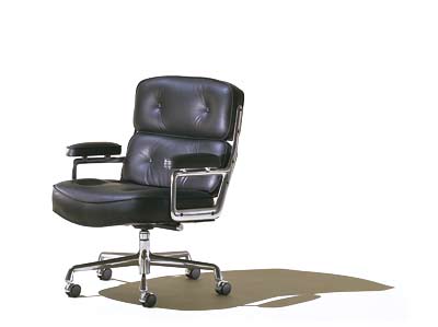
In some cases, relevancy is important. My article with pictures from Fog Creek’s party sold 4 or 5 of Joel’s books. It was a combination of a very desirable in this particular audience product with a closely related article. Interestingly enough, I tried to sell the toy that you can see in the picture as well, but none sold. As I own both books and don’t own the toy, this seems logical.

I might have tried selling flat panel monitors and Aeron chars (WOW, Amazon sells them too! ) ,that make Joel’s office so nice (in fact, at home I have the same exact dual monitor setup, an Aeron chair and a window with a view, and I had id before Joel wrote about his bionic office). These are big ticket items though, and the likelihood of someone buying them on a whim is lower. But then again, so are rewards.

The relevancy does not matter as much as I thought, though. For instance, I advertised “Make” magazine subscriptions and Shure E2c headphones, and sold a few.

In fact, I think that the approach to selecting products should be somewhat similar to the one that Kevin Kelly uses for selecting items on his website Cool Tools:

“Cool tools really work. A cool tool can be any book, gadget, software, video, map, hardware, material, or website that is tried and true. I am chiefly interested in stuff that is extraordinary, better than similar products, little-known, and reliably useful for an individual or small group.”

In short, advertising video iPods is good, advertising “The world’s greatest 3D IM” is not!

Side Note:
My former co-worker won a $300 gift certificate for a certain gadget catalog in a contest. Now, he’s a guy who spends a lot of money on gadgets, like the uber geek that he is. I mean, he owns planetofthegeeks.com domain. But despite that, he had a lot of trouble picking something to spend $300 of free money on in that catalog! Not only was everything overpriced, but there were very few things he’d be interested in owning!

The great thing about selling items from Amazon is that you know that the prices there are very Wal-Mart-like, and most of your readers already shop there. Some people prefer not to patronize Amazon because of software patents or other issues, but there are “organic” alternatives, like for example Think Geek (in fact they sell through Amazon too).

The one gripe that I have with Amazon is the difficulty in creating the links. The tools that they provide want you to use iFrames to create image wrapped links, which of course do not work well in RSS Readers. This brings me to my final point, the specifics of blog advertisement.

A blog is a two-sided entity: it generates page views from people who don’t use RSS aggregators and those who come in from search engine referrals. And then there are the views from within RSS aggregators, in case you are serving up the entire text of the article in the feed. Some blogs don’t do this, serving up only the title or a title and a teaser. The thinking is, readers will click through to the page where they will see ads and thusly generate revenue. Some do this because they don’t serve ads and want to limit their traffic, and yet some do it because they use a default setting in their blogging software and don’t know better.

The great thing about my advertising scheme is that you can serve ads in-feed. A New York blog Gothamist, for example serves atrociously uninteresting ads that repeat. At some point they had a long run of a flashing ad for something that made me unsubscribe from the feed. If they started selling interesting items, they could greatly increase their advertising revenue.

Advertising my way does not detract from regular content and isn’t cheesy. It is clearly marked, unlike those fake editorials in magazines and newspapers. Advertisement can be entertaining in itself! Since the early years of Sears, Roebuck and Co. catalog, people look through catalogs like Levenger, Victoria’s Secret Penzeys Spices and Think Geek for fun! My wife has a lot of gardening catalogs that she looks through now and then. After finishing an interesting post, readers would not mind learning about an interesting gadget or book they might want. In fact, they might already be in the mood to buy it! There is no reason to serve partial RSS feeds with this type or advertising.

P.S. I turned off comments to this article because for some reason it attracts a ridiculous number of spam comments. If you would like to contact me, see about the author section. I also changed to a different way of displaying Amazon’s related items.

The Taste of the Old New Coke

Let me start with one of my favorite quotes from The Matrix:

Tank: Here you go, buddy; “Breakfast of Champions.”
Mouse: If you close your eyes, it almost feels like you’re eating runny eggs.
Apoc: Yeah, or a bowl of snot.
Mouse: Do you know what it really reminds me of? Tasty Wheat. Did you ever eat Tasty Wheat?
Switch: No, but technically, neither did you.
Mouse: That’s exactly my point. Exactly. Because you have to wonder: how do the machines know what Tasty Wheat tasted like? Maybe they got it wrong. Maybe what I think Tasty Wheat tasted like actually tasted like oatmeal, or tuna fish. That makes you wonder about a lot of things. You take chicken, for example: maybe they couldn’t figure out what to make chicken taste like, which is why chicken tastes like everything.”

There are certain things that you should really taste at least once, but are usually hard to get a hold of to taste, like let’s say top quality caviar, or kobe beef, Peter Luger’s steaks . Other things, like oysters, haggis, Gray Papaya and Nathans hot dogs, high quality sashimi and other notable foods, that might be hard to obtain everywhere, but are still more or less affordable. There are whole lists of “things to try at least once” out there.

Then there’s a category of items that were eaten in the olden times, but are not considered acceptable food anymore: whale meat, horse meat and other intelligent and/or exotic animal meats. I’ve had whale steaks back in the day, whale meat was widely available in the Soviet Union, as well as horse sausage. Since I ate a lot of hot dogs , I am sure I had my share of cats, dogs and pigeons.

And of course, there are commercial drinks with formulations that are not made anymore. The first Coca Cola (the one with cocaine), Starbucks Tazo Blended Drinks, Incredibly and Sharkleberry Fin Kool-aid (as well as many other discontinued flavors.)

I was always especially interested in one soft drink that I never got a chance to taste: the “New Coke.” The myth-shrouded beverage seemed to be out of reach for me, until thanks to the twin wonders that are packrats and eBay, I got my own unopened can or genuine New Coke. That’s a reason for the new installment of Gastronomic Adventures, of course.

I chilled the $10+shipping can of soda and photographed it in all its glory. Look, just look at it!

I was expecting the can, that is at least 13 years old (in 1992 New Coke was renamed Coke II) to be completely devoid of carbonation. I was ready for a foul smell, discolored soda, etc. To my surprise, the carbonation was mostly normal and the coke smelled just fine.

I kind of knew what to expect — in theory New Coke has the same formulation as Diet Coke, except with sugar instead of aspartame, and should taste similarly to Diet Coke With Splenda. I knew that New Coke was supposed to be sweeter than Coca Cola Classic.

Of course, taste tests are a tricky thing. I am pretty sure I would have a lot of trouble telling Pepsi from Coke from Mexican Coke (the one in glass bottles and sweetened with cane sugar) from Diet Coke (if it’s with ice).

In any case, decade old New Coke _did_ taste a bit like Diet Coke With Splenda. It was not as sweet as I expected, and had that weird little aftertaste that I always associated with the Splenda Coke. I think in Diet Coke it’s masked by the aspartame and in Classic by higher acidity.

I seem to have not suffered any stomach upset or anything of that matter. Upsettingly I did not acquire any noticeable superpowers, except the ability to say that I’ve tasted the New Coke.

P.S. Does anybody know how to obtain some surströmming online or in New York?

P.P.S. I Know about hufu. I think it’s a hoax.

Technology To Die For

I learned from a very interesting book called “Defying Gravity: The Making of Newton” that during the development of Apple Newton one engineer committed suicide. Being ahead of its time, Newton did not become popular, although it was engineered so well, that to this day many enthusiasts still use it, write software, and even make new hardware for it. I am actually thinking of buying one on eBay still.

I don’t know if anyone got hurt during the development of iPod, but it was involved in several fatalities for sure.

First, a woman beat her boyfriend to death with the device. This is reminiscent of Russian Emperor Paul I being killed with a snuff box. I was recently watching Leonid Parfenov’s awesome “Russian Empire” series, where he showed the infamous snuff box. I always thought that it was rather large, but it turns out to be about the size on an iPod.
[update] Apparently this was a hoax.

Also, a kid in Brooklyn died from a knife wound when he was being robbed of his iPod. NYPD and MTA reacted by this wonderfully cryptic ad. Without actually mentioning Apple or iPod they are urging hipsters to swap out the distinctive white iPod headphones for ugly Radioshack ones. Maybe they should also suggest buying Creative’s (or Microsoft’s when they come out) players – nobody will probably want to kill for one.


Ad:

Space Bling

If you are a constant reader of this journal, you might have noticed that I am highly interested in unobtanium — various exotic materials. This post will depart from my usual blabbering about titanium.

Many years ago I got my first glimpse of aventurine – a form of quartz with suspended flecks of other minerals. The name itself sounded absolutely exotic and appropriate for a mineral that looks like a piece of solidified star field. It comes from Italian “a ventura” – meaning “by chance”. It refers to the fact that Italian glass makers learned to make glass that looks like aventurine by chance through mixing in flecks of copper. But in Russian “avantura” is a word that does not carry the same meaning. It can be best translated as “a risky and/or shady venture”.

Aventurine is usually green or orange, and I am not sure if the black version that I like so much is really aventurine at all. Recently I came by an ad in Russian Forbes magazine for a very expensive watch made by Bernhard Lederer Universe called blu-Planet. It has an internal dial made of aventurine which the ad claimed was of meteoritic origin.

My research shows that aventurine has a terrestrial origin, but while looking at meteorites I found a most interesting fact. It turns out that many metallic meteorites when polished and dipped in a dilute acid bath, show the most amazing patterns reminiscent of microchip’s silicone surface. These are called “Widmanstatten patterns” (after the name of a scientist who discovered them) and are a result of nickel and iron cores of asteroids slowly crystallizing for millions of years in the void of space.

Pieces of space rock are desirable. Apollo space program brought back a limited amount of Moon specimens and it was waaay expensive. Then it turned out that some meteorites found on Earth have the same chemical composition. So basically, you can get pieces of asteroids, the Moon, Mars and hell knows what else without leaving the planet. In fact you don’t need to leave your chair — eBay has loads and loads of meteorites for sale.

Space stones do not come cheap — they sell for about a dollar per gram, which is significantly more than the price of silver, and might go for much more than the price of gold. No wonder that a former truck driver from whose website I took these amazing photos of meteorites has been able to support his family through meteorite hunting. Overall, it looks to me like the cost effectiveness of a truck driver with an ATV and a metal detector is pretty good compared to the cost of our space program.


Advertisement:

How the Starbucks Siren Became Less Naughty

[update] Starbucks logo changes again.

You are probably here because you looked closely at the Starbucks logo and were a little confused about what is depicted on it. Is it a mermaid? What are those things that she is holding up with her hands? Wasn’t the logo different before? What’s the history of it?

I asked those questions myself and did a little bit of digging. My research started with a book that I had, called A Dictionary of Symbols by J.E. Cirlot. In it there was a chapter about Sirens.

Basically, from what I gathered from different sources, including that book, there is a lot of confusion between the different mythological half-women. Typically they are called Sirens – both the half-bird/half-woman and the half-fish/half-woman varieties. The fish type are usually called Mermaids. Both types according to the ancient Greeks were in the business of seducing mariners with songs and promises of sex and then killing them, but Hans Christian Andersen and Disney mostly made everybody forget that.

The whole sex-symbol status of mermaids hinges on the question which part is “woman” – upper or lower. “The other type of mermaid” that hapless Fry was referring to would have problems attracting suitors, of course. And how do you do it with the normal type?

Wise mythologists came up with the answer, of course. And the answer is a two-tailed mermaid sometimes called a Melusine.

The book had an old engraving of a two-tailed mermaid. It reminded me of the Starbucks Siren, but back then I did not realize that the original Starbucks logo had a slightly altered version of that engraving in the original brown cigar band-shaped logo.

Notice that the graphic designer removed the belly button, the unattractive shading around the bulging tummy of the 15th century siren and merged the tail-legs to remove the suggestion of naughty bits. The logo Siren also smiles a little while its 15th century doppelganger is looking rather grim. Other than that it’s clear that this is exactly the image that he or she was using.

According to uspto.gov “[Starbucks] mark consists of the wording “Starbucks Coffee” in a circular seal with two stars, and the design of a siren (a two-tailed mermaid) wearing a crown”.

Here’s the “cigar band” logo from which I took the image above. The original hippie Starbucks owners did not sell espresso drinks, but mostly sold coffee beans, tea and spices. Today Starbucks sells liquor and ice cream, but no spices if you don’t count the cinnamon gum and the stuff on the condiment table.

The next, more familiar green iteration of the logo has a more attractive stylized siren. The chest is hidden, but the belly button is still there.

Here is the current logo. They cropped the siren image so that only a hint of the tails is visible. I asked hourly partners at Starbucks and friends, and none of them could figure out what those things to the side of Siren’s head were.

Lately I’ve stopped seeing pictures of the Siren on Starbucks mugs – they seem to favor just the word “Starbucks”. I also started seeing the new type of the siren as part of store decoration and on coffee packaging. She only has one tail. I guess the family-unfriendly image of a fish-woman spreading her tails is on its way out.

[update] Here’s a picture of the new siren:

The brown Siren logo can still be found on merchandize sold at the original Pike Place Market Starbucks in Seattle. The logo is altered though – instead of a “cigar band” design it uses just a circle logo. Cigar band logo mugs and coffee jars can still be found on eBay for upwards of $50 per mug and $200 per coffee jar. I am still looking for anything bearing an “Il Giornale” (a company founded byHoward Schultz that later ended up buying out Starbucks with the help of none other than Bill Gates Sr.) logo.

[Update]
Dear Boing Boing readers – you might enjoy other sections of this blog such as Gastronomic Adventures and 100 Views of the Empire State Building.

[Update]
I was alerted to another article that explores the Siren’s symbolism. I haven’t used it in my research, but it is very thorough.

[Update] The whole logo history is described pretty well in Pour Your Heart into It : How Starbucks Built a Company One Cup at a Time. The book is full of other Starbucks trivia: if I remember correctly, it states that Howard Schultz is a close friend of Yanni.

[Update]

I received some information from Doug Fast, the designer behind the green logo. He also graciously sent me some rare examples of the logo, for which I am extremely thankful.

“I am the guy who designed the green SBUX logo. The original brown SBUX logo was designed in 1971 by my employer before I started working for him in January 1974. ( I still work there as a designer) The design company was then called Heckler/ Bowker, here in Seattle. Bowker (the company copy writer) was one of the three original founders of SBUX and left Heckler/ Bowker in 1984 to take on SBUX full time. (there were 5-6 stores at that time) The other two founders were; Jerry Baldwin and Zev Siegal. Heckler/Bowker came up with the Starbucks name and Heckler came up with the first (brown) logo. The other name strongly suggested was Pequod, but lost out to Starbucks.

The original SBUX store was NOT in the Public Market or in the Arcade as people think. It was at the corner of Western Avenue & Virginia, just north, across the street from the Public Market at the foot of the steep hill going up to 1st Avenue, and opened it’s doors in March 1971. I have a photo of it and also a drawing of it that was on an SBUX Christmas card from 1977.

The first retail Starbucks coffee drink concept store was originally called Il Giornale, and located on 4th Avenue in downtown Seattle. There was only one of these stores ever. I designed the logo for that in 1985-86, plus the coffee bag packaging, and still have the stationary, bags, and cup designs in my sample file. Howard Schultz was still an employee of SBUX at that time, not the owner, as I’ve seen said in previous blog info. here.

The reason only ONE Il Giornale store ever existed was because of the purchase of SBUX by Howard and his investers, and because the SBUX name and logo had so much capital already, they changed Il Giornale back to SBUX and wanted a more reproducable SBUX design, to go national.

I did the green “full siren” logo with a stronger, simpler, read for reproduction. The SBUX type was HAND DRAWN and based on the typeface, Franklin Gothic (this was pre-computer, folks) and had to be drawn so it bent well, around the circle. We submitted the logo to Howard, one with a red color and one in a green color. He picked the green color option.

In 1992 we had to blow up the siren to eliminate the spread, so called suggestive tails, so that’s the version you see today.

I still have most of the original concept work for the creation of this logo in one of my big sketchbooks. To me at the time, it was just another logo job to do. Who would have thought I’d be sick of seeing it all over the place. It isn’t one of my best logos.”

Original stores from the old coffee bag:

The original “cigar band” logo:

Il Giornale logo:

Green “bellybutton” logo

One of the newer coffee bags that reimagines the siren:

New “cigar band” logo with covered up nipples and cleaner lines:

New plastic stirrer / plug in the shape of the siren:

Old logo at one of the first (from what I hear it’s not the “original” location) stores at the Pike Market in Seattle

original-starbucs-logo

starbucks-pike-market

Did reading this article inspire you to write a poem about Starbucks? You can use Rhymebuster, the algorithmic rap generator. Turns out a lot of things rhyme with Starbucks (other than sucks).


Barely Legal Cheese

When I met Kitya, he told me that unlike Japan, US does not allow import of unpasteurized cheese from France. Never being into cheese much and thus knowing little about it, I still found it hard to believe that I would not be able to find some good and dangerous bacteria laced cheese in New York.

When I came back, it was time to go onto a gastronautic adventure. I headed over to Murray’s Cheese counter located at 43rd & Lex, inside the Grand Central market. Lo and behold – they had more varieties of French “raw milk” cheese than you can shake an unratified EU constitution at. The only thing is, the cheese was supposed to be aged for 60 days. I can totally live with that.

The “barely legal” cheese was very tasty, and my mighty Russian-American organism did not suffer from the French bacteria at all. I am pretty sure drinking single malt scotch with cheese is wrong, but I don’t really like wine. Now I am on lookout for a cool vintage Art Deco cheese board and knives on eBay and some books about cheese at Amazon.

I Don’t Know if this Qualifies as a Mitzvah

I am a big fan of a NBC’s failed TV show “The Restaurant“. If you remember, in the promotional clip Rocco says that 90% of restaurants fail in the first year. The author of this article claims that “the ridiculous myth about excessive restaurant failure rates is once again perpetuated and moves from industry scuttlebutt to everyday knowledge.” I don’t know the numbers seem about right to me – Rocco’s is out of business, right? I am just glad that I actually managed to go there once, eat lukewarm Italian food and have my picture taken with Rocco’s Mama.

So, what happens with all the cups, plates and flatware from all the failed restaurants? Well, partially it’s bought by resellers, such as a wonderful little store located right at the beginning of Silicon Alley in Manhattan. It’s called Fishs Eddy and it sells a wide array of used commercial plates and flatware. For instance, have you ever wanted to steal a nice fork from an airplane? Well, Fishs Eddy sells airline flatware.

They also sell some one of a kind items that seem to be specifically manufactured as novelties. Take these “Heroes of the Torah” tumblers:

They seem to be made as a follow-up to a movie called Keeping the Faith, a story about a priest and a rabbi who traded “Heroes of the Torah” trading cards when they were children.

There are of course no “Hero of the Torah” trading cards. That’s right, in real world they are called “Torah Personalities” cards. These were made in the late eighties-early nineties, and might still be manufactured. I dug up an image on eBay:

There’s also a version called “Torah Link” that is available from torahtots.com.