Random Amazon Goodie

Unpaid ads:

Stackoverflow is the most addictive developer’s resource. Go check it out now! I use it myself, and I got to tell ya, they don’t call it “crack overflow” for nothing.

Joel helped me find my current job. Check out the Joel on Software job board if you are not happy with yours.

WestNIC provides reliable reseller hosting services across the globe.

Evernote is the best code, memo, photo, todo, wishlist application I’ve ever used. Mad props for making Memex real.

A group of excellent web developers

More Unpaid Ads:

Jesse Reklaw’s Slow Wave comics absolutely rock!. Jesse designed Deadprogrammer.com corner graphic, the one with the programmer and the cat. And now you can buy his new book - The Night of Your life:

Dust and Rust - a pretty good New York photoblog.


Here's My Card

I want to have a personal business card. All the cool kids have one. The thing is, as you know from reading my blog, I am a bit eccentric. Just a plain ol’ boring business card won’t do.

I ventured forth into the depth of Interweb to find out about fancy business cards. One of the more useful articles was found on Robert Scoble’s blog, of all places. He has some good pointers.

Unfortunately I can’t do a card that will say “go and type in Michael into google and click 47234524th page of results”. It’s because I hope that you all will link to my blog and my pagerank will improve some day.

Another famous type of a cool business card was popularized (or even probably invented) by JWZ: his cards often had a neat title - they varied from “Scientist” to “Hacker” to “Hacker Emeritus” to “Benevolent Dictator”. I am not cool enough to pull something like that off.

The next though that came into my mind - titanium! There are companies that make metal business cards, and you can special order titanium.

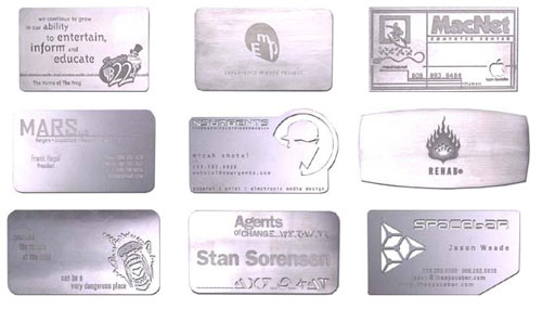
The problem with cards like that is that they are prohibitively expensive, and since I am not
“King of All Pimps”, I simply can’t afford them.
By evening, Itzler could be found at Cipriani, washing down plates of crushed lobster with yet another bottle of Johnnie Walker Blue label and making sure everyone got one of his signature titanium business cards engraved with NY Confidential’s singular motto: ROCKET FUEL FOR WINNERS.

Michael Krakovskiy - Pimp Programmer.” Hmm, that’s won’t work either. By the way, Jonny Walker Blue Lable sucks. Any decent single malt is much, much better.

CD Rom business cards, while cool looking, are not that useful. Their unusual shape and thickness make them hard to keep, and nobody ever puts them in a cd rom. Ever. Well, almost.

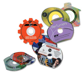
There’s another side effect of cards like this: they don’t work in and may break slot-loading cd rom drives, like those on some macs. I know this firsthand as one certain magazine ran a promotion with a small cd in one of the issues. I hear that it broke a few car cd players.

The funniest type of cards that I could find is the chocolate one.

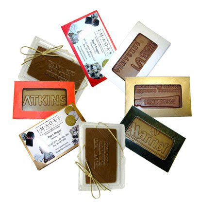
These are wildly impractical, expensive and probably don’t taste good. And unlike cd rom and metal cards can’t even be used as deadly weapons.

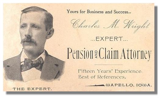
I even did some digging on Wikipedia. This Victorian card made me smile. I love the caption under the engraving.

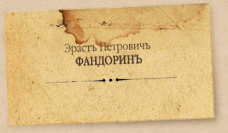
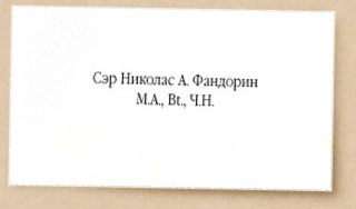
I also found amusing the entry screen for Boris Akunin’s works. It shows calling cards (similar but not the same thing as a business card) of two of his book characters separated by 100 years. You can clearly see the decline of the art of typography today :)

Let me know if you have any ideas, as I seem to be stuck.

No votes yet

Comments

Fri, 09/01/2006 - 15:04 — dan (not verified)

keep it simple dude. Pick a nice font (I like emigre’s Mrs. Eaves http://www.emigre.com/EF.php?fid=109), have little information on it, perhaps your name, web site, and email addy and have it letterpressed.
We used SOHO letterpress for our wedding invites and they did an amazing job.

Fri, 09/01/2006 - 21:16 — deadprogrammer

Yeah, that’s what I am thinking too. But where’s the pizzaz?

Sat, 09/02/2006 - 09:50 — Sam Spade (not verified)

[apologies for being off-topic]

Dude

My latest research occurred at the Cafe Vivace across from the REI off Denny Way in Seattle. I had an americano which was barky or muddy. Dissatisfied I then ordered a latte. The barrista produced an immaculate heart shape, but it was bland. Honestly I like the Starbucks ones just as well. I guess the foam seemed special, just not to my taste. I couldn’t much taste the espresso. Vivace has a clean modern decor. The barristas are so cool as to appear clownish to the untrained eye. Their chocolate-covered graham crackers were up to snuff.

IMO the Caffe D’arte downtown is better than Victrola or Cafe Vivace, though I haven’t been there in a few years. Nota bene that when other espresso stands serve Caffe D’arte it’s usually mediocre or worse.

Agent Sam Spade
 Seattle

I await my next assignment.

Sat, 09/02/2006 - 21:49 — deadprogrammer

Well, I dunno. I get coffee beans from Vivace and Victrola all the time, and they are some of the best you can get, in my opinion at least.

Sun, 09/03/2006 - 09:50 — Sam Spade (not verified)

You know more about coffee than I by far. Maybe I’m unlucky. I can’t see the americano at Vivace as anything but poor though. My wife wouldn’t touch it, and she’s a daily coffee drinker. It tasted like drip coffee made far too strong rather than espresso.

The cannonical Vivace’s seems to be a tiny place on Broadway, which I’ve seen but never paid any mind. I’m probably going to Seattle tomorrow morning and if so I’ll stop by. On Vivace’s website Emeril and a bunch of other people gush wildly about their coffee. Something’s got to give.

Regards
The Reverend Dr. Spade

Sun, 09/03/2006 - 10:02 — deadprogrammer

I still find it rather weird that you use cafe americano as your quality assurance drink.

I love Wikipedia’s take on americano:

One popular explanation for the name is that it was originally intended as an insult to Americans, who wanted their espresso diluted. If this is the case, many American coffee drinkers are either unaware of or unfazed by the derogatory nature of the name, even in some cases going so far as to misinterpret americano as being a uniquely American way to drink espresso.

Insulting or not, it should be noted that there is some truth to the statement that most U.S. coffee drinkers find espresso too strong to drink straight. American coffeehouses typically serve more latte and cappuccino than espresso.”

Sun, 09/03/2006 - 18:03 — Developer Unruh (not verified)

I personally like the Victorian portrait card alot. Why don’t you get picture of yourself in a jacket and tie, use some cheesey photoshop engraving action, and put “The Expert” under it? That would be very unique, and cheap.

Mon, 09/04/2006 - 02:35 — deadprogrammer

Yeah, I am thinking of doing that too. The thing is, making a good looking fake engraving is pretty difficult. I did always want to do a hedcut though…

Mon, 09/04/2006 - 05:13 — Sam Spade (not verified)

Okay today I went to the little Vivace stand on Broadway. I planned to have an espresso, but they serve it only in porcelain and I didn’t want to sit down. Instead I got the four ounce macchiato. It was extraordinary, possibly the best espresso drink I’ve had. I’m convinced.

I don’t know what was up with the americano I had at the fancy Vivace cafe near REI. It really was gross. It would have been gross without the hot water. This is not an espresso vs. americano thing.

Other than being a lowbrow American myself, I favor the americano because the espresso is puny. It’s over too fast. Espresso is not too strong for me. If I spend two or three dollars I want to get more than a sip. Anyway like I said I know jack about coffee, I don’t even drink it much.

Incidentally Vivace’s sign says they serve only ristretto shots as well.

Thanks for the tip.

Mon, 09/04/2006 - 18:45 — Andrew (not verified)

I enjoy using a full-colour picture of myself looking slightly silly as the background for my business cards (e.g. www.blindrut.ca/tmp/business-card-v1.pdf). If your intended use is “icebreaker” or “conversation foil” it’s usually a good way to go.

Post new comment

The content of this field is kept private and will not be shown publicly.
  • Allowed HTML tags: <a><b><i><img>
  • Lines and paragraphs break automatically.

More information about formatting options


 Subscribe in a reader

What's All this Then?

My name is Michael Krakovskiy, and this is my blog.

Here’s what you might find interesting:
100 Views of the Empire State Building project: I try to take 100 interesting photos of Manhattan’s (sadly) tallest building.

My Gastronomic Adventures: I eat weird food - from 13 year old New Coke to Durian and parasitic fungi.

My attempts to grow exotic plants: pineapples, coconuts, etc.

My photos, mostly of New York City.

My musings about architecture mostly illustrated with my own photos. Would you like to learn about a mental patient who died at 103 who served as a model for some very famous sculptures? How about Brooklyn’s ugliest building? How about a wooden skyscraper?

I find myself frequently writing about logos. The most popular article I ever wrote is about the redesigns of the Starbucks logo.

I wrote a series of “Best Sci-Fi You Haven’t Read” posts:

Psywarrior
Yes, Virginia There Is Synergy
Call Time Police - We’ve Got a Time Traveler

Other topics that interest me include NYPD, New York City subway system, Japan, and things made out of titanium. On top of all of that, I seem to be interested in pigeions and Rupert Murdoch.

Dear reader, please browse around. You are sure to find something interesting. I could really use some help in bringing in readership: subscribe to the rss feed, digg the stories (there’s a convenient button at the bottom of every article), link to my blog from yours, write some comments. I put in a lot of effort into writing, and I really appreciate your attention.

If you don’t want all this pseudo-intellectual and want some lolcats? Please don’t go away. Here, I have that stuff too. Here, here’s another. And another. And another. I lied about not posting cat pictures.