I want to have a personal business card. All the cool kids have one. The thing is, as you know from reading my blog, I am a bit eccentric. Just a plain ol’ boring business card won’t do.
I ventured forth into the depth of Interweb to find out about fancy business cards. One of the more useful articles was found on Robert Scoble’s blog, of all places. He has some good pointers.
Unfortunately I can’t do a card that will say “go and type in Michael into google and click 47234524th page of results”. It’s because I hope that you all will link to my blog and my pagerank will improve some day.
Another famous type of a cool business card was popularized (or even probably invented) by JWZ: his cards often had a neat title – they varied from “Scientist” to “Hacker” to “Hacker Emeritus” to “Benevolent Dictator”. I am not cool enough to pull something like that off.
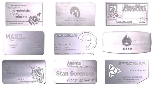
The next though that came into my mind – titanium! There are companies that make metal business cards, and you can special order titanium.
The problem with cards like that is that they are prohibitively expensive, and since I am not
“King of All Pimps”, I simply can’t afford them.
“Michael Krakovskiy – Pimp Programmer.” Hmm, that’s won’t work either. By the way, Jonny Walker Blue Lable sucks. Any decent single malt is much, much better.
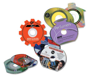
CD Rom business cards, while cool looking, are not that useful. Their unusual shape and thickness make them hard to keep, and nobody ever puts them in a cd rom. Ever. Well, almost.
There’s another side effect of cards like this: they don’t work in and may break slot-loading cd rom drives, like those on some macs. I know this firsthand as one certain magazine ran a promotion with a small cd in one of the issues. I hear that it broke a few car cd players.
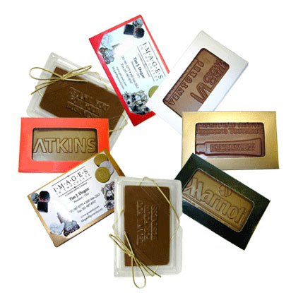
The funniest type of cards that I could find is the chocolate one.
These are wildly impractical, expensive and probably don’t taste good. And unlike cd rom and metal cards can’t even be used as deadly weapons.
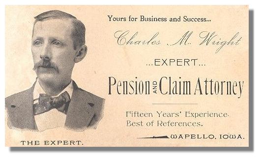
I even did some digging on Wikipedia. This Victorian card made me smile. I love the caption under the engraving.
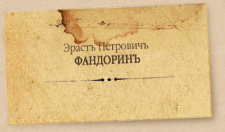
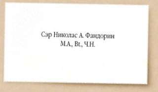
I also found amusing the entry screen for Boris Akunin’s works. It shows calling cards (similar but not the same thing as a business card) of two of his book characters separated by 100 years. You can clearly see the decline of the art of typography today :)
Let me know if you have any ideas, as I seem to be stuck.
