The Claw or Playing Not So Hard

When I began my career hiring managers still said things like “we work hard, and we play hard”. The “playing hard” usually consisted of drinking tequila shots after work and having either a ping-pong table or an arcade machine or two in the office.

Free tequila shots were always a crowd pleaser. Not so much with the games. The worst offender was the Packman machine. The silly little tune and “WAKA-WAKA WAKA-WAKA WAKA-WAKA” got old really fast. The ping-pong table was even worse: it’s hard to write code late in the evening in the middle of a death march project while system adminstrators click-clack the celluloid ball for hours. Both were gone quickly.

The lone “play hard” straggler was the awesome APB arcade machine that was placed near restrooms. “Help, help”, “yeah, yeah” and the awesome mumbling of the commanding officer deeply etched in our collective brains.

Besides insidious noise pollution, arcade machines make coders burn out even faster: staring into blinking phosphorus is not good after a long and hard day.

So, how can a startup stay true to the Silicon Alley/Valley cliche? I think I figured out an answer. A claw machine otherwise known as a “skill crane”.

My co-worker recently got obsessed with an obscure iphone game called Clawzilla. The original purchase price is a bit steep, but it includes free game tokens. The graphics suck big time, but the remote control functionality and responsiveness is top notch. In theory you can even claim toys caught by you by using a claim code and providing a few bucks for shipping, but that part did not really work for me.

In any case, me an my co-workers somehow rediscovered that claw machines are awesome. I spotted a toy claw machine at a drugstore and could not resist buying it. I cut the wire to the speaker that blasted circus music, but it’s still a bit noisy (but not as bad as the video makes it sound) because of poor gear alignment. We filled it with memory sticks, a titanium spork, minifigs and other geek items, culminating in a business card of our MIA CTO.

It’s still kind of lame. Unfortunately there are no affordable “real” mid-size claw machines on eBay: they were only created recently for prizes like the iPod. It’s kind of interesting: there’s a claw machine for iphone, and an iphone for a claw machine. In any case, these small machines can only be found brand new and cost several thousand dollars. Meanwhile, eBay is full of fully functional $500 claw machines.

Those are great. Load it with old phones, unwanted swag for conferences, etc. Use the proceeds from the quarter slots for charity (be it beer for developers or a real charity), and watch your employees and friends unwind trying to grab that lobster harmonica. It’s a dumping ground for swag accumulating in the drawers as well as a way to refocus and rest your eyes.

The best part? Have your designer make decal featuring local headcounts and localized title card and decorate your machine with them.

I only play a doctor on TV

So, those magnum Jupiter brains at Crispin Porter + Bogusky managed to crap the bed with their Microsoft ads instead of making Microsoft cool. For some reason this made me remember these three factoids:

According to Wikipedia, PC Guy John “PC” Hodgman is a Mac user, and Justin “Mac” Long is computer illiterate.

Kazuo Kawasaki, the Japanese designer for Sarah Palin’s glasses, is grateful to the Republican vice presidential candidate for making his product famous, although he acknowledged he also likes Democratic presidential hopeful Sen. Barack Obama“. Palin’s frames without lenses cost as much as John Edward’s haircut.

I’ve read somewhere that Norm Abram hates plaid shirts. A person who worked for the show told me that his shirts are mostly from Land’s End, by the way.

I don’t know, I guess this is how my puny Pluto brain works…

The House of Lamps or Lamp Lust

I firmly believe that expensive and well designed office chairs like Aeron or Mirra make a very good investment. On the other hand my friend, a very successful entrepreneur, tells me that much cheaper 300 dollar chairs are just as good, and that his most prized employees, when asked what kind of a chair they want said that it does not matter. My friend is very smart, very rich, and probably right.

People who have chair lust, like me, sometimes have an even more irrational desire – to buy expensive table lamps. When Joel Spolsky visited me at work, i pointed out to him that everyone at my office had a four hundred dollar Artemide Tolomeo desk lamp. Joel, famous for his office architecture fetish, was not impressed — oh yeah, we have a whole bunch of them too at Fog Creek, — he said.

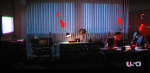
I noticed that the set designer of the hit show House, MD also has an obsession with lamps. Even more interestingly, I noticed that Dr House’s office has three very interesting lamps.

Lamp A is a paragon of British design, Bestlite, a lamp that I always wanted, and never bought because it’s crazy to spend that much money on a lamp. Designed by Robert Dudley Best and made famous by Winston Churchill, who had one in his office, it’s the Bentley of expensive designer lamps. It’s just crazy to spend over $600 on a lamp, innit?

Lamp B is the Artemide Tolomeo, a floor version of the lamp that I have at work. It’s a beautiful lamp that works very well. The desk version is about half the price of Bestlite, but it’s crazy to spend $300 on a lamp, right? Even if it’s designed by Michele De Lucchi and Giancarlo Fassina?

Lamp C appears all throughout Princeton-Plainsboro Teaching Hospital and gets the most screen time. It’s a 25 dollar Antifoni work lamp from Ikea, and the one that I have on my desk at home. Who designed it? I don’t know, it says “Ikea of Sweden”. What does Antifoni mean? According to Nordic Names, a website for translating crazy Ikea names like Bjöberg and Drömma, it means “antiphony“.

By the way, apparently Ikea founder Ingvar Kamprad has a Nazi past and chose to name all the furniture because SKUs were hard for him to keep track of due to his dyslexia. Also Gillis Lundgren, besides being famous for designing the Billy bookcase (I have 12 of these in my apartment) , actually invented the concept of flat pack furniture when he sawed off legs from a table that would not fit into a car.

Also on the subject of Ikea lamps:

7 Things You Can (Mostly) Do Without in Your Web Business

I’ve spent a lot of time in meetings about websites. Not as much as I’ve spent building websites, but a sizable chunk of my career. I mostly spent that time listening and not being listened to. But now that I’m older, have “Sr” in my title (it stands for Senor), a beard, those cool designer glasses, and have a lot more weight in meetings. Mostly due to the fact that I got pretty fat.

Previously I wrote about the evils of redesigns in The Russian Tea Room Syndrome, and about how web developers are like cooks and prison inmates. Restaurants are a notoriously difficult businesses to run, mostly because there are a lot of amateurs who do not understand what is not important. It’s not what’s important. Everything is important. It’s knowing what can be cut, especially in the beginning, that makes some restaurants succeed when others fail.

Here’s my list of 7 things that seem like they are important in websites, but really aren’t. These are not deal breakers. These are the things to think about last.

1) Looks. It’s nice to have a clean and beautiful design. But making a site pretty is not going to make you more money. Just look at plentyoffish.com – probably the ugliest dating website in existence. It does not stop its maker from raking in 10 mil a year without any hard work whatsoever.

2) SEO. SEO is the alchemy of the web business. I’ve seen more sites get sandboxed by Google than gain pagerank from SEO efforts. Most big url rewriting efforts create broken links, which are bad no matter how you look at it. Don’t break urls, if you can – make them descriptive, and try to make your site linkable (i.e. GET instead of POST search forms), but that’s about all that might help you. Spending a lot of money on SEO is just plain stupid.

3) Performance. Everybody hates slow and crashing websites. But unless this lasts for years, it’s not a deal breaker. Twitter suffers from worst imaginable performance trouble. Livejournal went through a long stretch of bad performance. Even the big dogs like eBay and Amazon have a slow spell or outage or two. MS Windows became the most popular OS in the world not because of its stability. Of course it’s currently losing market share to Apple, but this precess took decades. If anything, it looks like Twitter outages make its users miss the service so much, that when they get back in the twitter their brains out after bitching about the outage for a bit.

4) Good branding. A good name, url, and logo are not going to make you more money. They are just not that important. As long as it’s not too embarrassing, like therapist.com it’s going to be ok. If you look on Alexa, icanhascheezburger.com has almost as much traffic as tvguide.com.

5) Pure CSS markup and web standards compliance. I’m sick and tired of being told that “tableless” design is somehow important. It’s not, it’s not, it’s not. Go to google.com, amazon.com, ebay.com, nytimes.com and view the source. You will see tables galore. Wasting time eliminating tables is just plain stupid. And all-div completely web standards-compliant XHTML markup is not going to make you any more money. I refuse to feel bad about using tables. And perfectly validating XHTML is only going to help page scrapers.

6) Keeping the site ad-free. Site users are ok with ads. They really, really are. If you have what they want they will suffer through the biggest ads you can throw at them. “Half Page Godzillas”, “Skyscrapers”, “Page Killas”, “Shrieking Flash Sound Diddlers” – whatever you call your most annoying ad – despite heated assurances from the users, it’s not going to make most of them leave. Some will and more will follow, but it’s not as drastic as you might think. If you have something unique. I’m not advocating horrible Flash ads. “Flash Sound Diddlers” are not more effective in selling stuff than tasteful Adsense ads which will not have anybody at all leave. You can use ad money to buy more servers, more content, ads of your own. This will bring in more users.

7) Widgets. If your entire web strategy is based on building widgets, well, you are in trouble. You are entering an frenzied and very crowded market. Widgets are the bastard child of old school web “badges” and “push technology.” Widgets sometimes work great for increasing pagerank, just like the “web awards” that were given out by some sites in Web 1.0 times. They might get people to link to you, especially if these people are Myspacers that are constantly looking for shiny things to line their pages with. But in the big scheme of things widgets are not a great way to spend ttime and money.

Ze Paul Frank

In my career as a web development I’ve seen a lot of brilliant and competent people, as well as a lot of utter incompetents, on all levels of the corporate ladder and working at all levels of productivity. Basically, if I were to make a competence scale, it would look something like this:

– <–10-9-8-7-6-4-5-4-3-2-1-0-1-2-3-4-5-6-7-8-9-10–> +

Let’s say user data release by AOL would rate at negative 7; setting out to rewrite Netscape from scratch at negative 9; changing all the links of an established website in the name of SEO at negative 5; writing tons of spaghetti code that nevertheless functions and serves users at positive 1; coming up with PageRank algorithm and implementing it — at positive 10. There are also those who come into the office and do nothing at all – that’s 0. Ase we all seem to notice and remember negative things better than positive, sometimes corporate life seems like one big orgy of incompetence and bad ideas.

I’ve long had a theory, why even with so many negative contributions, American companies mostly prosper and thrive, despite incompetency. To explain it, I usually use an ant metaphor. See, when ants are carrying a bug or a caterpillar back to the nest, they almost always succeed. But the thing is, they do not cooperate very well. They all have different ideas about which way to pull, and some, instead of helping, actually climb on the cargo or collide with other ants. Others just watch from the sidelines and generally mill about. But even though ants pull in different directions, the resulting force vector generally leads to the nest, and the caterpillar gets there eventually.

Recently, an article about a designer Paul Frank caught my attention. He is fighting his former business partners who jettisoned him from the company bearing his name. He came up with the design ideas that made the company what it is, as well as lent it his name. The business partners accused him of not contributing to the daily business grind, bought out his shares and either fired him or drove him to resigning (depends on whose story you listen to). It’s getting nasty:

” “Those guys are saying Paul Frank is not a person,” says the designer, whose given name is Paul Frank Sunich. “I hear they’re all wearing T-shirts that say ‘We Are Paul Frank.’ Well, you’re Paul Frank Industries. You’re not Paul Frank.”

I’ve seen the monkey design that Paul Frank is so famous for, but did not know that it was a multimillion dollar business. Apparently it’s very popular – and I definitely do believe that both the business partners that made this quirky brand into such a powerhouse and the guy who conceived it made positive contributions.

What I have the issue with is the person who’s running their web department. It’s not even the unusable obnoxious flash-ridden websites that don’t work in Firefox. It’s the fact that this person apparently never did something very basic – typed in “Paul Frank” into Google. Because when you do, you get this as a first result:

I don’t have a problem with the programmer who used a stock client detection script from somewhere. We all do that. But putting “Client Detection Script” as the title of the first page of your site is rather idiotic. And nobody at the company even searched for “Paul Frank” in Google, even if to see what other Paul Franks there are out there!

Getting back to my ant theory, squabbles, badly designed websites and all those people who prolifically do bad things are balanced out by things done right. The website may suck, but the brand is so good that people will put up with it. Individual ants might be doing stupid and counterproductive things, but it all gets balanced out. The caterpillar gets dragged into the nest, whether it wants it or not.

How the Starbucks Siren Became Less Naughty

[update] Starbucks logo changes again.

You are probably here because you looked closely at the Starbucks logo and were a little confused about what is depicted on it. Is it a mermaid? What are those things that she is holding up with her hands? Wasn’t the logo different before? What’s the history of it?

I asked those questions myself and did a little bit of digging. My research started with a book that I had, called A Dictionary of Symbols by J.E. Cirlot. In it there was a chapter about Sirens.

Basically, from what I gathered from different sources, including that book, there is a lot of confusion between the different mythological half-women. Typically they are called Sirens – both the half-bird/half-woman and the half-fish/half-woman varieties. The fish type are usually called Mermaids. Both types according to the ancient Greeks were in the business of seducing mariners with songs and promises of sex and then killing them, but Hans Christian Andersen and Disney mostly made everybody forget that.

The whole sex-symbol status of mermaids hinges on the question which part is “woman” – upper or lower. “The other type of mermaid” that hapless Fry was referring to would have problems attracting suitors, of course. And how do you do it with the normal type?

Wise mythologists came up with the answer, of course. And the answer is a two-tailed mermaid sometimes called a Melusine.

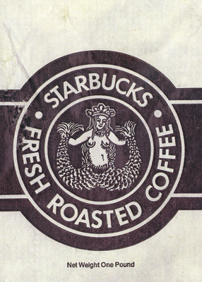
The book had an old engraving of a two-tailed mermaid. It reminded me of the Starbucks Siren, but back then I did not realize that the original Starbucks logo had a slightly altered version of that engraving in the original brown cigar band-shaped logo.
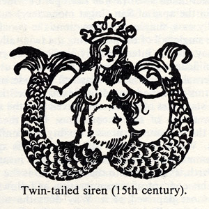
Notice that the graphic designer removed the belly button, the unattractive shading around the bulging tummy of the 15th century siren and merged the tail-legs to remove the suggestion of naughty bits. The logo Siren also smiles a little while its 15th century doppelganger is looking rather grim. Other than that it’s clear that this is exactly the image that he or she was using.

According to uspto.gov “[Starbucks] mark consists of the wording “Starbucks Coffee” in a circular seal with two stars, and the design of a siren (a two-tailed mermaid) wearing a crown”.

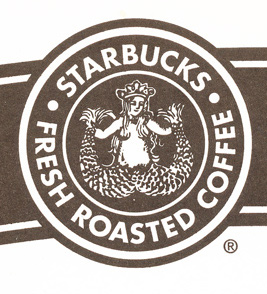
Here’s the “cigar band” logo from which I took the image above. The original hippie Starbucks owners did not sell espresso drinks, but mostly sold coffee beans, tea and spices. Today Starbucks sells liquor and ice cream, but no spices if you don’t count the cinnamon gum and the stuff on the condiment table.

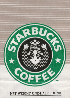
The next, more familiar green iteration of the logo has a more attractive stylized siren. The chest is hidden, but the belly button is still there.
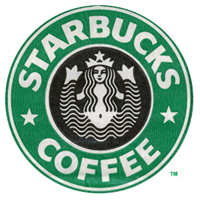
Here is the current logo. They cropped the siren image so that only a hint of the tails is visible. I asked hourly partners at Starbucks and friends, and none of them could figure out what those things to the side of Siren’s head were.
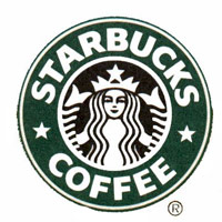
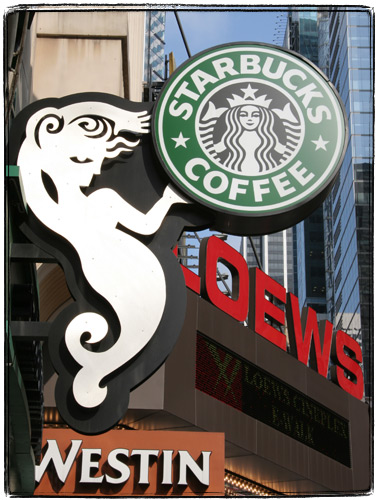
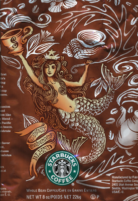
Lately I’ve stopped seeing pictures of the Siren on Starbucks mugs – they seem to favor just the word “Starbucks”. I also started seeing the new type of the siren as part of store decoration and on coffee packaging. She only has one tail. I guess the family-unfriendly image of a fish-woman spreading her tails is on its way out.

[update] Here’s a picture of the new siren:
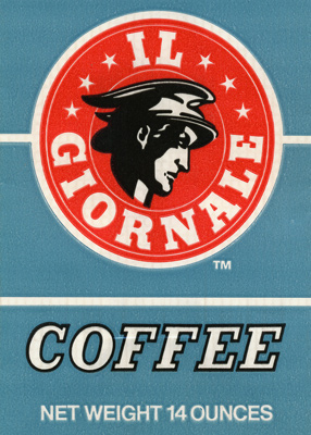
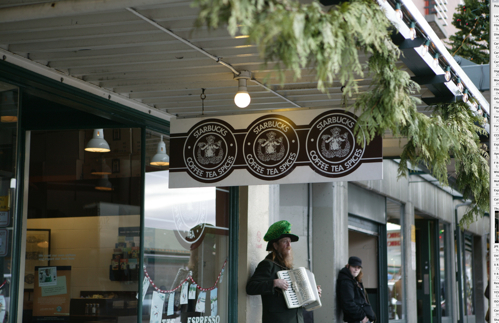
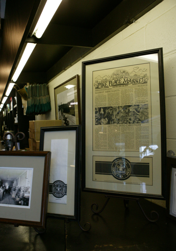
The brown Siren logo can still be found on merchandize sold at the original Pike Place Market Starbucks in Seattle. The logo is altered though – instead of a “cigar band” design it uses just a circle logo. Cigar band logo mugs and coffee jars can still be found on eBay for upwards of $50 per mug and $200 per coffee jar. I am still looking for anything bearing an “Il Giornale” (a company founded byHoward Schultz that later ended up buying out Starbucks with the help of none other than Bill Gates Sr.) logo.

[Update]
Dear Boing Boing readers – you might enjoy other sections of this blog such as Gastronomic Adventures and 100 Views of the Empire State Building.

[Update]
I was alerted to another article that explores the Siren’s symbolism. I haven’t used it in my research, but it is very thorough.

[Update] The whole logo history is described pretty well in Pour Your Heart into It : How Starbucks Built a Company One Cup at a Time. The book is full of other Starbucks trivia: if I remember correctly, it states that Howard Schultz is a close friend of Yanni.

[Update]

I received some information from Doug Fast, the designer behind the green logo. He also graciously sent me some rare examples of the logo, for which I am extremely thankful.

“I am the guy who designed the green SBUX logo. The original brown SBUX logo was designed in 1971 by my employer before I started working for him in January 1974. ( I still work there as a designer) The design company was then called Heckler/ Bowker, here in Seattle. Bowker (the company copy writer) was one of the three original founders of SBUX and left Heckler/ Bowker in 1984 to take on SBUX full time. (there were 5-6 stores at that time) The other two founders were; Jerry Baldwin and Zev Siegal. Heckler/Bowker came up with the Starbucks name and Heckler came up with the first (brown) logo. The other name strongly suggested was Pequod, but lost out to Starbucks.

The original SBUX store was NOT in the Public Market or in the Arcade as people think. It was at the corner of Western Avenue & Virginia, just north, across the street from the Public Market at the foot of the steep hill going up to 1st Avenue, and opened it’s doors in March 1971. I have a photo of it and also a drawing of it that was on an SBUX Christmas card from 1977.

The first retail Starbucks coffee drink concept store was originally called Il Giornale, and located on 4th Avenue in downtown Seattle. There was only one of these stores ever. I designed the logo for that in 1985-86, plus the coffee bag packaging, and still have the stationary, bags, and cup designs in my sample file. Howard Schultz was still an employee of SBUX at that time, not the owner, as I’ve seen said in previous blog info. here.

The reason only ONE Il Giornale store ever existed was because of the purchase of SBUX by Howard and his investers, and because the SBUX name and logo had so much capital already, they changed Il Giornale back to SBUX and wanted a more reproducable SBUX design, to go national.

I did the green “full siren” logo with a stronger, simpler, read for reproduction. The SBUX type was HAND DRAWN and based on the typeface, Franklin Gothic (this was pre-computer, folks) and had to be drawn so it bent well, around the circle. We submitted the logo to Howard, one with a red color and one in a green color. He picked the green color option.

In 1992 we had to blow up the siren to eliminate the spread, so called suggestive tails, so that’s the version you see today.

I still have most of the original concept work for the creation of this logo in one of my big sketchbooks. To me at the time, it was just another logo job to do. Who would have thought I’d be sick of seeing it all over the place. It isn’t one of my best logos.”

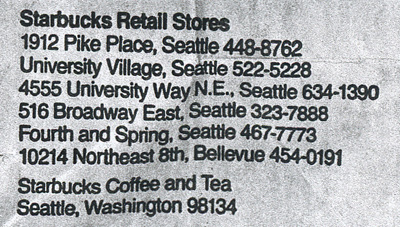
Original stores from the old coffee bag:
The original “cigar band” logo:
Il Giornale logo:
Green “bellybutton” logo
One of the newer coffee bags that reimagines the siren:
New “cigar band” logo with covered up nipples and cleaner lines:
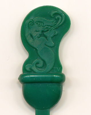
New plastic stirrer / plug in the shape of the siren:
Old logo at one of the first (from what I hear it’s not the “original” location) stores at the Pike Market in Seattle
original-starbucs-logo

starbucks-pike-market

Did reading this article inspire you to write a poem about Starbucks? You can use Rhymebuster, the algorithmic rap generator. Turns out a lot of things rhyme with Starbucks (other than sucks).

Blinking Tema’s Stuff

Thanks to the wonders of the WaybackMachine Lebedev watchers can track what everybody’s favorite Russian designer has in his office at temporal markers A B C and D. If you open these links in different tabs of your Firefox browser (you are not using IE still, are you?) you can use a technique that astronomers call “blinking” to see the changes in Tema’s fine equipment.

The most puzzling change is from B to C to D. It looks like he didn’t like the new Herman Miller Mira and went back to good ol’ Aeron.  I am surprised that he isn’t using dual monitors yet. 

Also notice how the picture on the monitor does not reflect the changes up to D.

So far the only exact matches to my equipment is the chair and the wastebasket. My Intuos2 is a smaller 4×5, my Griffin powermate is black, not silver, my camera is a cheaper but better Digital Rebel, instead of post-its I use a police memo binder with a reporter’s pad inside, my keyboard, trackball and mouse are made by Logitech, the dual screens are Viewsonic VP171b, the computer is a Shuttle XPC. My cigar ashtray which gets used only a few times a month is made out of radium glass. My cellphone is cheap and looks like a brick, but thanks to all those Verizon towers that irradiate everyone around, has awesome reception. And for pens I use whatever is left from my office supply therapy.

And Lipstick Too

I have a small collection of cheap box cameras that my grandfather bough for my in his garage sale adventures. I decided to look into filling the rest of space in one of my bookshelves with specimens from eBay. One thing that I often do is sort the auctions descending by price. That way I often find most curious stuff. On the top of the search for “Kodak Brownie” were two amazingly beautiful cameras with striking art deco design:

“The Kodak Beau Brownie came in two models, the 2 and 2A and were made from1930 to 1933. They were styled by the leading American designer Walter Dorwin Teague, who created a modernistic geometric pattern in two tones on the front panel, which was enameled in a color matching the leatherette covering of the rest of the camera.
The Beau Brownies came in five colors including, old rose, blue, black/purple, brown/tan and green. “

And this wasn’t a fluke either. Kodak also made “Coquette”, which featured a lightning bolt art deco design and came with a matching lipstick holder.

Take a plain box, give it a new design and add some color. Everything old is new again, right?

I think Apple should try to add a matching lipstick holder.

TT : Thought Tally : Dude, Where’s My Biochemistry Degree? or Kinky Crew Superstar

is going to like this. As I learned from TV Guide Magazine, Ashton Kutcher majored in Biochemistry.

According to one of the most annoying things a customer can do at the checkout line is to say “He heh. I guess it must be free” when the scanner beeps and refuses to scan the code. See, I could never come up with that stupid and apparently common joke. A Null is not a zero.

This kind of reminded me about a dude who was playing an electronic one arm bandit in Moscow when the machine crashed with 999999 rubles in the payout window. He stayed at the gaming parlor for days guarding the machine, but in the end the machine was rebooted and he wasn’t given any money. Or so I heard.

Coca cola definitely tastes better when it’s sold in those glass bottles. You know the ones that are probably based on the shape of the cacao pod (which was mistaken for the kola nut by the designer or something). They still make those in Mexico and sometimes they are sold in a few bodegas in NYC. I always thought it tasted better because of the glass, but finally found out the true reason:

“She told me that they were bottled in Mexico and I nodded since I already knew that and said, “I think it is because they use real sugar.”
She shook her head, “No, no, not the sugar. It’s the water.”
She leaned in like she was telling me a secret, “Mexican water is the BEST water in the entire world.”
Just then a smaller woman leaned in beside her grinning with a single eyebrow raised and whispered.
“It’s MAGIC water!”

Apparently it is not Montezuma’s revenge that assails unsuspecting tourists, but the magic waters that sour in the bellies of the unimaginative, somewhere South of the border.”

Many big corporations in order to retain employees use powerful “cult team building” techniques. One thing that I noticed is that worker ants usually have very peculiar job titles. For instance at Kinko’s the official title is “Co-worker”. At McDonald’s – “Crew Member”. From Gig I learned that Kinko employees unofficially use “Kinkoid” instead of “Co-worker”. And from an lj user in I learned that a McDonalds crew member who has formidable years of experience, but isn’t a manager is called “Crew Superstar”. I guess it’s kind of like “Research Fellow” at Microsoft :)

TT : Homer Shrugged

1) The trilogy that I actually care about is complete. The Golden Transcendence : Or, The Last of the Masquerade is here, and it doesn’t dissapoint. I’ll write my review soon.

Is it just me, or did the book jacket’s designer rip off Zhaan from Farscape?

(image from http://farscape.bittersweetblue.net)

2) Ebay auction: The Simpsons Homer as Atlas A La Carte Statue

Very impressive.

3) How a google search for video drivers helped ‘s mom grow her vocabulary.
Isn’t technology wonderfull?

4) Learned about this in “This Old House Magazine”. There’s a company that makes a table saw that senses the change in capacitance between wood and human (and as this demo shows, pigeon) flesh and stops momentarily.

Watch the videos here. would probably get a kick out of that.

5) There was an article in the Bulletin about Atoms for Peace.
Dammit, where’s my Ford Nucleon?

(image from conceptcarz.com)