Optimus Mini Three Full Review

I once read a book called “The Mouse Driver Chronicles: The True-Life Adventures of Two First-Time Entrepreneurs” about two guys who started their own company with an unorthodox business plan: making a real, physical product and selling it. This happened during the dot com era, when everyone was making money hand over fist with immaterial products: websites, content, synergy and such. At the very most, bits and bytes would overlap with physical world in online stores – you could order something online and get it delivered, but there were very few companies that produced an actual product. Well, there was one place that would send a real dog turd to a recipient of your choice, but they went under and I can’t even find their website. “Brick and Mortar,” a metaphor for physical world (as opposed to online) stores became a pejorative.

So, these two guys embarked on creating a company with a single product: a mouse that is shaped like golf driver and selling it to big novelty stores and catalogs. Very not dot-com. Designing the product was easy: take a golf driver head, slap mouse buttons on it – there it is. Dealing with the manufacturer was a lot more difficult. These days most of electronic products are made in China, and flying there is pretty expensive. You have to deal with the language barrier, timezone shift, and cultural differences, while collaborating on making a physical product. A single miscommunication and a whole batch worth tens of thousands of dollars might be ruined.

This is the reason why so many great product ideas go unrealized. A great example of that is SiliconFilm: a film roll-sized device that would convert your regular SLR into a digital one. Many people would want to buy one, but it’s been a stady winner of Wired’s vaporware awards.

Mousedriver was a simple product: a stock mouse in a slightly different housing. When I’ve heard that Art. Lebedev studio was actually planning to make one an OLED custom input device, Optimus Mini Three, I had my doubts that it would ever become real, but plunked down 100 bucks (a special pre-order price, it’s $160 or so now) and was prepared to get my money back in a year or two. Instead, in less than half a year I got a parcel from Taiwan. Inside was a working Optimus Mini keyboard. A was dumbstruck.

Now, Art. Lebedev Studio is a slightly more serious outfit than the mousedriver guys. It’s a large (about 150 people) design firm lead by a brilliant designer Artemy Lebedev. This guy:

Artemy (aka Tema aka Art.) Lebedev is so notorious in Russian web design scene, that he goes by the moniker “Youknowwho.” The Studio is based in Moscow, with satellite offices in Latvia and Ukraine. Web design is their bread and butter, but lately they’ve been branching out into industrial design. Starting with a funky coffee mug called ColorShift Atmark, they’ve been steadily building their portfolio of actually manufactured objects.

There are only two other design companies that excite me as much, IDEO and Frog Design. Lebedev Studio in my mind is destined to be as great as IDEO. One day I found out that my favorite toothpaste tube(Crest Neat Squeeze) and toothbrush (the “fat” Oral-B one) were both designed by IDEO, as well as many other wonderful things. Good design is very important to me, and Art. Lebedev Studio is finally starting to come out with things that I can buy.

The concept design for a keyboard with buttons containing little OLED screens called Optimus recieved a lot press coverage. Lebedev would be crazy to attempt manufacturing something complicated like that, just as it would have been stupid to attempt to create Apollo spacecraft without building a Redstone rocket first. So Youknowwho decided to do a proof of concept – a three button OLED “keyboard” and called it Optimus Mini Three. As I mentioned before, mine arrived from Taiwan a short time ago.

I opened the box, plugged in the USB cable, installed the software and was up and running in about a minute. USB devices are supposed to be plug and play, but can be very finicky – refuse to be recognized, fail to install drivers, etc. Wasn’t the case with OM3 – the usb communication code is rock solid.

One thing you should know about the organic led screens is that they are extremely hard to photograph. They behave kind of like the old tv screens and computer monitors, having some sort of a refresh scan. Ideally, I would take pictures in a professional light tent with a camera on a tripod taking a lot of pictures with a slow shutter speed. I ended up taking a lot of pictures hand holding the camera with the exposure of 1/13th of a second. My lens has an anti-shake feature and I have very steady hands, but the pictures could be a touch sharper if I used a tripod. There are also problems with moire pattern that shows up in pictures, but is of course not visible to the human eye.

Here I loaded some sample images from the web. They look very crisp live, but even with all the camera artifacts, they look passable photographed. The contrast and resolution is very impressive. Also, the plastic that covers the screens gives off very little glare and does not hold fingerprints well. The only thing that shows up is light-colored specks of dust. I did not even bother wiping down the buttons after pressing them for the most part.
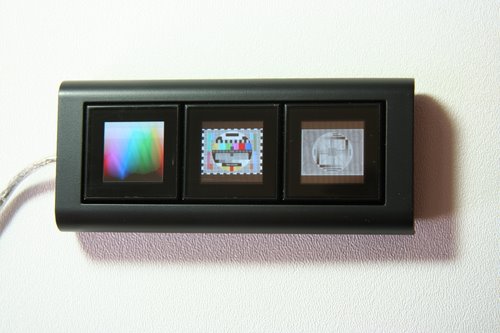
Here’s an example of the silly slot machine game that comes with the software.
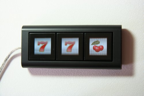
Here’s a closeup of a single button. There is a bit of an issue with the pixels right at the top and bottom: they are a bit off.

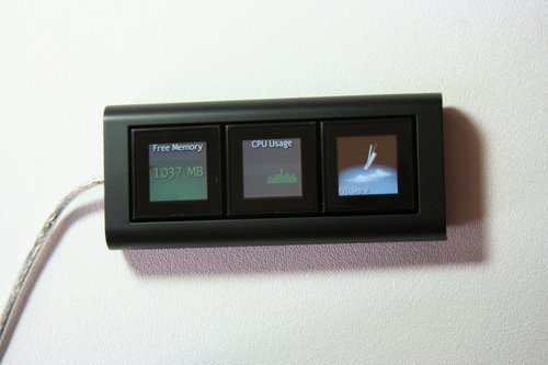
The memory and processor resource tracking application shows a \little artifact: a small stripe of dead pixels. This seems to be a software issue though: these pixels work in other applets and images, and actually show up in the software preview. In resource monitor mode the software itself takes about 10% of processor time for itself. This can probably improved, but this is not much more than I would expect from any resource monitoring application. Overall the “configurator” software is in a pretty solid beta. It does not crash, but certain features need some work: the Windows Media Player widget keeps scrolling “Winamp” messages, time and weather widget does not change the weather and is hard to read, etc.
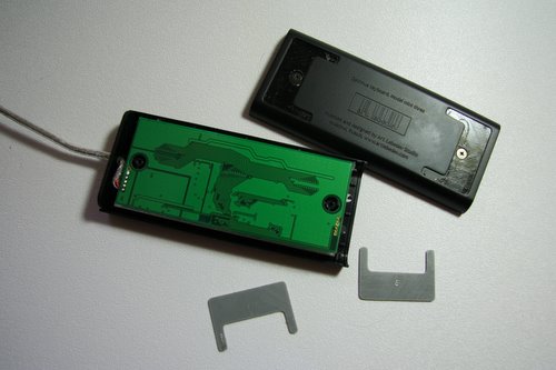
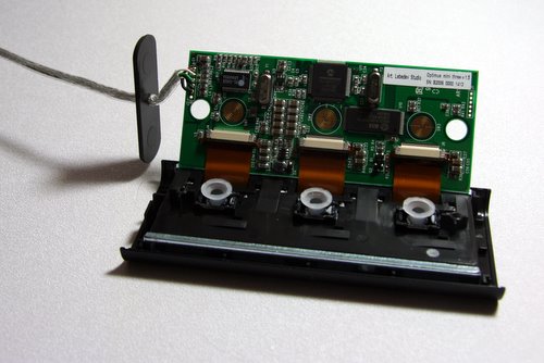
I could not resist opening the this thing up. I pried up the non-skid rubber and found two screws. Mr. Lebedev has a habit of leaving funny notes in code comments of most of his websites. I was looking for a message, or the design team’s signature on the inside of the case (like with the original Apple Macintosh), but did not find anything.

The keyboard is not completely silent – when in operation it generates a very faint buzzing sound and the buttons are slightly warm to the touch. I thought that there might a little fan inside, but did not find one.
The keyboard looks like it’s made out of metal, but it’s actually very high quality plastic. To make it more hefty, the designers used two strips of metal as wedges that hold the pcb in place.
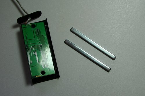
I did not take apart the screen assembly, but unlike most electronic devices these days, the mini keyboard seems to have been designed with future service in mind. Replacing the screens is easily within the abilities of do-it-yourselfers. As you can see, the key mechanism is the soft, rather than clicky one. This is a matter of preference, of course, but a click, as a feedback mechanism would be nice.
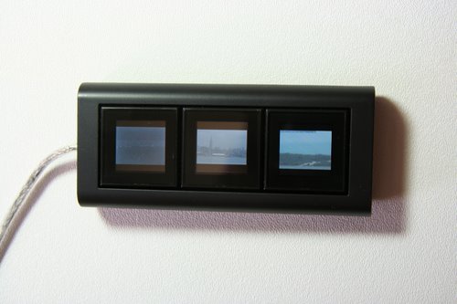
A lot of message board nerds cry – “unlike the full keyboard it’s useless!” The usefulness of mini three is in the software, of course. Even in it’s present state with one minute of spare time I came up with at least one cool use for it – a three webcam viewer. The picture is worse than the original, but the idea is that the left button shows Mount Fuji (at the moment under the veil of the night), the middle one – the Empire State Building and the right one – a live seahore webcam that lets me know what the weather is at my favorite fishing hole. I haven’t played with the SDK kit that is available yet, but it seems to be super nice. “What can I do with this?” – whine some on digg and reddit message boards. A hacker’s reaction would be different – “what can’t I do with this!”
160 bucks seems like a lot of money for a three button keyboard. I’ll admit, it’s not for everyone. The thing is, people spend a lot more on stupid case modifications and other blinkenlghts. And this well-designed gem of an accessory would be the coolest thing as far as the eye can see in your personal hell of a cubefarm. It’s a little hackable art piece. Practical? Not very. Cool? You bet your squeedly-spootch. Is it a good deal? Well, a much lamer lcd display goes for 80 bucks. A very neat laser keyboard goes for 180. Shiny is expensive.

I have one gripe with the design. The keyboard is made so that it will lie flat. I’d like to have a little wedge, so I’d be able to see it at an angle (I think I’ll make one myself). What I do like, is that the screens are easily rotatable in software, so you can just lay it vertically.

Of course, it’s a bad idea to program Optimus Mini Three to trigger self destruct, as it’s not cat-proof. But I think I’ll program a cat toy sequence in it though. So far the plastic stood up very well to cat claws.

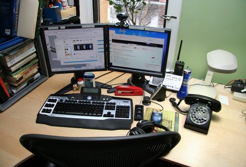
For sticking with this lengthy and rambling post, I’ll let you take a little glimpse in my geeky life. Here’s a snapshot of a part of my table, including my fancy input accessories, for which, as you might have noticed, I have a bit of a weakness.
A new poll

I played around a little with Advanced Poll, a free perl script that is automatically installed by Dreamhost, only to realize that it’s not particularly advanced. You can’t even have a dropdown-stlyle multiple choice question! Also, I could not find a way to make it work in an RSS feed. Then I installed a Democracity plugin for WordPress, which, while a bit easier to work with, is even more limited in features. Do you, my loyal readers have any suggestions or do I need to write the stupid poll software myself?

Meanwhile, the current poll is a pretty simple question. Go vote.

Take That, Rupert

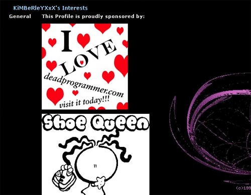
The majority of deadprogrammer.com traffic these days consists of myspace.com users hotlinking images. I really don’t mind hotlinking, in fact, I encourage it, but the thing is myspacecadets never ever link back to me. It’s common courtesy – if you use somebody’s image as well as server resources, provide a link back.

Well, now I use this little snippet of code that in my .htaccess file to replace any hotlinked image from myspace.com with a tasteful ad for deadprogrammer.com:

RewriteEngine On
RewriteCond %{HTTP_REFERER} ^http://(.*\.)?myspace\.com/ [NC]
RewriteRule \.(jpe?g|gif|png)$ photos/hotlinked.jpg [L]

All of a sudden, hundreds of popular myspacers are promoting me:

Classy. If you have a better idea for a replacement image, let me know.

The Russian Tea Room Syndrome


“Man told me,” He said, “that these here elevators was Mayan architecture. I never knew that till today. An I says to him, ‘What’s that make me– mayonnaise?’ Yes, yes! And while he was thinking that over, I hit him with a question that straightened him up and made him think twice as hard! Yes, yes!”

“Could we please go down, Mr. Knowles?” begged Miss Faust.

“I said to him,” said Knowles, ” ‘This here’s a research laboratory. Re-search means look again, don’t it? Means they’re looking for something they found once and it got away somehow, and now they got to re-search for it? How come they got to build a building like this, with mayonnaise elevators and all, and fill it with all these crazy people? What is it they’re trying to find again? Who lost what?’ Yes, yes!”

“That’s very interesting,” sighed Miss Faust. “Now, could we go down?”

Kurt Vonnegut, “Cat’s Cradle

The Russian Tea Room, once a popular restaurant created by ballerinas and danseurs (aka male ballerinas) of the Russian Imperial Ballet for themselves and their friends. Later it became an expensive restaurant for the Manhattan high society. In 1996 the new owners closed it down for 4 year and $36 million renovations. In 2002 the restaurant closed, and the owners were bankrupt. In the aftermath, one of the chefs, M.D. Rahman, can be found on 6th avenue and 45th street selling some of the tastiest street food in Manhattan. I bet he’s making more than he did back at the Russian Tea Room now with his little cart.

In the parlance of the Internet this is known as a “redesign” or a “relaunch.” If you are making a living out of web development, like I do, chances are that you participated in a vicious cycle of web site redesigns. They usually happen like this: managers decide to do it and get funding, a lot of meetings follow, specifications are written (or not), arbitrary deadlines are set, designers create graphical mock-ups, then coders swarm and engage in what’s referred to as “death-march.” Managers change their minds about the look and feel a few times during the death-march for an extra morale boost. Finally, a redesigned website launches. Managers start planning the next redesign right away.

In the olden times the CEO’s nephew often got the web design job. Well, these days the nephew grew up, he has a consulting agency. “This is old and busted, let me redesign this mess and you’ll get new hotness” – he says. Pointy-haired bosses everywhere nod and say – “yes, yes, new hotness”, and the cycle keeps on going, redesign after a redesign.

There are a few different types of redesigns. Firs of all, there’s changing the look. In the simplest and best form, this is a very quick deal, especially if the site is properly architected for quick changes. It’s like taking your plain vanilla cellphone, buying a snazzy faceplate, one click – instant new hotness. I have nothing against this sort of redesigns.

The only thing you have to look out for here is what I call the “Felicity effect.” A television show Felicity had a famous redesign failure – the actress Keri Russell cut her trademark long hair. One might argue that she is hot no matter what, but the show suffered a huge drop in ratings. You have to keep in mind that a new look rarely attracts new customers, but often upsets the old ones. For instance, I like Keri’s new look, but I would not start watching that show.

The second type of a redesign involves changing the underlying technology of the site. One might change the content management engine, database engine, rewrite the site in a different language, make it run on a different web server, different operating system, etc. These usually turn out to be the most disastrous and costly of redesigns.

Joel Spolsky wrote about “… the single worst strategic mistake that any software company can make: … rewrit[ing] the code from scratch.” In the web publishing world these kinds of rewrites cause a lot of grief and devastation. A huge technology change always requires a lot of debugging and fixing afterwards, and as soon as most of the bugs are fixed, a new redesign comes around, because, see, ASP.NET 2.0 C# is “old and busted” and Vista Cruiser Mega Platform D## is “new hotness.”

I am not talking here about replacing a technology simply because it does not work or is dangerous. But redesigns are rarely aimed at fixing things – they are done in search of hot technologies and hot looks. By the way, amongst pointy-haired web execs fixing things is less glamorous than perusing new technologies, and that is less glamorous than changing the looks.

A building superintendent I know was in a middle of a huge project – repairing three old and unsafe elevators as well as fixing the crumbling facade of the building. Although the repairs were crucial, they did not earn him the love of the tenants that the old superintendent enjoyed. The old super, instead of fixing broken things, engaged in an almost constant painting projects, changing the color of the paint every time just a little bit. And when he wasn’t repainting, he would leave out the paint bucket and a brush on some rugs in the lobby.

The web execs often go for the best of both worlds – equivalent to changing the foundation of the building (and not the old one was sagging), as well as painting it a new color at the same time. The full Monty web redesign is what the pointy-haired want.

Let’s take a look at the sense that such redesigns make from a capitalist point of view in an area that I know well — web publishing. Web publishing businesses work just like any other. You take some money (aka capital), you spend that money to produce something and you hope that that something makes you even more money one way or another. In economics this is known as Marx’s general formula for capital: Money-Commodity-Money.

Another thing that I faintly remember from my economics class is a rather disturbing concept called “opportunity cost“. See, when you invest money in something you instantly incur this cost. Why? because you can’t invest your money twice, and there always seems to be something you could have invested in that would give you a better return. Let’s say it’s 1995 and you are an editor in, oh, Random House or HarperCollins. You have a budget to publish some children’s books and there’s a pile of proposals on your table. You pick a few. They make money, win awards, etc. Yet, the opportunity cost on every one of those books is about a kajillion dollars, as in that pile there was a certain book by a woman named Joanne Rowling.

In theory, any web executive’s first objective should be to make, and not lose money. Also they should look to minimize the opportunity cost whenever possible. This is of course not the case for many of them. They are thinking: hey I have this fat budget – I can do a big redesign, or …. hmm, what else can I do with that money so it will make me more money?

So how would one go about increasing profits? In the web publishing today content is once again king because of the maturing web advertising, vast improvements in hosting costs and google-inspired web indexing and searching. This was not the case in the earlier days of the web, but now you can directly convert “eyeballs” into profits. The process is rather simple: you create web pages, users visit them, you show users ads (for which you are paid). The relationship is linear – more users = more ad impressions = more money.

So, first of all, you might produce more pages. With search engines like Google, even pages that are hidden in archives of your website will still produce pageviews. The more pages you add, the more revenue you’ll get. In fact, pages with useful information, once placed online become something very dear to a capitalist’s heart – an income generating asset, the very thing that the author of Rich Dad, Poor Dad is so excited about. They are like the geese that lay golden eggs.

The cost of producing more pages comes from three sources: the cost of content – you need to pay someone to write, take pictures, etc; the cost of placing it online – “web producers”, the people who write html, create hyperlinks and optimize images draw a salary; and the cost of hosting/bandwidth – if you are hosting huge videos you costs might be more than what you can get from advertising, but if it’s just text and pictures you are golden. As you surely don’t expect the Spanish Inquisition, there’s the fourth cost: the opportunity cost of showing this content for free, instead of asking for subscription money. The main thing to remember, once the content/feature is created, the costs to keep it online and generating money is trivial.

Besides producing more content, there are other ways of making more money. One might improve the relevance of ads on your pages. If you have a third party ad system, you are pretty much can’t do that. But if you have your own, you might create mechanisms for serving super-relevant ads. Sometimes you might add e-commerce capability to your content website. For instance, if you have a gadget review site, injecting opportunities to easily and cheaply buy the gadgets that you are writing about will likely bring in more more money than machine generated dumb ads.

One might create content that is more valuable to advertisers. For instance, keywords such as “mesothelioma lawyers”, “what is mesothelioma” and “peritoneal mesothelioma” generate ridiculous costs per click on Google’s AdSense. If creating content about “form of cancer that is almost always caused by previous exposure to asbestos” that is so popular with lawyers is not your piece of cake, you can create content about loans, mortgages, registering domain names, etc.

Then we enter the murky waters of web marketing, and especially “SEO” – search engine optimization. In short, if you get other websites to link to your pages, you will get more vistits, partially from those links, and even more importantly, because search engines will place your pages higher in their results. The hard, but honest way to do this is to produce unique, interesting and timely content. No body’s interested in that. Encouraging the readers to link by providing urls that never change and even “link to us” buttons is not in vogue: most web execs prefer non-linkable flash pages. Another way is to pay for links – in the best case for straight up advertising, in the worst case – to unscrupulous “link farm” owners that sell PageRank. Then comes the deep SEO voodoo – changing the file names, adding meta tags, creating your own link farms and hidden keyword pages. At the worst, there’s straight up link and comment spamming. Unethical methods of promoting your business work: Vardan Kushnir who spammed the entire world to promote his “Center for American English” had enough money for booze and hookers, but not many people shed a tear for him when he was brutally murdered (maybe even for spamming). In corporate world the equivalent is the PageRank ban from Google.

So, you could spend your money on all of these things that I described, and hopefully make more money. On the other hand, redesigning a website from top to bottom to make it “look good” or “more usable” will not bring in more “eyeballs”. A redesign of a large site takes several months for the entire web staff. The possible positive aspects of the redesign are these:

1) Faster loading pages
2) Easier to read text
3) More straightforward navigation
4) Cleaner look
6) Bug fixes
7) Switching from a more expensive software and hardware to cheaper

Existing users will probably like you better, but will new ones all of a sudden descend onto the redesigned site? Not likely. In fact, some think that the ugliness of MySpace design is an asset rather than a drawback. People want something from websites. Be it news, funny links, videos, naked pictures, savings coupons or product reviews, design does not matter too much to them. If they can click it, read it and (for the valuable geeks with blogs and websites) link to it – users are generally satisfied.

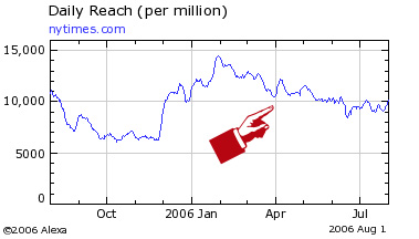
Here’s an example of a well executed major redesign of a high profile website, the New York Times. NYT always had a well designed website, and the new one is pretty nice too. But is there a lot of new traffic? Here’s an Alexa graph.

At the worst redesigns bring:

1) Broken links (sometimes every single url changes and all links from outside break)
2) Heavier graphics, proliferation of Macromedia Flash
3) Slower loading pages
4) Loss of features and content
5) New bugs
6) New software and licensing costs, more expensive servers

Often this is all that they bring. Broken links hurt the search engine positioning. New software costs money. It takes a long while to work out the bugs.

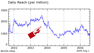
Here’s an Alexa graph of another major redesign on a website, which name I’d like to omit. Just as the traffic recovered after a big redesign in 2000, a new one hit in 2003. It seems to be recovering again.

The thing is, many businesses are very robust and the disastrous effects of web redesigns do not kill them. Pointy-haired bosses make their buddies rich, while getting kudos for the redesigns. Everyone stays busy, and software companies get to sell a lot of server software.

The Microsoft Movie Conspiracy

Robert Scoble is the most powerful Microsoft blogger. One word from him and hordes of bloggers start typing gibberish, hoping to make it into the A-list. Must there be anything he can’t do? Yep. Apparently there is a building at the Microsoft campus where his badge does not work.

That top secret facility produces the best Microsofts products I’ve ever seen. They make (amongst other things) short movies shown to attendees at shows like PDC and CES. Sadly, once shown, those movies do not make it onto Microsoft’s website or into the bundles of MSDN subscription cds (I’ve checked). They get suppressed for some reason.

I believe there’s a conspiracy to hide the fact that Bill Gates and Steve Ballmer left the company a long time ago. I mean think about it, would you continue to work if you had that kind of money? My theory is that they were replaced by two top notch actors. The actors must get bored from time to time, so they are given a high quality production crew and a possibility to create short movies from time to time.

I can’t find the link now, but IMDB listed Steve Ballmer cast as a possible villain in Batman: Year One movie that never got filmed.

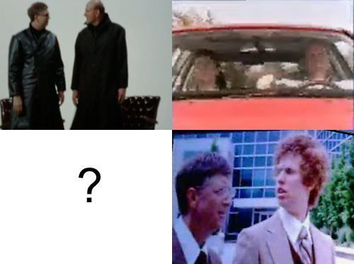
In any case, the convention shown movies sometimes leak out. Matrix spoof, the latest one, for instance is partially available at this website (if you scroll down there are screenshots from the full version). In it Linux agents are interrogating hacker known as Steve-O.

In previous years there was the Volkswagen commercial spoof, where Gates and Ballmer are cruising around the neighbourhood in a Jetta, pick up a discarded Sun server from the curb, but then, after a few blocks and a few whiffs of something stinky inside the server, they deposit it back on the side of the road. I saw that one at a PDC event, and it was preceded by a never aired IBM commercial in which Mike the Lawyer and friends are cramming a huge server in a small elevator.

There were also the Napoleon Dynamite spoof and the Austin Powers spoof which I can’t find anywhere for some reason. Are there any others that I’m missing?

By the way, impersonating Austin Powers seems to be a favorite pastime of gazillionairs.

See No Evil

I don’t care what Sergey says; I think that google.cn is evil. Writing about this in a blog that runs Adsense advertising would be more hypocritical than I usually am, so I removed all Adsense advertising and replaced it with my own ad.

There. Look at me. I am claiming a slightly higher moral ground.

I guess I’ll continue using google.com and gmail.com since I am nothing but a drain on their resources anyway. I can’t recall when I clicked on an ad there last time when and it wasn’t a “pity click.” My guess is that they are making their bajillions of dollars from clickbots .

What Up

The following will probably be only interesting to people who build their own computers (and probably not even them), so feel free to skip this post.

My little Shuttle XPC computer gave up the ghost (the onboard SATA raid controller got really messed up). It took me a good while to frankenstein together a reasonable machine out of all the parts that were stashed away in my apartment, so I am a-computin’ again. I am researching a purchase of a high powered replacement, but meanwhile, let me share some technical tidbits that I’ve learned along the way.

First of all, it’s really easy to actually fry a floppy drive. Fried floppy drives look like they are working, but they don’t. And without a floppy drive you can’t install (or repair) Windows 2000 or XP on a SATA or IDE raid array. Even if your motherboard claims that it can boot from a USB floppy drive, it probably can’t. Well, at least mine can’t. The moral of the story is that doing away with legacy hardware such as a floppy is not a good idea.

Anyhoo, it’s a good idea to have separate two drive arrays: one for data and one for the system and programs (it’s a good practice to point data directories such as the desktop to the data array). The data array should run raid 1 (mirroring) – that way if one drive dies, you will still have another. You can periodically backup onto a third drive and hold it in a remote location. With 250 gig SATA drives costing about 100 bucks there is no reason not to do this.

The system drive should run raid 0 (striping). Striping actually significantly speeds the system up. You can also keep the system drive small, say about 40 gig – and back it up onto the data drive via Norton Ghost. It might be a good idea to splurge on real SCSI drives and a card. In fact, that’s what I’ll probably do for my new computer, as drives seem to be more of a speed bottleneck than RAM or processors.

SATA drives can be mounted externally: it’s called eSATA. If you have a small computer such as an XPC it’s a very good idea, as the drives become much easier to cool. I am probably going to jerry rig an eSATA enclosure out of an old computer case and some hotswap thingies, but they are also available from these guys.

I am a big fan of dual monitors – have two 17″ lcds. To run a dual monitor setup you need either two video cards or a “dualhead” video card. Well, I have a dualhead Matrox P750 (bought it because it has 2 dvi outputs), and boy does it suck. Driver installation is a nightmare – there are several versions of video card bios and and a multitude of driver versions. Most don’t work and crash Window. If you do get it to work, the stupid card can’t work well with low color/resolution settings: it shows lines and crazy patterns in bios screens. There’s a bios fix out, but it does not work. More than that, if you want to color match the monitors through a calibration cajigger, you can’t set up individual color profiles on the monitors. In short, I am much better off with two separate cards.

Ad:


Did you know that you can color calibrate your monitor with a nifty usb powered gadget so that your digital photos will stop looking like crap? I’ve used one for a while, and it rocks!

GRETAGMACBETH Eye-One Display 2 (This is the one that I have. People say that it’s a little bit better than the cheaper
ColorVision Spyder 2)

ColorVision Spyder 2