Four Stations of New York City

Some people like saying “the Internets”. I like saying “the Subways” (as in Ms. Subways). The subway system in New York City is really a patchwork of different systems, all built by different companies during different times with different philosophies. Because of that subway kiosks and stationhouses are so different in style.

Usually the kiosk is built to blend in with the surroundings. For instance one in front of the Citicorp building echoes its slanted shape.

The one in front of the over the top Art Deco RCA building is also thoroughly Deco.

On the other hand right in front of the dignified Victorian station kiosk with its cast iron ornamentation you will find a supermodernistic “Sculpture for Living“.

Avenue H stationhouse (aka Fiske Terrace Station) of the Brighton line is an altogether different animal, not found anywhere else in the system. It’s an old shingled railroad stationhouse, hailing back from the day when Midwood was really just that – woods in the middle of Brooklyn.

[update] By the way, just in case I ever find a way to travel back in time, I have a ticket for that railroad ready:

Maybe when I finish One Hundred Views of the Empire State Building I’ll pay homage to Hiroshige. We’ll see.

Midnight Linkage

* Oh, such an awesome shot from inside the motorman’s cab. Click on “comments” to read about how it was taken.

* Wow. Decopix.com, one of the best sites about Art Deco that I’ve ever seen, presents mind-boggling Art Deco fridge.

* Similar to the celebrity path pavers in Brooklyn Botanical Gardenthat carry the names of famous Brooklynites like Isaac Asimov and Mae West, you can have your own paver in Tompkins Square Park through Make Your Mark in the Park program. And it’s just 250 bucks per paver! 70 characters – enough for a url. I am actually thinking about this…

NYC Buildings You’ve Never Noticed : The Graybar Building

Graybar building is one of the bigger, yet lesser known New York City skyscrapers. Located at 420 Lexington Avenue, it leans against and over Grand Central Terminal. In fact, I walked by it many times thinking that it was a part of Grand Central.

The understated Art Deco design helps to hide the huge bulk of the building. Some of the sparse embellishments are striking and very unusual.

The cables that hold the rain canopy in place are in the shape of ship’s mooring ropes, complete with rats and anti-rat devices. I did not notice this at first, but the rosettes from which the ropes emanate are decorated with rat heads. Freaky, huh?

Bas relieves to the side of the entrances are rather conventional allegorical representations of communication – a dude holding an old-timey (but maybe slightly out of date in In 1927) phone with lightning bolts around his head and stuff and transportation – similar looking dude holding a truck. The other two relieves are of Deco-Assyrian looking Prometheus with fire.

There’s an antenna at the top of the building. I could not find any information about it.

And Lipstick Too

I have a small collection of cheap box cameras that my grandfather bough for my in his garage sale adventures. I decided to look into filling the rest of space in one of my bookshelves with specimens from eBay. One thing that I often do is sort the auctions descending by price. That way I often find most curious stuff. On the top of the search for “Kodak Brownie” were two amazingly beautiful cameras with striking art deco design:

“The Kodak Beau Brownie came in two models, the 2 and 2A and were made from1930 to 1933. They were styled by the leading American designer Walter Dorwin Teague, who created a modernistic geometric pattern in two tones on the front panel, which was enameled in a color matching the leatherette covering of the rest of the camera.
The Beau Brownies came in five colors including, old rose, blue, black/purple, brown/tan and green. “

And this wasn’t a fluke either. Kodak also made “Coquette”, which featured a lightning bolt art deco design and came with a matching lipstick holder.

Take a plain box, give it a new design and add some color. Everything old is new again, right?

I think Apple should try to add a matching lipstick holder.

Perky Stuff

I’ve made coffee in almost every which way, except percolated. I also never owned a percolator. Alt.coffee news group FAQ which I always regarded as the highest authority in all things caffeinated, seriously disses the French-invented percolator. On the other hand, people who actually drank percolated coffee usually have good things to say about it. Because of that I think I’ll hunt for a nice percolator specimen on eBay. A glorious Art Deco instrument in chrome and Bakelite. Even if I won’t like it’s coffee making characteristics, it will remain in my collection as a sculpture.


(This particular auction seems to be reflectoporn free.

The Building

Believe it or not, I finally visited my favorite building. My earlier detailed article about the building is here. And here are some photographic notes (a lot of the pictures did not come out well because it was already dark):

From the ground you do not get the same airy, soaring feeling because the massive base hides the true proportions of the tower. But there are redeeming features up close, like this dramatic and unusual triple flagpole:

Once you get closer, other beautiful details come into view, like this stunning art deco lamp:

The lobby is Deco elegance itself:

Later we had dinner at a restaurant in the South Street Seaport. The food was so-so, but the view was amazing:

More Useless Rockefeller Center Trivia

Rockefeller Center buildings are not overembellished with decorations. A few major buildings have beautiful art deco relief’s on their facades, but most lesser buildings don’t have those. On the other hand an underground tunnel that connects the buildings has this beautiful mural on the wall.

I’ve been passing it by for many years without thinking too much about it. I called it “A Half Naked Punk Whipping Two Naked Women”.


I came by a photograph showing this bas relief on a side of a building. But it’s in the underground tunnel, I thought. Well, as I learned from the book (and could have learned from the little plaque on the wall), the bas relief is actually called “Radio and Television Encompassing The Earth” and a similar plaque used to be on the 49th street facade of the demolished RKO Roxy Theater aka Center Theater. The piece if based on a watercolor of Hildreth Meiere. I wonder what happened to the original plaque..

Here’s what the Roxy Theater used to look like inside:

The Dark Tower III

One of my ongoing photographic projects is the creation on a full Tarot deck. So far “The Tower” has the most candidate photos.

This is a smokestack of the Brooklyn College Heating Plant. It’s a very beautiful art deco structure. I’ll take more pictures later.

A security guard hassled me when I took pictures of the Plaza Building. I need some good impressive looking paper to ward off clueless security guards. Or a copy of rules and regulations.

Shaker and Baker or Gaudi, not Gaudy

When I was in my teens, I wanted to become an architect. I read books about architecture, and one of my favorite pastimes was trying to tell the architectural style of any buildings I saw. I did that in my native city of Odessa, Ukraine and on the trips to Moscow, Leningrad and Kiev. For a while I really favored the Gothic style. I really liked the soaring feeling of gothic churches. But then I’ve seen a rather plain building with rounded, yet also soaring shapes. The only decoration on the building were relief plaques. The building was rather old, yet depicted on the plaques were an airplane, a light bulb, a telegraph key and I think a radio. My dad explained to me about Art Deco style.

Here, in America, I learned about different art movements of the beginning of the century. It gets pretty complicated. There is Art Deco, Art Modern, Art Nouveau, Arts and Crafts and Shaker style. Why I like these styles? Well, it’s because I think that they have just the right proportion of beauty and utility. This is a sort of a mental cheat sheet that I have (embellished with links, of course):

Shaker Style: Shakers are a now mostly extinct religious sect. In fact they are a splinter of the Quaker movement, and were called shaking Quakers because their praying during which they shook. I can’t distinguish Shaker Style from Arts and Crafts, and indeed they are very similar. Genuine Shaker items are very expensive, but these days many manufacturers make shaker style furniture and kitchen cabinets. Although great designers and craftsmen, there are very few Shakers remaining. I bet it’s all because they are supposed to be celibate.

Arts and Crafts: Started in Great Britain. A bunch of designers and architects were pissed off by the poor quality and gaudiness of early mass produced things. Their motto was something to the tune of “turn artists into craftsmen and craftsmen into artists”. Simple bordering on austere designs, natural materials, muted colors, handmade look. The radically new idea was to take away most of decoration, but at the same time turn structural elements into decorations. Instead of hiding beams, supports, joins and other elements of construction, the designers would instead show them off. The solidity, strength are considered virtues. The proportions are usually more down to earth, not meant to dwarf a person. Think Frank Lloyd Wright and Newcomb College Pottery. Basically heavy duty, expensive hand made crap for rich people with good taste.

Art Nouveau: Started in France. The name is derived from the name of some gallery or exhibition or something like that. The idea was to create a whole new style for the new century. Just to be different. The designs are organic (meaning that things looked as if they were grown, not built), proportions – elongated. Not a single sharp edge to be seen. Think Aubrey Beardsley, Tiffany (who names their son Louis Comfort?), Gaudi and what he did in Barcelona. I would also call H.R. Ggiger’s stuff modern Art Nouveau, although I don’t know if that’s correct. In general a style for eccentric rich people.

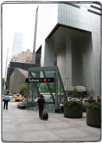
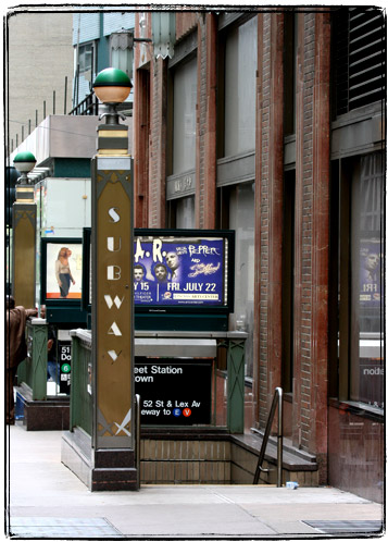
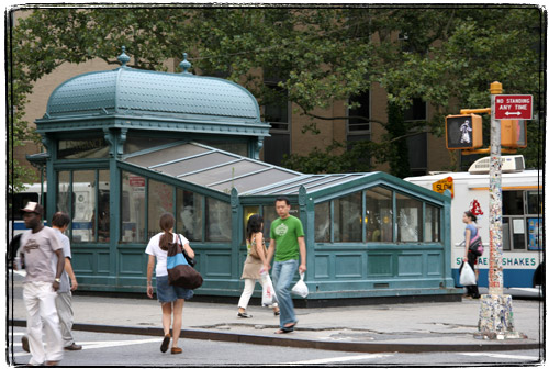
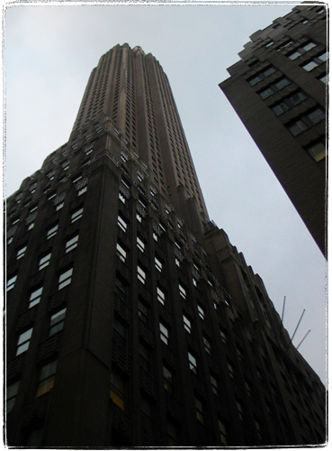
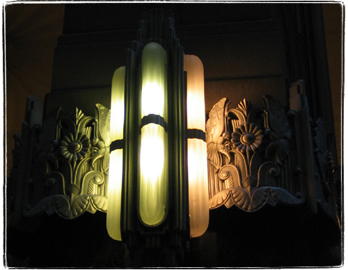
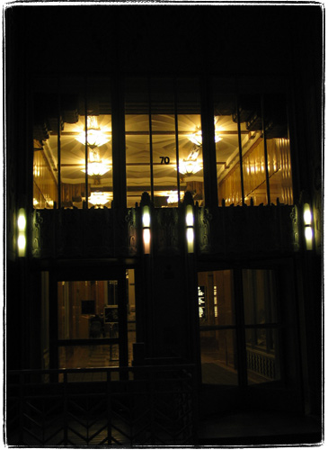
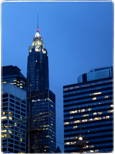
Art Deco: Very similar to Arts and Crafts and Art Nouveau. The major difference is that instead of making things look hand made, the fact that things are made by machines now is celebrated. Elements of the design are very industrial, proportions – soaring. There is a wide variety in colors used – sometimes they are muted, even dark, sometimes – absolutely outrageous. Shining stainless steel is not out of place, and neither is polished black lacquer. Think Chrysler Building, Empire State Building and other New York skyscrapers, early Polaroid cameras, bakelite rotary phones (in fact anything made out of bakelite), cathedral radios, turn of the century cars.

The thing is, Art Deco is easily corrupted. There is a style that is sometimes derogatively referred to as “Bronx Modern” or “Flatbush Renaissance”. Gaudy, ugly stuff. Like much of Italian furniture sold in Brooklyn. Or like Joey Tribbiani’s apartment in “Friends”. Such perverted Art Deco is rather common. Do not confuse it with true, beautiful Art Deco.

New And Improved Deadprogrammer.

Now with 20% more rantolioum!

No, I am not on vacation. And no, I am not reading the Harry Potter book. And of course I haven’t run out of ideas. I was just a bit busy. In fact, I am still busy. But I will steal time from sleep, reading and Tivo to bring you more good stuff.

Coming soon to a browser near you:

  • Deadprogrammer’s favorite skyscraper (this is going to be a good one)
  • Really awesome artifacts of Art Deco era
  • Pen computing, mind mapping, memex and friends (continuation of the rant)
  • NYC subway mosaics
  • Rants about Tablet PC
  • Some more artsy fartsy pictures, why not
  • Sci-fi book that I want to plug
  • Livejournals you should read