The World Is Your Spitoon

BoingBoing writers don’t seem to be able to shut up about betel lately. This reminded me of a 4th or 5th grade report on India (great friend of the Soviet Union, emerging economy, blah, blah) that I had to do in school back in the Soviet times.

I remember the teacher get very interested about betel chewing and prematurely praise it as a great habit. Then I reminded her that importing such a thing would mean having to deal with bright red spit all over. It’s not like the Soviet Union did not have its own share of hygienically questionable customs.

Back then Soviet sci-fi writers promised us Communism with goods being teleported right into our crystal palaces for free from anywhere on the globe. I guess that (and my flying car) did not work out, but today Capitalism brings us the ability to order almost anything from almost anywhere through electronic computers.

So, if I want to try some betel all I need to do is pick between The Basement Shaman and Shaman Palace or many other fine merchants.

Who knew that there are so many stores catering to shamans. At leats now I know where the Suburban Shaman.

Hmm, I guess I could get one of these and try to rid my cubicle of the sick building syndrome.

Creative Time Wasting 404

Dear readers, let me vent some useless thoughts about HTML and share the fruit of my procrastination with you today.

It occurs to me that HTML code has finally become a third rate citizen of the World Wide Web. Back in the day, there were horrible WYSIWYG editors that mangled poor HTML, raped it by adding their own non-HTML tags and in general produced bloated and unreadable mess. They still exist today. But now most sites are script generated, so rarely do you see clean, beautiful and handcrafted HTML code when you view the source.

One of the worst offenders is Microsoft, of course. It gave FrontPage, an unholy product of a dying company called Vermeer Technologies (I’ve read in this book that the price of FrontPage was huge and number of copies sold – miniscule) an eternal life as a part of the Office Suite. Other Office programs always produced horrendous HTML. And now, they don’t even want developers to touch HTML directly. They added extra layers – Server Controls (again, plans for VTI extension and FrontPage come to mind) and Web Forms to isolate them from the language that can be learned in 20 minutes and mastered in a few years.

I can’t say that positive things did not happen. For one, fewer people write in old skool all-caps HTML tags. All lowercase tags are so much more readable.

Also now it’s probably safer to put little Easter eggs and funny notes in HTML comments. Are there more of those around? I don’t know. But the oldies but goodies are still out there.

Famous hacker JWZ’s enigmatic page contains this haughty comment:
<!– mail me if you find the secret –>
<!– (no, you can’t have a hint) –>

Smarter people than me tried, but failed to find meaning in in the 404 lines of what seems to be a hex dump. Former Livejournal user mcgroarty, for instance, wasted a good chunk of his time on this. Where is his blog now, by the way? Does anyone know?

What I noticed though is that the page is not static as mcgroarty probably assumed. It changes with time. More than that, it seems like it is not the same data – it probably cycles through different files. You can clearly see that if you look at http://www.jwz.org through the wayback machine. Meanwhile you can see the old design featuring the Jamie’s cool terminal graphics likeness. You can see the old design get resized, then get replaced with the 404 line nightmare. Then “mail me if you find the secret” gets added. Enough people send emails and JWZ, always eager to save some time, adds “(no, you can’t have a hint)”.

Are these 404 a cruel joke – meaning not found?

I suspected that the 404 lines show chunks of the old green image that I mentioned, or are generated from web collage. When I looked at the famous animated compass gif (the one that replaced the Netscape diddler when you typed in about:jwz or went to JWZ’s old homepage in Netscape 1.1 and some other early Netscape version I think) I found another hidden message from JWZ:

“You have a lot of free time on your hands, don’t you?
Tell jwz@jwz.org that you found the secret message!

http://www.jwz.org/
about:jwz

“Some people will tell you that slow is good — and it may be, on
some days — but I’m here toò tell you that fast is better. Being
shot out of a cannon will always be better than being squeezed out
of a tube. That is why God made fast motorcycles, Bubba.”
— Hunter S. Thompson

Oh, Jamie, I have very little free time. But whatever free time I have I usually end up wasting on stupid things.

This does not seem to be the solution to the 404 line homepage puzzle, but the heck with it.

Russian-speaking readers can entertain themselves with reading comments over at tema.ru. There are a couple of hints of hidden links, a few sprinkles of profanity, showing off about Photoshop mastery. Outstanding advice to journalists that was there in the earlier version is gone. I also remember seeing a completely blacked out page about his photo equipment there (you needed to do control-a trick to see it) in a very old version of the site. http://www.design.ru has its share of rowdy commentage.

Commentatore

I really hate email these days. Gmail might have solved (at least for me) the storage problem and mostly solved the spam problem (the filter is very efficient), but there is soooo much crappieness in email.

Email servers and clients are just out of whack lately. Even Gmail checks zip files for executables somehow (neat trick) and refuses to add them. It works ok if you change the extension to .zip.foo or something like that. But this at least is a decent way of dealing with the problem of people sending virus laden executables – warn that you are not sending it and let through people who are smart enough to rename the extension.

On the other hand I’ve encountered every type of nastiness – from silently dropping emails to stripping the attachments (again, silently) to bouncing the email back with absolutely unintelligible error messages.

Filter stupidity similar to what excellent Joe Grossberg is describing here is also rampant.

Oh, and trying to send out an email in Russian. Fugedaboudit! The extra bits in Unicode or KOI-8 get chewed off every which way rendering my laboriously typed and spelling error infested emails unreadable half the time. If there is a way to reliably send Russian encoded emails without using attachments – I was not able to find it yet.

Worst of all, you sit there waiting for a replies wondering – are people just ingnoring me? Did the message get silently dropped, swallawed or chewed up on the way? Did it get lost amongst spam about Ciagra and Vialis? (As a side note, my co-workers were joking this morning about how I should write on my cubicle dweller’s box that contains vitamins, painkillers, antiacid and caffeine pills “V1A8RA” in marker). Did the person mean to answer me but forgot lately? Did something happen to him or her?

But you know what I hate even more than email? Public comments in blogs. Letting my own often illiterate and/or stupid comments spill out onto the Information Superhighway and having them fester and petrify there for future generations is not a good idea. From now on my policy is not leaving any comments whatsoever. I’ll use exclusively email from now on. If you want to leave me a public comment in Livejournal – go ahead, but I’ll probably answer via email. I do try to answer most comments.

Also a part of this policy is not reading or writing any private posts in Livejournal. Nothing good ever comes out of them.

In other news, I am thinking about leaving a little note at the bottom explaining obscure puns in my topics. For instance this one is based on the Sopranos Episode 204 title – “Commendatori” (Knights). Babelfish tells me that “commentatore” means “commentator”.

Phi, Spongebob?! Phi !?!

Probably the easiest way to dramatically improve your snapshots is to learn about the rule of thirds. You know, divide what you see in the viewfinder by two lines into thirds horizontally and vertically and try to get more interesting parts to roughly be either where the lines cross or on the lines themselves. If your picture did not come out like that, you can usually fix it later with a crop.

Rule of thirds is actually a rough approximation of the golden ratio which is very well explained at Wolfram’s website. The pictures will look even better if you will use lines that are conforming to the golden section.

Just a crack of a difference: fat lines are thirds, thin lines – golden mean (I did not use the plugin when I cropped the photo).

I was playing around today with a plugin that renders golden rectangles, spirals and triangles. I checked some of my old photos – many seem to follow golden mean rather than the rule of thirds.

I was also thinking about writing my own Photoshop plugin like that (that one does not look like it’s worth 32 bucks to me), but Adobe has draconian new rules about who gets the SDK. So instead I decided to write this post.

I ordered a book about golden mean and related stuff from Amazon. Helpful Amazonian electrobrain is suggesting the movie Pi. The dang thing is pretty smart.

Meanwhile I got kind of curious as to how appealing the golden rectangle actually is. Let’s see.

Things that are strangely appealing. Spongebob Squarepants. Yep, the golden section cuts straight across his weird little belt. It’s also interesting to note that he is almost always drawn kind of sideways – in front projection the proportion would be off.

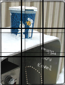
The Greek cup (about which I wrote at length before and mentioned in probably the only poem which I ever wrote. Yep, it roughly conforms to the proportion and “to serve you” is right at the division.

Now, let’s see. Ugly things. That picture of one of the ugliest buildings in Brooklyn. It’s waaaaay off. And so is the SUV in front of it. The older house on the left is good though.

Cars are tricky though. The most beautiful car that I know is Tucker Torpedo. It does not fit a golden rectangle either. But it roughly fits two. I tried to fit two rectangles onto the SUV in the picture and to the Scion xB, which is jarringly boxy. No go. Let’s see, but Chrysler PT Cruiser, a car which I actually like, fits two rectangles also.

This is all terribly crude and unscientific, but might hopefully be useful to you.

Happy New Year!

I created some postcards to send out via email, but my contact list is messy, some of the emails are old. I am hungry and thirsty (there’s a bottle of Veuve Clicquot and some Vietnamese food waiting for me), so if you did not get a postcard, here they are:


I have to admit that the I copied the idea from a postcard that was sent to me by Reneka – the maker of my coffee machine. I’ve made this latte art pattern with their machine – no Photoshop, so I am hoping they are not going to hold this plagiarism against me. The postcard they sent features a cup with “05” in it – I added a pine tree looking rosette.

That Tactical Sensation

Today I am going to explore the geek/NYPD cop connection. Let’s see:

Geeks have Dockers Mobile Pant. I am not sure why Dockers marketing people all of a sudden decided to use the singular form of the word, but I guess they wanted to play on the connotation of “panting”. “Mobile Pant(s)” are dorky and ugly khaki pants that somewhat lessen the bulges from cellphones and pdas. I used to own a pair, and can’t say that I liked it much.

NYPD has “Patrol Tactical Pants”. Most New York newspapers ran gushing stories about NYPD being oh so very fashionable with the introduction of these pants. You can still find regurgitated bits of those stories over at Gothamist blog.

Moving on. Geeks have their Darth Vader lightsaber replicas. You can purchase a a cool plasma one with crazy effects or in a true Jedi manner build one out of a Heiland photo flashgun, just like the real thing.

Traffic cops started to appear with red led lit batons – mmmm, dark side color :

You can purchase your own pair of “Patrol Tactical Pants” over at Galls. They also have duty jackets (these are perfect for fishing), buckle less belts (these just look neat) and gloves.

Police gloves are cheaper, look and fit better than most good quality civilian gloves. I always hated wearing gloves because taking them off when I need to pay for something, use a camera or a phone. Some police gloves are made so that you can pick up a small coin in them easily. Just look at these: “enhanced tactical sensation”, cut resistance and “Water-resistant kangaroo leather palms”? Can you say the perfect winter fishing glove?

They also have more esoteric equipment:

Cold Water Immersion Suit – for NYC sewer diving

Rhino® 14″ Wheel Immobilizer – for that dumbass whose car alarm wasn’t letting you sleep all night

Holding Cell and Holding Cell Bench (perps sold separately) : as a gift for everybody’s favorite night club owner