
You think your job sucks? That’s nothing.
Author: deadprogrammer
-
The Bastard Coworker From Hell
writing in fabulous : “I got a nice little lecture from the manager about how I can’t have “boyfriends pressing the buttons on my register”. “ -
Nautical Nonsense
This ad for a new jellyfish exhibit at Brooklyn Aquarium was on the side of a bus (and the bus was moving when I took the picture). I guess the blurb applies not only to jellyfish, but also to the graphic designer who masterfully placed the Pepsi logo in that corner.

-
I Like Small Keyboards and I Can Not Lie You Other Brothers Can’t Deny
The perfect keyboard. A geek’s holy grail. And I am not immune to the siren’s call of this insane quest.
If you think that there isn’t much innovation in the field of alphanumeric input devices, you are in for a surprise. If you don’t think so, then you’ll be less surprised.
There are four main schools of keyboarding thought:
1) Typewriter keyboards suck , if you are really hardcore, you should use chord keysets. A chord keyset is basically a keyboard that uses combinations of buttons (like chords on a piano) to encode letters and numbers. Since fingers don’t have to travel horizontally and vertically, tremendous typing speed can be achieved. Chorded keyset is somewhat similar, but not the same as a stenotype machine used by court stenographers. According to The Straight Dope stenotype training takes 2,700 class hours (some of the classes probably have to do with understanding law terminology and the like) and you have to type 225 words per minute at 95% – 98% accuracy to pass the state exam.
Douglas Engelbart had really high hopes for his version of the keyset. Much of his research as well as The Mother Of All Demos included a setup that had a keyboard, a mouse and one handed keyset.

A historic moment: Engelbart uses his chord keyset to delete the first Spam.
Closeup of a keyset, or Small Black Hit’em Bugger Teeth as it’s known in Pigin EnglishThe problem with chorded keyboards is the super steep learning curve and what’s even worse, the skill of typing in chords seems to quickly deteriorate without practice.
2) Then there are those who think that the root of evil is the QUERTY layout. I am yet to see a person who regularly uses Dvorak keyboard, and the whole superiority of it seems to be just a myth.
3) In the olden times there was the horror of The Space Cadet Keyboard. There were a few other devices that LISP programming aliens seemed to use. Truly bizarre geekery.
4) On the other end of the spectrum of weird keyboards are ultra expensive contraptions. Even though outrageous prices are binding this group together, the usefulness, good looks and coolness factors are all over the board for these. You have to be one rich (or fiscally irresponsible) geek to afford them. There are keyboards that are split in two, like this Kinesis keyboard that mounts on armrests.
has one and likes it.

Then there is a truly scary keyboard from the same maker that has bowl shaped indentations for keys:

This $350 keyboard has vertical set keys. I think I saw somebody’s review of it which stated that using it hurts. A lot. And I think I believe that person.

Fingerworks this $339 keyboard that has gesture recognition. Apparently
uses one right now. The learning curve seems to a bit steep according to his post.

I think that all of these far out solutions are a bit too much. Split keyboards are kind of nice though. That Kinesis keyboard is 133T, but I did fine with Natural Keyboard Elite.
I also had Microsoft Natural Keyboard Pro which was discontinued (I think) is just like Elite, but with a row of buttons on top. Out of those buttons the volume control was very useful. In fact, the perfect keyboard in my opinion should have a set of buttons for volume control. I might get a Griffen Powermate for that purpose though. But at $45 it’s pricey. But cool. The rest of the soft buttons were mostly useless.
I wish I could map a button to a key combination that switches between keyboard layouts (Cyrillic and English), but that wasn’t possible with out of the box functionality. Some of the soft buttons are outright dangerous, like the crappy “sleep” button. If pressed by accident it would plunge all of your unsaved data into the buggy realm of Windows power management, the cursed ACPI.
Before then I experimented with a “clicky” keyboard. I purchased an IBM model 42H1292 aka The One True Keyboard. These Irish built mastodons capable of various feats of endurance have special spring loaded keys instead of wussy rubber membrane ones. Manly. Very manly. A click of The One True Keyboard can be heard for miles in an empty cubicle farm. But also a pain in the ass. Turned out I don’t like the clicky sound, the keys were getting stuck sometimes (even though I bought an unused, keyboard gravy free one).
Right now I am thinking of switching to a mini keyboard, like the Happy Hacking Keyboard. Right now I am typing this on a mini keyboard that my friend Dan lent me. It’s called MiniTouch. I has those IBM style clicky keys and a layout that with a little remapping could really work for me. Does anybody know a good Windows keyboard rempapper? The layout feature that I use the most is a function key that turns arrow keys into page up/down/home/end. Oh, and one thing that I do with all keyboards is turn off (by ripping out) the caps lock key. That thing is pure evil.
-
What’s a Good Rhyme for RSS?
I wonder how many people are reading my livejournal through an RSS aggregator. Apparently paid livejournal users get a full text rss feed (and not just the headings). So here it is :

-
Another Post from cubicle filled corridors of the Newscorp Building.
We tender this premium coffee for your enjoyment as a tribute to your good taste. It comes from the deadprogrammer’s collection to you 33.
Recently a commercial Bunn coffeemaker in our office kitchen was replaced with an automatic Keurig B2003 machine that uses K-cups. K-cups are a neat technology, but not suitable to good coffee preparation. Cffee from k-cups tastes like coffee prepared in athletic cups (because it gets very stale). On the other hand, conventional Bunn machine was actually very good, but we had the most foul prepackaged coffee. To this day I have one package of that coffee hanging on the wall of one cubicle. Check it out:

I new there was something weird in that coffee. “Milds”! What the hell are “milds”? Judging by taste it is probably tobacco. Or dried dog crap. But then, what else what did I expect from a company called “Mother-Parkers”? Hey, these motherparkers even have a website.
There is an OU symbol on the package. Milds must be kosher.
-
Up There In the Stratosphere
Today, when we think about science fiction, we think of rocket ships and outer space. But things were different in the 40s and 50s. Back then the blue sky was almost as exciting a frontier as the black void of space. Hugo Gernsback’s magazine Air-Wonder Stories and TV serial Zombies of the Stratosphere featuring young Leonard Nimoy were all the rage.

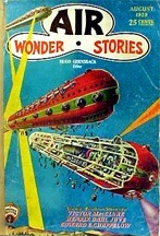
The word “stratosphere” was considered and became a futuristic branding element a bit less common than “o-matic” and “o-rama”. It seems to me that Boeing started this trend : B-52 Stratofortress bomber , KC-135 Stratotanker and 377 Stratocruiser. But then the marketers caught on to the hipness of everything “strato”: Sheaffer Stratowriter pen, Fender Stratocaster guitar, Pontiac StratoChief car and probably many other things that I don’t know about. Prefix “strato” was usually applied to top of the line products.
And you don’t really get any more “strato” than Zenith Stratosphere 1000Z console.
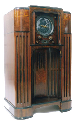
Considered by some to be the best vacuum tube radio ever produced, it is also one of the rarest. It was top of the line and cost $750 when it was made in 1930s. Times were tough, and there were not enough customers to purchase these amazing and beautiful radios. Only 350 sets were ever made, 40 are known to survive. Today 1000Z is a wet dream of any vacuum tube radio enthusiast.
What attracts me to 1000Z? Well, first of all I am a fan of vaccuum tube sound. The absolutely stunning art deco design is just gorgeous, especially the airplane style tuning dial. It looks like it belongs on a starship. This is how I imagine Henry Kuttner’s “twonky” device.
There is an interesting thing about the ads for 1000Z. As it can be seen in this ad, there is a art deco porcelain cat sitting inside the concave area of the cabinet of the radio. This led some collectors to believe that the cat was sold together with the radio. But apparently it was only used for the photo shoot. Still, people lucky enough to own a Zenith Stratosphere try to buy a cat statue to go with it.
-
WML : How to Good-Bye Obesity: Heart Rate Training. Malarkey? or Effective Way?
I am a hardened veteran of the battle of the bulge. There are a lot of factors working against me — genetic predisposition, laziness, sedentary lifestyle. Yet still, from time to time I wage a war on fat, and often enough come out victorious. I despise people who say that you should like your body the way it is. Body image hate is A-Ok in my book.
Generally I spent most of my life in various states of obesity. But three times I managed to bring my weight down to normal. The first time was when my parents signed me up for summer gym classes. Calisthenics and running 5 times a week for a whole summer really slimmed me down. Unfortunately the very charismatic coach we had ended up getting drafted into the Soviet army, and without motivation I stopped exercising and started gaining weight again. Then my dad got me into a tennis class. I got in only because he was a chief engineer in charge of building the stadium which housed the tennis courts where we played. I sucked at playing tennis, but by the time I left the Soviet Union my weight was back to normal.
American food, stress and more stress took it’s toll during my high school years. Still, one summer I took a gym class during summer school and took to running 10-12 laps around the stadium every day. My weight was back to normal again. But then I’ve got a job at Nathan’s Famous and gained a lot of weight eating free hot dogs and fries.
I never had any luck with diets up until now. Surprisingly enough Atkins diet really works. But of course it’s not enough. In fact, I lost 30 pounds and stalled. But then
suggested that I try heart rate training. There’s this company called Polar. They make very accurate pulse rate monitors. These monitors consist of two parts: a transmitter strap that goes around your chest and a watch which picks up the wireless signal from the transmitter.


The device continuously monitors your pulse so that you can adjust your effort level to stay in the fat burning zone. Luckily treadmills in the gym that our corporate overlord and beloved billionaire tyrant built for us already have Polar receivers inside. And as it turned out the gym attendants have transmitters available on request. You just punch in the desired heart rate and the treadmill adjusts to you. It also accurately calculates calories burned. And the overhead monitors are tuned into various Fox channels. Simpsons while working out — what could be better?Running with heart rate monitor is just amazing. You don’t get too tired, but you know that you are exerting yourself just enough to burn fat. It’s very motivating. To keep myself further motivated I think I’ll buy myself an iPod when I loose another 10 lb.
If you were wondering, the subject line is a reference to the title of this book.
-
Mermaid Man And Blibbet Boy
I always liked the concept of branding. There is something very noble in putting your mark on something you created. If programmers were always required to put their name and contact information as a comment in every piece of code they wrote, maybe there would be less bad code. People usually are embarrassed to put their brand on something inferior. And if not, at least the end users would know whose abomination they are dealing with. There is a bank near where I live. It’s called Roslyn. That’s a weird name, right? Ok, I thought. Maybe that’s the name of the founder. The rose on the logo is because of “ros” in the name. Heart? That’s something the graphic designer put into it. But then, during the remodel of the building I noticed the original name plaque which was visible for a short period of time. And it turned out that the name of the bank probably occurred kind of like the “fishbulb” Mr. Sparkle from that Simpsons episode.
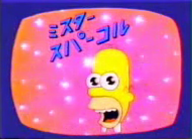
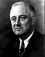
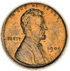
Announcer: [in English] Mr. Sparkle. A joint venture of Matsumura Fishworks [a smiling fish appears on the left half of the screen] and Tamaribuchi Heavy Manufacturing Concern [a light bulb appears on the right half of the screen. The two logos meld to form — Mr. Sparkle!] The bank near me used to be called Roosevelt Bank. And then it merged with Lincoln Bank.
+ 
= 
I might be wrong about this though. It’s just that I’ve also seen a Lincoln bank in Brooklyn that became Roslyn. I am also not sure which Roosevelt this was, Teddy or FDR. Anyway, moving on. I noticed for the fist time the special “nibbled” letter “O” in Microsoft’s logo when I was on Microsoft’s campus. At first I thought that it was just a “bug” – maybe the logo manufacturer missed a small piece :). In the cafeteria that was near the artificial waterfall I had a burger called “the blibbet burger”. I only learned what that was much, much later. Apparently the old MS logo featured a funky letter “O” which was called “the blibbet”. In 1982 the new, much more subtle logo was introduced. The programmers were already mightily pissed by marketing people which were starting to play a much more important role and this was the last drop — a huge “Save The Blibbet” campaign swept the campus. I dug this up at uspto.gov:
 I am still pissed off that I didn’t see Lake Bill (check out this awesome 3d view) and the Microsoft museum. And our handlers didn’t have any extra coupons for the Microsoft company store. Maybe next time. Now Starbucks. It took me a while to realize that the woman on the *$ logo is a mermaid. You see, I was used to a regular, single tailed variety. But apparently the one on the logo is a two tailed mermaid (or a siren) referred to as Melusine. I’ve read about it in some book about symbolism that I purchased at Barnes&Noble. Apparently the two tails have something to do with the Melusine’s ability to have sex with sailors, and being a sexual symbol. Think about it. I bet the whole thing with spread legs/tails on the logo is what caused the later redesign of the logo, on which you can only see the upper part of the Starbucks siren. The old logo is usually referred to as the “bellybutton logo” because you can see the siren’s bellybutton. Items with the old logo are pretty hard to come by.

In fact, the first logo wasn’t even green, it was brown. But I’ll write more about Starbucks later. More? You want more? Well, I wrote about the three versions of NASA logo, the Worm , the Vector and The Meatball here.

