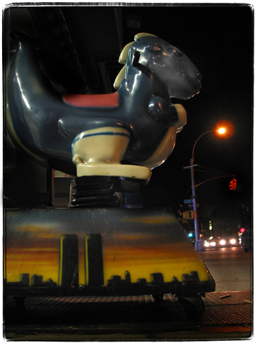
I don’t want the Freedom Tower. I want the Twins back. This is a somewhat controversial opinion – some feel that the Twins are gone forever, together with the lives of the people on the planes, in the towers and those who came to help them.
To use M. Diddy’s expression, in Corporate America controversy is not considered “a good thing”. Chock Full O’ Nuts, for instance, removed the towers from its logo.
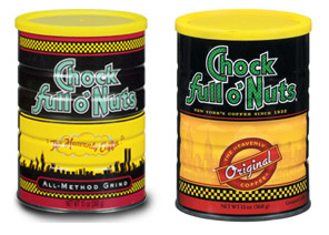
On the other hand, many other companies still use their old skyline logos that feature the Twin Towers. I have a much bigger collection of these logos, but it’s a little hard to find all of them.
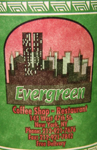
The person who designed Evergreen Diner’s cup either chose an unusual viewpoint or just drew random boxes to represent skyscrapers around WTC.
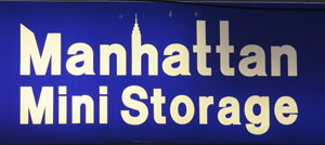
Manhattan Mini Storage even got the positions right – Citicorp then Empire State then the Twin Towers (if you look from the park towards Brooklyn).
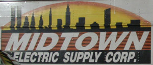
Midtown Electric‘s view is from Brooklyn.
The painter who worked on this kiddy ride did not strive for accuracy, but I guess for the 10 or so years that I’ve seen that particular kiddy ride around I bet nobody was confused about which particular skyline was depicted there. Can any of the Freedom Tower designs do that? Because every time I am looking at the rendering with the Freedom Tower proposals I am thinking – holy crap, that’s Philadelphia (and it looks like I am not alone in that particular opinion).
