The Legend of Kovalevsky’s Tower

I decided that I’ll take a break from a blogging break to tell a story that has two of my favorite things: symbolism and legends of my hometown. In particular, it’s the legend of the Kovalevsky’s Tower.

A fountain and a tower are two very commonly used symbols. A fountain is a symbol for life and creativity, one with a mostly positive meaning. A tower is a darker symbol, one about overreaching achievement, and fall. In Tarot a Tower card is an ill omen. Yet a tower is a very attractive symbol. I am immensely drawn to towers, just look at how frequently I write about them.

There aren’t any skyscrapers in my hometown. There are fountains though. Not just the regular water spritzing ones: there are three very important neighborhoods called The Big, Middle, and Little Fountain. You see, Odessa, although on the sea, is located very far from any rivers that can provide potable water. In the olden days much of the water was procured from three wells, the Big, Middle, and Little Fountains, which were located relatively far from the city center, near the sea. An alternative way to collect water from rooftops was available, but as there’s a lot of dust in the air, people referred to this less tasty water as “this is no fountain”, an expression that survived to this day referring to something sub par.

If you take a tram from the city center, you’ll pass through the many stations of the Little, Middle and Big Fountains which follow the sea shore and are mostly filled with dachas. My grandparents used to have a dacha at the 13th station of the Big Fountain, a little plot of land with a house and outhouse that my father and grandfather built themselves. When we left, it was sold for about $7000. I am told that the land that we used to own would be worth about $1,000,000 today.

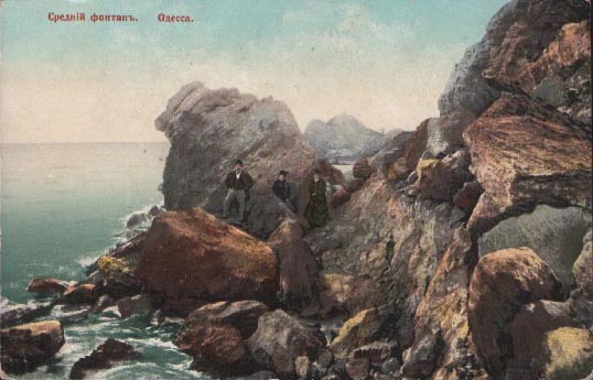
The last station is 16th. There you would switch to an ancient little tram with two “heads” (it was needed because there was only a single track, and one tram would service the whole line going back and forth). This tram, nicknamed push-pull would take you to yet another neighborhood called Kovalevsky’s Dacha. There were more dachas there, a large Russian Orthodox monastery, and natural, sand-less beaches with steep rocky cliffs (the rest of the shore used to be like that as well, but the cliffs where dynamited and sand washed on).

There is a legend connected to Kovalevsky and his dacha. This legend is a little bit like Rashomon, as there are many different ways it’s told.

In one version, a wealthy merchant, Timofey Kovalevsky decides to solve Odessa’s water problem by building the first water line. He finds a huge water well beyond Big Fountain and starts laying pipe into the city. At the source he builds a huge tower. He finishes the project, but he is financially ruined due to insufficient revenues. Either the water is of poor quality (not like Fountain water, because of the pipe sediment), or because people are afraid of technology and call his water “machine water”, or because around the same time another water line from Dniester river is completed. One way or another he is ruined, and commits suicide by jumping from the tower. In this version it is a story of pitfals of technology, its quick obsolescence and/or inferiority to older technology.

A famous version of the story comes from Kataev’s “Lonely White Sail”. In Kataev’s version Kovalevsky undertakes his water line project alone out of greed. A slew of bankers beg him to take them as partners, but he refuses, wanting a water monopoly. He builds the tower to get to the water, only to run out of money – the water is too deep, and the machinery and pipes are too expensive. He begs the bankers for money, but they refuse. Kovalevskiy keeps circling around the tower thinking about how to get money to complete the project, getting crazier and crazier, but one day gives up, climbs the tower and jumps off it. In Kataev’s version the legend is a cautionary tale of greed.

An even more disturbing version comes from Paustovsky’s “Slow Time”. Paustovsky tells the story differently. In it, Kovalesky is a very rich eccentric. He buys a plot of land far from the city and builds a dacha. Then he commissions a huge tower to be built, for no practical reason whatsoever. Several times he drinks tea at the top of the tower, and then commits suicide by jumping from the top. In another variant of this the purpose of the tower is mystifying the contractors, until the moment it’s complete: Kovalevsky has it built in order to jump from. This way it’s a story of depression, eccentricity, purposelessness, and suicide.

All stories mention that the tower was preserved until WWII, and did end up serving a purpose: it was a very good nautical navigational landmark. During WWII it was destroyed, similar to Tesla’s Wardenclyffe Tower on Long Island. Legend of Wardenclyffe Tower echoes many aspects of the legend of Kovalevsky’s Tower – the running out of funds, the mysterious purpose, etc.

This, of course is all very lame journalism and research. I am basically retelling the same story the way I heard it, the way I’ve read it on a number of websites, and in several books. I don’t have access to archives or any specialist literature that might shed any light on what really happened with Kovalevsky and his tower. I hope maybe commenters might eventually add some more information to this post.

I don’t know exactly where the tower used to be and where its remnants are right now. My understanding that it’s somewhere near the Big Fountain cape. The link provides the rough coordinates and a photo. Maybe it’s possible to find the location in Google Maps.

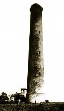
I was able to locate only a single photo that supposedly shows the tower on a website retelling one of the variants of the story. The tower is indeed humongous, and really does not look like a water tower. Maybe there’s a point to the the story about a pointless tower built for suicide.

[update] I recently found this old photo that provides a view from beyond the lighthouse:
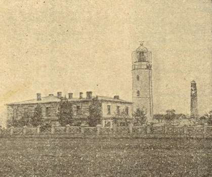
From all the accounts that I’ve encountered the tower was destroyed. But what is this then? I’ll be in Odessa this summer, and I’ll mount an expedition to check this out.
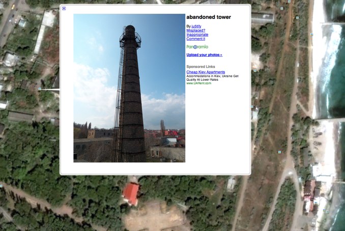
The tower is described as an over-sized chess tower, a tower that looks like a lighthouse, a good navigational aid seen from the sea, and a ominous, dark building.

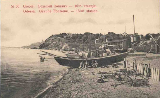
Here are some two old postcards (a photograph and its retouched version) of the Big Fountain cape. There is a lighthouse, and something that looks like a long slender tower. Could that be Kovalevsky’s tower?
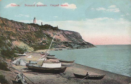
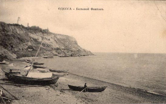
This is what the natural beaches looked like all over Odessa’s coast. I remember beaches near Kovalevskiy’s dacha looking like that when I was little.
Another view of the Big Fountain cape, with a “shalanda” fishing boat. There’s something tower-like in the distance, but it’s very hard to tell.
Zoomfly Test: Capitalist Monkey

I frequently want to post images that don’t make a lot of sense to post in smaller format. I’ve been meaning to build a custom zoomer similar to Zoomfly, but gave up and just installed an off-the shelf module.

Here’s a sample file – a scan from a Soviet “Youth Technology” magazine circa 1961. A bought a couple of these on eBay – and I got to tell you, they really took me back… While growing up I was constantly reading back issues of these magazines, and now, in these few random issues that I purchased I found a few illustrations that I remembered, like the one that is at the end of this post. It’s a very strange feeling – remembering a picture last seen 20 years ago.

Another very strange feeling is noticing the lack of ads and Photoshoppery – all illustrations are either photographs or drawings, and they look so much better than what you’ll find in most todays magazines.

The article that accompanied this full page illustration was titled “Bourgeois Ideologists on the Future of Mankind” and was about doom and gloom that proliferated amongst western philosophers. In the illustration robots are going Abu Gharib on their creator’s ass, Martians are running for cover from Pentagon’s missiles, labour bosses are exploiting monkeys, dour looking generals are growing artificial goose-stepping soldiers, hippies are going back to stone age, and Malthusians are working on biological warfare. The top hat wearing capitalist monkey in the background is just darling.

Meanwhile, on the next page simple Soviet people are partying in the light of aurora Borealis.

Amazon Ads in RSS Feeds

A while back I’ve added an advertising module to my site that allows me to inject amazon item ads both into the site content and into the rss feeds. I hand pick the items, which most of the time fall into one of the three categories: stuff that I would probably want myself, stuff that I already have, stuff that I mentioned in the post, and stuff that is just funny. Four categories.

This is not “punch the monkey”, not the same one ad that some bloggers stuff into their rss feeds and keep there forever until you are sick of it. From time to time the amazon items are really funny.

On the other hand, at my level of readers, the princely 6% commission that I get on Amazon purchases that come through the site, it’s not really a major financial incentive. The ads do cover my hosting expenses, but I do kinda feel guilty of thrusting the ads on my readers.

So, tell me, what do you think about the ads? Should I just junk them? I already replaced some of the ads on the site with links and ads for products that I simply like, without getting any payment, just as a way to say “thank you” to the people who make these products. I might do the same thing with the rest of the ads.

Along the Way: MTA Arts for Transit

Along the Way is a tour through New York’s underground museum of contemporary art, works commissioned by MTA Arts for Transit for the subway system and commuter rail lines. Vivid murals by Roy Lichtenstein and Romare Bearden convey the energy of Times Square, while Robert Wilson’s Coney Island Baby captures the festive spirit of the city’s playland. Currently underway are a photographic installation by Mike and Doug Starn at the new Fulton Street Transit Center and a large-scale ceramic wall drawing by Sol LeWitt at Columbus Circle.

Initiated in 1985, this collection of site-specific public art now encompasses more than 150 pieces in mosaic, terra-cotta, bronze, faceted glass, and mixed media. The program takes its cue from the original mandate that the subways be designed, constructed, and maintained with a view to the beauty of their appearance, as well as to their efficiency. Arts for Transit is committed to the preservation and restoration of the original ornament of the system and to commissioning new works that exemplify the principles of public art, relating directly to the places in which they are installed and the community around them.

Subway Art

Two gifted photographers have documented every aspect of this extraordinary urban subculture, complete with 239 full-color photographs.

Photoshop Disasters

Seetharaman Narayanan did more to alter reality than 99.99999999 percent of people in this world. It’s ridiculous how much the look of everything changed after Photoshop. All the ads, illustrations, all the graphics in the world look different than they did in the 70s and 80s.

If you wish, Adobe website will give you a number of useful lessons on how to use Adobe trademarks, such as:

“CORRECT: The image was enhanced using Adobe® Photoshop® software.
INCORRECT: The image was photoshopped.”

and

“CORRECT: The image was enhanced with Adobe® Photoshop® Elements software.
INCORRECT: The image was photoshopped.
INCORRECT: The image was Photoshopped.
INCORRECT: The image was Adobe® Photoshopped. ”

Meanwhile everything I see around me in printed form has been photoshopped to death. These days when a professional digital camera is cheaper than a copy of Adobe® Photoshop® software and the streets of major cities are full of starving young models, the photoshopers out there would rather spend hours doing unnatural things with expensive stock photos.

I could understand this if the companies who would be doing this were short on money. But you know, when the same crappy stock photo is used in an ad for Vagisil and an O’Reilly book cover? That’s ridiculous.

There’s this blog that I’ve been reading lately called “Office Snapshots”. Recently they showed pictures of the offices of Vertrue. The seem to have spent more on a single chair than on the design of their “about us” page. Take a look: the title of the graphic boldly states “WHO WE ARE”. Judging by the graphic the answer is: “We are some smiling office drones from a crummy stock photo.”

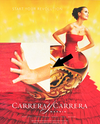
Another fun blog that I’ve been reading is Photoshop Disasters. They mock crummy designers. After reading it I started paying a bit more attention to the small details of various ads. It’s crazy how many disturbing details there are. For instance, just now, I picked up a copy of some magazine that my wife was reading. Literally the first ad that I saw had a 6-fingered model:

Alteration of reality in photographs is not a new phenomenon, of course. There’s a great book called “The Commissar Vanishes” about the way photographs were altered in the Soviet times, especially to disappear repressed individuals. Besides sequences of photos of Stalin together with “disappearing” commissars, there’s a portrait of Stalin done by a pretty incompetent painter. Stalin, upon seeing the picture, crossed out the ear and wrote the following:

“This ear says that the artist is not well schooled in anatomy. J.Stalin.”

“The ear screams and shouts against anatomy. J.S.”

I don’t have a scan of that page, but believe you me, that ear was almost as disturbing much of the photoshopped models in today’s ads.

Yume

The walls in my apartment are mostly bare. The only hanging pictures I have right now are posters from the Transit Museum store. These are pretty cool, but having the same art in my home and my train is a little depressing.

I was browsing through eBay, looking for — what else — Japanese prints to replace the posters. Since I was little, I wanted to own a real Japanese woodblock print. Not a reproduction. A real print.

When I was working as a porter in a Manhattan building, I once had to help an old lady move a piece of furniture. On her walls hung several small woodblock prints, which to me, looked exactly like the Utamaro reproductions that I’ve seen in a book. They definitely looked old. I asked the old lady about them, and she mentiontioned that she bought them many years ago in an auction for next to nothing.

Now I understand that I overestimated the value of the prints. Ukiyo-e prints were made by tens of thousands even during the lifetime of the authors, not counting the contemporary bootleg copies. The publishers retained the woodblocks and made even more prints later. They still continue to do so today.

It’s true that the museum-quality prints of famous printmakers can cost into hundreds of thousands. But luckily for people like me, collectors of Japanese prints are very similar to the stamp and coin collectors: they put a lot of premium on the condition of the print and its rarity, leaving a wide spectrum of less than perfect, but much more affordable material, which is still impressive as hell. For instance, my research shows that an early edition of a print by a household-name artist like Hokusai or Hiroshige in an average condition can cost as little as a cheap digital SLR camera. With the worsening of the condition the pricing moves into digital point-and-shoot camera price range. But unlike the camera, a real Hiroshige is not likely to diminish in value or become obsolete. Later editions and reprints can be had for the price of a restaurant lunch.

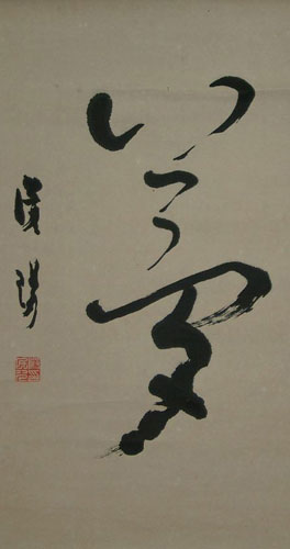
I need to do a lot more research before I’ll buy some prints, probably from an offline dealer, but meanwhile I came upon something interesting on eBay. A hanging calligraphy scroll, the type for hanging in a tokonoma, caught my eye. It had a single kanji, Yume. Yume literally means “dream.” The kanji representing it looked like a person leaping in dance to me. I did not win a bid on it, and went looking for another one like that. To my surprise, the second calligrapher’s “dream” looked like a spooky bird. I did not win that auction either, but I wonder what a whole collection of these would look like on a wall…

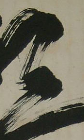
I particularly like the brush streaks.

Modernism, Postmodernism and the Voice of the People

“It’s the combination of narcissism and nihilism that really defines postmodernism” Al Gore

I am a man with huge gaps in education. Every time I think about all the history, philosophy and literature that I should be familiar with, I shudder. Take, for instance, Modern Library List of Best 20th-Century Novels. Out of the top 10 I olnly read numbers 4, 5 and 10.

By the way, Modern Library editors did not understand the web enough to run a poll for a reader selected top list. Of course, the list came to include 4 Ayn Rand and three L. Ron Hubbard titles, with two top spots going to “Atlas Shrugged” and “The Fountainhead,” and third to “Battlefield Earth”. I am a bit surprised to see the Objectivists defeat the Scientologists, but I guess they’ve heard about the vote earlier and mobilized their forces ahead of time somehow.

A similar “vote” happened on the TV Guide website once. The poll was run to determine the most annoying Star Trek character, and early on Ensign “Wussley” Crusher had a good lead on the competition. That was until Wussley’s alter ego, popular blogger Wil Wheaton, asked his readers to stuff the ballot box. Funnily enough, both wilwheaton.net and tvguide.com have the same PageRank of 7, so he had more than enough readers to rig the vote. I don’t remember who won and I can’t really look it up because in its recent redesign TV Guide broke most of the old urls (one of the reasons why its PageRank is so low).

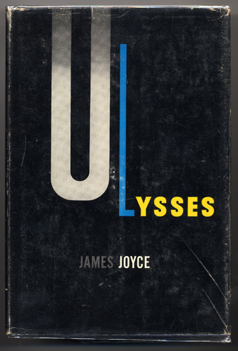
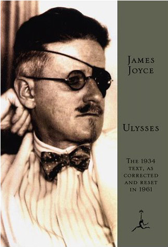
Anyway, I really wanted to talk about the top Modern Library novel, Ulysses by James Joyce. I must have started this book 3 times, only to get stuck a couple of pages into it. I’ll have another go at it sometime, but I am afraid I am not smart enough yet to tackle it.

One thing that leads me to believe that there might be a day when I’ll enjoy Ulysses is my growing appreciation of the Modernist movement. Even though the contents of the book elude my understanding at this moment, I really like the dustjacket created by E. McKnight Kauffer and book design by Ernst Reichl. Just because of the dustjacket design I paid $15 for this book many years ago, when I usually refused to pay more than a buck for a used book. The elegance of the form and color, the expressiveness of the simple type elements is lightyears beyond the current, and I guess what should be called “Postmodern,” cover.

The funny thing is that “Modernism” is not modern at all. We are talking about books, architecture and music that is at least 50, and some times almost 100 years old. What comes after Modernism? Postmodernism. Honest to God, it looks like our society is running out of naming ideas. What do you name a language that comes after B? C. And then? C++. What comes after Generation X? Generation Y. Then? Generation Z.

The latest poll is about Wesley Crusher.

Top of the Rock

I have been looking forward to the opening of the “Top of the Rock” for a long while. As soon as the online ticketing system became available, I got the tickets for the first day, and the first sunset that this observation platform became available to regular shmoes like me.

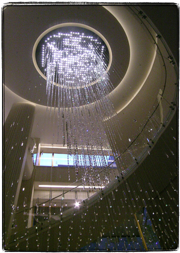
The entrance, which is located in the underground concourse is decorated with this fancy Swarovski Crystal chandelier. Top of the Rock chose two somewhat strange marketing alliances – with Swarovski and with Target.

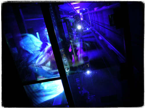
The elevator ride to the observation platform features a ceiling-projected movie of cheesy historical images and newsreels. Though that you can see exposed and lighted elevator shaft which is much more impressive.

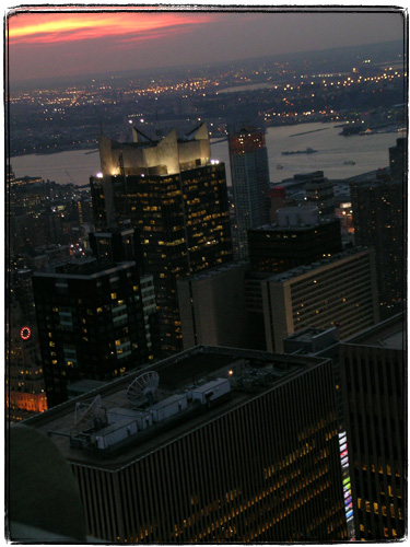
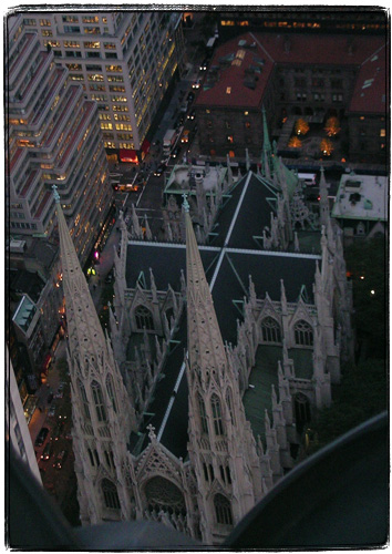
Once you get to the multistoried observation platform, you start to notice and and photograph hundreds of interesting things otherwise unseen from the ground. The rooftop of the building where you work.

The cross of St. Patrick’s Cathedral.

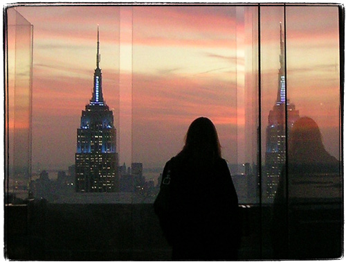
You get to stand basically face to face, on the same level with the spire of the Empire State Building, only separated by the annoying bulletproof glass. The spaces between panes allow you to take decent pictures, and the top setbacked platform does not even have the glass. That’s where you can entertain your superhero daydreams – by quietly standing there, of course, and not by jumping off of it.

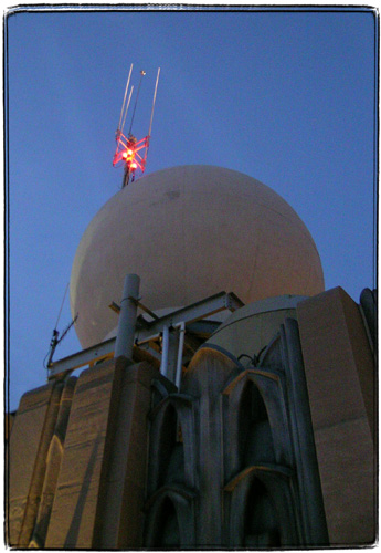
Besides the glass and the loud tourists, the only annoyance that I can name is a little bit of sewage smell. I am pretty sure that came from the plumbing vent that you can see in this picture.

Overall, I have to say that the whole experience was superior to the Empire State Building observatory. Online ticketing interface allows you to buy tickets for specific time, avoiding lines (the guy who coded the ticketing system even dropped me an email on my previous entry). You get to see the Empire State Building itself, as well as views of Central Park. The top deck without the glass is very cool.

Unfortunately I forgot my own camera and had to borrow co-worker’s Nikon, so I’ll be back with my own gear, the long lens and possibly a tripod. One unsettling thing about Top of the Rock, though, is that the ticket (but not the website) states that you are only allowed to take pictures for non-commercial purposes. That’s not very nice. I did see a lot of people with tripods and fancy cameras though – hopefully they are not going to hassle me.

The Devil In The Details: Brownstone Sculpture

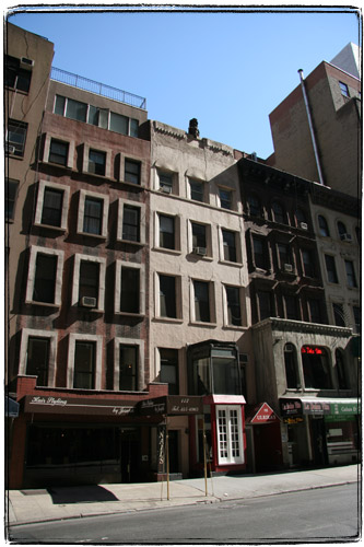
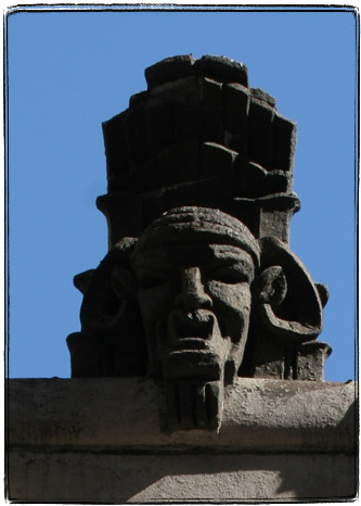
There is a little brownstone at 113 E 60th St in New York is rather plain. But it has a rather weird sculpture up top.

At closeup it looks rather sinister, doesn’t it? I could not find any information about the building online. I wonder if the little guy a result of Victorian love of morbid and exotic things, or it was added later, in the Roaring Twenties.


Ad: