Civic Fame

Municipal Building in Manhattan is said to be the one that directly influenced Soviet architecture because Stalin really liked its look. What was called “City Beautiful” style in America in 1880s, with some alterations became known as Stalin’s Empire, Stalinist Baroque, Socialist Classicism and simply as Mustachioed One’s Wedding Cakes. In fact there are 7 buildings in Moscow that look very much like it.

These 7 sisters, as the buildings are known are shrouded in legend. I’ve heard that because of the lack of metal girders their walls are tremendously thick at the bottom. I’ve heard that they go down into the ground as far as they go into the sky, that there are old explosive self-destruct charges left over in some of them, that there is a huge monument to Stalin stored in one of the huge cellars. I’ve heard that the super secret “Metro 2”, the secret subway running underneath them.

It’s very ironic that Stalin picked this very American, capitalist style for his favorite buildings. Even more ironic is the way that the Objectivists lead by Ayn Rand picked an art aestetic art aestetic very similar to socialist realism, maybe with a little more art deco thrown in.

There is a common theme that runs through Ayn Rand’s life and work – grand ideas and ideals not realized. Rand herself, was so obsessed with capital and investement, yet never invested much of her money. She opposed government monetary control, yet supported Objectivist #2 – Alan Greenspan himself.

Rand’s work is full of references to things that never came to life. In “Fountainhead”, Roark’s boss, Henry Cameron, has a blueprint of an unbuilt skyscraper on his wall. Also in that book, there’s the statue of “Industry” that never went in to the lobby of the fictional Cosmo-Slotnick Building, described as “.. a slender naked body of a man who looked as if he could break through the steel plate of a battleship …”.

I am endlessly fascinated with ghostly architecture. There’s a special space in my mind’s eye for ghost structures. The fictional ones, like Henry Cameron’s Dana Building. The destroyed ones – the World Trade Center, the Singer Building, the old Penn Station, the Zeppelin mooring tower on top of the Empire State Building, and many more. And the ones that were never built – like the 8th Stalinist sister, the Palace of the Soviets, with a gigantic statue of Lenin so big and so high up top, that it needs shortened legs and torso to preserve the perspective.

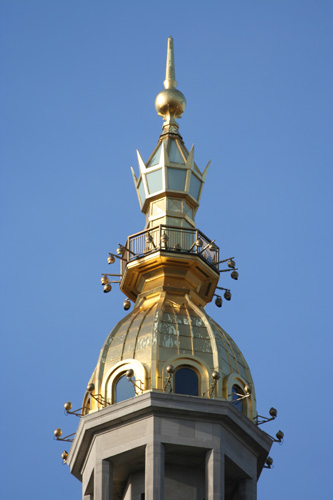
The very real Municipal Building also has a giant statue on its top. While not as huge as the Lenin one, still, in New York it’s only second to the Statue of Liberty in size. The statue by Adolf A. Weinman is called “Civic Fame”. She battled wind, rain, snow and smog for almost a hundred years now. Her hand dropped through a skylight in a cafeteria on 26th floor in ’36 and had to be repaired, and in ’91 she took a helicopter ride up and down for cleaning and further restorations.

The model for “Civic Fame”, Audrey Munson, had an even harder and more intense life. At the turn of the century she was a supermodel for sculptors and painters. In some sense that yielded a much more permanent record of her than most of today’s supermodels will enjoy as there are literally dozens of important sculptures of her in New York City and around the world bearing her likeness. When the movies came about, she became an actress and entered history books as the first known woman to star in a movie naked. Well, tastefully, as an artist’s model.

There’s a book about her life, the Wikipedia article, this woman had the most unusual and tragic life. From the height of fame, through the court case involving a doctor who killed his wife to be with her, to financial destitution and into the mental asylum at 39 where she died at the age of 104 (!).

I wonder what she felt like standing in front of the Municipal building, knowing that it was her at the very top, with a shield and a crown.

The city website says that the crown has some dolphins on it, but even with this magnification I can’t see them.

All I know is, now I just have to find as many instances of Audrey Munson in New York City’s buildings and museums. That will be an interesting photographic project. I wonder if it’s her on the Eastern Airlines Building mural.

The Torah Code

There’s a sequence in Darren Aronofskiy’s “Pi” when the protagonist, mathematician Maximilian Cohen is induced by a Hasidic Jew to on something called Tefillin. Here’s a frame from the movie:

For an ancient Jewish religious artifact, the two black leather boxes and straps used in prayer, are very strange looking and science-fictiony. I decided to do a bit of research on them, and came upon a lot of very interesting stuff. I’ve made a lot of notes, but for years I did not have the time to sit down and actually write this post.

Tefillin is a very curious Jewish religious artifact, similar to a few others, such as Sefer Torah and Mezuzah. What they have in common is the exactitude in which they reproduce holy texts in hand-written form.

Scott Adams nicely summarized the problem of propagating holy writing in his recent post:

I never knew that there are about a zillion different versions of the Bible because (and I am summarizing Ehrman’s entire book here) it was copied and recopied by hand, by semi-literate, opinionated morons for hundreds of years. Sometimes the copiers left stuff out, sometimes they added their own explanations where things didn’t seem to make sense, and other times they simply made errors.

This, of course, brings to mind the old joke about a novice monk who asks his superior about the possibility of mistakes in the holy books that the monks in his monastery have been copying by hand for centuries. The head monk goes to check the originals hidden away in a vault. Having not heard from him for days, the novice monk goes to check on the old monk and finds him hunched over the old books crying and saying the same phrase over and over. “The word is ‘celebrate‘ !”

The Hasidic Jew from “Pi” was a Torah numerologist. See, the Torah is considered to be the literal word of God as given to Moses, exact to a letter. Hebrew letters have numerical values, so Torah can be treated as a string of numbers that might contain hidden patterns, encoded messages, maybe even computer code. Exactitude is very important here – a single letter might change everything, like in a computer program or a cyphered message. Or like removing the letter “r” from the word “celebrate”.

The practice of using Tefillin comes from a literal understanding of a passage in the Torah, Deuteronomy 6:8.

“And these words, which I command thee this day, shall be in thine heart:

And thou shalt bind them for a sign upon thine hand, and they shall be as frontlets between thine eyes.”

What seems to be a poetic metaphor about the importance of the holy writing, is taken literally here, prompting the creation of an artifact consisting of two black leather boxes containing scrolls with passages from the Torah to be worn bound to a hand and forehead with leather straps.

If you’ll go shopping for a set of Tefillin, you might be surprised at how much they cost. The cheapest set from a reputable place will set you back at least several hundred dollars, with better made ones costing in the thousands of dollars. Why? Because of the excruciatingly exact way they are supposed to be made.

The leather cases and straps need to be made from Kosher parchment and to pretty exact specifications. The cheaper ones are made from glued pieces of leather, the more expensive ones are made out of single pieces of leather, either folded using what one website calls “Jewish origami” or pressure-molded by special presses. The latter are considered more kosher.

But the cases are a small part of the value of the Tefillin. The handwritten scrolls are what’s expensive. Scribes (Sofer) who are qualified to make kosher Tefillin are few and far between, and not only because they are supposed to a God-fearing, religious Jews of high moral fibre. The letters on the scrolls are small, but have to be perfectly formed in a rather complicated font, of which there are several varieties. There can’t be a single mistake, not even in a part of a letter.

There are certain prayers that have to be said. Letters have to be written in a precise order. They can’t touch each other, holes or edges of the parchment. Parts of the letters can’t be erased and they have to be perfectly formed. The parchment has to be properly prepared, a proper quill pen and specially formulated ink has to be used.

These are just some basic rules that I gleaned from various websites. Apparently they rules are so complicated that even experienced scribes are sometimes baffled at subtleties of writing these scrolls. When in the middle of a laborious process of writing a scroll, they sometimes come to consult a specialist called a posek rather then throwing away their work and starting anew. Even a specialist is sometimes not sure if a letter is correctly formed. What happens then is rather interesting:

“Shailos tinok is a query presented to a child. Occasionally a posek will be in doubt how to render a decision, psak. […] He will suggest that a child […] who knows the letters of the Aleph – Bais but has not yet learned to read, be asked. Such a child sees nothing other than the form before him and can judge without any influences.”

There are literally thousands of ways in which the tiniest imperfection can completely invalidate a Tefillin. And religious Jews take this commandment very seriously, so making of Tefillin is in no danger of being outsourced to China despite the high availability of good calligraphers there.

There’s even a dispute as to in what order the scrolls need to be put into the cases. Most rabbis agree, but still, there are some who put two pair of Tefillin at once, made in two different ways. Kind of like Ned Flanders who “kept kosher just to be on the safe side”.

On the cynical side, there’s a phenomenon referred to as “Tefillin date”. Some hypocritical Jews take their Tefillin with them when they go on a date, planning to spend the night, and while breaking the pretty clear “no sleeping around” rule, not breaking “pray with Tefillin in the morning” rule.

Sefer Torah is a full length Torah (about 300,000 letters) written on a scroll in to specifications that are similar to the making of Tefillin. While writing Tefillin scrolls might take experienced scribe 2-3 days, Sefer Torah is often a lifetime project. Their cost ranges from tens of thousands of dollars to millions of dollars.

This exacting standard of copying is what made the modern Torah scrolls match almost exactly the texts dating back to before 100 BC found in the Dead Sea scrolls.

If you ever lived in New York City, you must have seen a mezuzah, the third and simplest of the Torah scroll artifacts. It comes from a literal understanding of Deuteronomy 6:9

“And thou shalt write them upon the posts of thy house, and on thy gates.”

Mezuzah takes a form of a decorated case containing a scroll nailed to a doorpost. On almost every floor of almost every apartment building in New York you’ll find at least one door with a mezuzah. In some, like in mine, almost every door has one. The variety of the decorative cases is astounding. There are big ones, small ones, ornate ones, simple ones. They are made of plastic, wood, metal. Most are left by tenants of long ago. Many are painted over. In many cases I see voids in paint where mezuzah used to be.

The one left to me seems somewhat old, probably left by the original owners of the apartment. On the back it has the original orange paint which is not out of character for my Art Deco building. I bet it dates to the 50s or 60s (can’t be much older than that because it’s “Made in Israel”).

What makes it absolutely invalid, of course, is the lack of the handwritten scroll inside. In fact, this is the case with most mezuzot you’ll find in New York. The case might be pretty, but the scroll inside takes at least a few hours of scribe’s work and costs from 30 to 100 dollars.

Even though I am not an observant Jew, one of these days I’ll replace my mezuzah case with a titanium one and buy a real scroll. Also, I want to put on a Tefillin once. All I have to do is find the nearest mitzvah tank, but Hasidim make me feel uneasy.

Japanese Brooklyn

Victorian Brooklyn is amazingly beautiful. In Victorian times skilled labour and land was cheaper than it is today and wealthy people were able to build really elaborate and architecturally significant residences rather than Mc Masions of today.

In a big lot of old postcards that I picked up on eBay I found this – a postcard featuring “The Japanese House, Flatbush, N. Y.” It looks like this wasn’t the only time this house was featured on a postcard: here’s another one.

Don Wiss of the Brooklyn photo store photo fame graciously allowed me to use his picture of the Japanese House, which turned out to be
Frederick S. Kolle House at 131 Buckingham Road.


Here are Don’s notes, mostly gleaned from the AIA Guide to New York City.

I did a little bit more digging and found a New York Times article, which somehow is fully available.

The house was built by a developer in order to promote Prospect Park area.

Alvord advertised the house in Country Life in America in the summer of 1903, calling it ”a faithful reflection of the dainty Japanese art from which America is learning so much.” But the house was ”thoroughly practical,” the ad continued, with a ”porcelain Roman bathtub, also needle and shower baths,” and a 22-minute commute to Park Row. It was offered at $26,500.

According to this calculator that translates to somewhere between 600K if you use Consumer Price index to 12 million if you use the relative share of GDP. Stupid Zillow is showing values in $1 million range, which is of course very wrong. I suspect that the current value of the house is much closer to the GDP share range :)

The NYT article goes on to say that Dr. Kolle, the first owner of the house was a pioneering radiologist. It seems like he purchased the house on the cheap after the unusualness of it did not attract many bidders. Also, in 97 the house used to belong (and probably still does) to the director of Flatbush Development Corporation who bought the house in the 70s.

The following quote made me drool:

“Except for the kitchen, the ground floor interior of the Fischers’ house is completely intact, with dragon figures in the stained-glass windows, Japanese decorative detail around the fireplace and a definite feeling of thinness to the partitions — there are leaded glass windows between the sitting and dining rooms. The Fischers have furnished the house with an eclectic mix of furniture and artwork, from Belter to Bauhaus, as well as memorabilia from the Kolle family.”

Apparently the Flatbush Development corporation is holding a Victorian House Tour, that at least in 97 featured the Japanese House as one of the stops. I wonder if they still do – I’d love to see it.

Looking at the butt-ugly condos and renovation in McMansion syle that I see all over, I can’t help but think – will they build houses that are postcard-worthy again in Brooklyn?

It’s Tough Being Boss

Several days ago I was startled by something in a post titled “moving up in “teh company”” in Livejournal’s Starbucks barrista community. The poster said:

“< insert typical “yay me, I’m being promoted to SS” comment here >

So I went to my learning coach class last night. It was very informative and good. I’ll begin official SS training about a week and a half from now.”

It took me a little while to realize that SS in Starbucksian jargon stands for Shift Supervisor, not Schutzstaffel. Over the years I got used to being asked for my SS (Social Security) number, but apparently when I hear “SS” in other contexts my first thought is still “Nazis!”.

This reminded me of a rumor that I’ve heard before. See, I’ve been told that that SS uniforms were so stylish because they were designed by Hugo Boss. It did not sound right – I thought that Hugo Boss is an American company, that was created after the war and that Hugo Boss is not a real person, but a created brand, like Mavis Beacon (see my post about that).

The first place I went to was hugoboss.com. Well, I was wrong, it’s a German company all right. But the website is missing “Company history” section. Suspicious. I mean, usually established companies are rather proud of their beginnings. Kennethcole.com, for instance, has a whole segment about how Kenneth Cole (he’s a real person, I’ve even met him once) hacked New York City rules by pretending to shoot a movie in order to gain valuable parking permit necessary to sell shoes out of a trailer. You can read all about it here.

So, I did a little digging of my own and guess what – according to Wikipedia, which in turn quotes Washington Post, Hugo Boss, the founder of the company did indeed design and manufacture Nazi uniforms, and on top of that likely used forced labour.

Here’s a picture from hugoboss.com:

And here’s one from Wikipedia that I doctored up a little (I changed the position of the guy on the right – the original is here)

Maybe Hugo Boss of today is very, very different from the WWII era one, but they do make some snappy clothes.

Looking Up, Part 1a

I’d like to start a series of articles about looking up. This is the first one.

Truly cool New Yorkers do not look up. I on the other hand, look up not much less than a tourist fresh off the bus. Unlike most tourists though, I own a really expensive long lens.

In the beginning of the skyscraper era, architects were confused about how to design the look of these super tall buildings. One of the decisions facing them was – what to put on the top. There were many choices. A very popular one was to use a little temple/colonnade on top, based on the ancient minaret that was later converted into a bell tower – the fabled Giralda Tower. Then you could use a giant torch or lantern, a mini ziggurat, statue, a spire or a combination of several of these. In following posts of this series I’ll give you examples of those buildings. But today my theme is crowns.

The Crown Building on 5th Ave.


You can’t really see that without magnification – the crown features what seem to be colored glass jewels.

New York Life Insurance Building.

They have an awesome series of ads featuring the building. My favorite one is where they do a time-lapse walk through, with changing eras, people and New York Skyline, ending in the future where a girl with a futuristic haircut steps out of the building, into a hovertaxy and zooms away. Please let me know if you find a video of that.

Metropolitan Life Insurance Company Tower. “The Light That Never Fails”, the old symbol of the company (now it’s Snoopy) is set inside a crown-looking lantern top.

The American Radiator Building : A crown fit for the king of the Radiator Planet.

The Old RCA Victor Building has such an expensive and complicated top, that one might question it’s usefulness – it’s almost impossible to see any details from the ground.

Wireless Maiden, close up.

later, architects decided that it wasn’t worth it to decorate tops of the buildings – they are hard to see. The era of International Style did not allow for interesting skyscraper tops. You’d be lucky to see a neon sign. Fortunately the architectural firm of Skidmore, Owings & Merrill brough back the practice of decorated tops, as can be seen on the Bear Stearns Building. Another example of an SOM topper is the World Wide Plaza Building.

Hey Hey, Ho Ho. One Zero Zero One, Zero!

Unions in New York City are masters of psychological warfare. When they set up a giant blow-up rat (seasonally decked in Christmas tree lights) in front of your business and start singing union songs and chanting chants, well, it’s not a pleasant experience.

The chants are catchy. Here’s my favorite one:

We are the Union, we are the Union
Mighty, mighty Union – mighty mighty Union
Everywhere we go – everywhere we go,
People want to know – people want to know
Who we are – who we are
So we tell them – so we tell them

I culled this great quote from an article at Fastcompany.com:

“Twelve years ago, Mike O’Connor, owner of Big Sky Balloons & Searchlights in Plainfield, Illinois, created the first rat at the request of a union member in nearby Chicago. Said the union man of O’Connor’s first sketch: “It’s not mean enough.” O’Connor added bigger fangs and a pink belly with “festering nipples.” “I love it,” the man said. So did other unions. Today, Big Sky sells between 100 and 200 rats a year–even though it is a nonunion shop itself.”

Bigger fangs. Check.

“Festering nipples.” Check.

The rat is all over the city. Sean of Dust and Rust blog caught one in front of a Duane Reade.

If you decide to organize, I guess you can buy your own over here.

Badges And Stuff

I picked up for a few bucks this Univac security guard’s shield. Like many security badges it’s based on a New York State Great Seal. The proportions are changed and the figures of Liberty – woman holding a Phrygian cap on a stick (well, actually Liberty pole if you want to get technical) and Justice – woman with a sword and scale. There’s sunrise over Hudson inside the shield, but without the two boats. New York State’s motto Excelsior (which is Latin for “Up Your’s”).

The plastic laminated id is kind of cool, because it’s a miniature punchcard.

I guess the manufacturers of rent-a-cop badges are trying to make them subtly similar to NYPD logo, yet different enough not to get in trouble. NYPD badge is based on a similar, yet very distinct New York City Seal. Instead of Liberty and Justice it features American Indian with a bow. The other figure is enigmatic – for the longest time I thought that it was another American Indian holding a dead animal or a tomahawk. In fact, it turns out to be a Dutch sailor holding a “sounding line” – a nautical depth measuring rope. Another useless bit of trivia: Mark Twain chose his pen name from the expression “mark twain”, meaning only two fathoms reading on the sounding line.

The five stars on the chevron are for the five boroughs, the windmill is for the Dutch origins of New York City. The most unsettling part, is of course the Justice scales that rest on top of fasces, a bundle of sticks with an axe inside – the ancient symbol of authority. Along with the swastika, fasces has been marred as a symbol of Fascism, to which it gave its name.

The Real Estate Hogs and The Coin Counting Robot

Remember that The Simpsons episode where Starbucks swallows every store in Springfield mall?

“… Bart, while walking through the Springfield Mall, passing several Starbucks, goes into a store called “In and Out Piercing”.
Employee: Can I help you?
Bart: I’d like to get my ear pierced.
Employee: Well, better make it quick, kiddo. In five minutes this place is
becoming a Starbucks.
Bart gets his ear pierced, and has a diamond-shaped clear stone inserted into the new hole. As he leaves the store, it, like all of the other stores above and around it, is transformed into Starbucks.”

New York City was one of the last markets that Starbucks entered, mostly because of high real estate costs. But besides Starbucks, there are two types of businesses that swallow an enormous portion of commercial space in NYC: drugstores and banks. Whenever you see a sizable store for rent, it’s almost inevitable that it will become a drugstore or a bank.

The drugstore business is not particularly profitable, but one chain, Duane Reade, seems to be opening store after store. In my neighborhood there are two Duane Reades one block from each other, and several other equally lame pharmacies. There’s an interesting article called The Mystery of Duane Reade which among other things, addresses a question just as interesting as “Who is John Galt.” Unlike Galt, Duane Reade is not really a person. The crummy drugstore chain derives it’s name from the first store that was located on the corner of Duane St. and Reade St. in Manhattan.

Banks are even worse real estate hogs, and are popping up even faster than Duane Reade and Starbucks. There are two stores that went out of business recently in my neighborhood, and both are being replaced by banks. There’s a bank across the street from where I live, and one or two on almost every block. Yet there are no supermarkets bigger than a tiny little Pioneer in a 20 block radius.

The stiff competition is forcing banks to offer new services to attract customers. Commerce Bank, for instance, offers a service called “Penny Arcade.” They basically have change-counting Coinstar machines without the fee. All you have to do is get the receipt from the machine, and the cashier will exchange it for paper money.

During the last major cleaning fit that I had, I took my overflowing coin bowl and dumped it into a canvas bag. I weighted it on my Health-o-Meter physician’s scale which is exact to within 1/4 lb. The scale read 29 1/2 lb.

Here’s what 29 1/2 lb of coins in a Strand bag look like:

I dragged the heavy money bag to the bank, and proceeded to empty it out, handful by handful into the Coinstar machine. I had to suffer loud and annoying cartoon voice aimed at kids and overall felt like a dork, but I got rid of all the change and cashed in my printed receipt. As I was curious of the how exact the coin count was, I asked the cashier for a copy of the receipt. She had to do it by hand for some reason, but here it is:

To calculate how much this should theoretically weight, I need to do a little bit of math. A dollar coin weights in at 8.100g, quarter at 5.670 g, dime at 2.268 g, nickel at 5.000 g and penny at 2.500 g (according to the US Mint)

This gives us: 5 * 8.100g + 358 * 5.670 g + 987 * 2.268 g + 659 * 5.000 g + 1928 * 2.500 g = 12.423876 kg

12.423876 kg = 27.3899581 lb.

That’s about 2.1 lb difference from my original weight. The machine rejected a Chinese coin, two Boston subway tokens and a few coins with gunk on them. The bag probably weights at most 1/2 lb. So it seems that the coin-counting automaton cheated me out of a pound of coins. That’s about 9 bucks by my calculations.

[Update] I’m told that pre-1982 pennies weight 3.1 grams instead of 2.5, so my calculation is a bit off.

Of course, my experiment is far from exact. It depends on the number of factors, such as the possibility of my scale being not as precise as I think or the possibility that coins lose some weight after being in circulation. But somehow I highly suspect that the Coinstar machines are undercounting. Wall Street Journal journalist ran an experiment with a remeasured amount of money. I can’t find the original article, but this quote about $87.26 seems to be floating around a lot:

“For consistency, we began with equal piles of $87.26 worth of pennies, nickels, dimes, and quarters that we had gotten from a local bank in coin envelopes.

Talk about a tough economy. The machines at both Commerce Bank and Coinstar gave us less back than we put in — Commerce Bank missed by a whopping $7.02, while Coinstar was off by 57 cents.”

Where is Eliot Spitzer when you need him?

Ad:


Health-O-Meter Physician’s Balance Beam Scale: a must have weapon in the battle of the bulge.

A “rogue” (read “somewhat sloppy, but very interesting”) economist tries to answer tough questions, such as: What do schoolteachers and Sumo wrestlers have in common? How is Ku Klux Klan like a group of real-estate agents? Why do drug dealers still live with their moms? Where have all the criminals gone?

Top of the Rock

I have been looking forward to the opening of the “Top of the Rock” for a long while. As soon as the online ticketing system became available, I got the tickets for the first day, and the first sunset that this observation platform became available to regular shmoes like me.

The entrance, which is located in the underground concourse is decorated with this fancy Swarovski Crystal chandelier. Top of the Rock chose two somewhat strange marketing alliances – with Swarovski and with Target.

The elevator ride to the observation platform features a ceiling-projected movie of cheesy historical images and newsreels. Though that you can see exposed and lighted elevator shaft which is much more impressive.

Once you get to the multistoried observation platform, you start to notice and and photograph hundreds of interesting things otherwise unseen from the ground. The rooftop of the building where you work.

The cross of St. Patrick’s Cathedral.

You get to stand basically face to face, on the same level with the spire of the Empire State Building, only separated by the annoying bulletproof glass. The spaces between panes allow you to take decent pictures, and the top setbacked platform does not even have the glass. That’s where you can entertain your superhero daydreams – by quietly standing there, of course, and not by jumping off of it.

Besides the glass and the loud tourists, the only annoyance that I can name is a little bit of sewage smell. I am pretty sure that came from the plumbing vent that you can see in this picture.

Overall, I have to say that the whole experience was superior to the Empire State Building observatory. Online ticketing interface allows you to buy tickets for specific time, avoiding lines (the guy who coded the ticketing system even dropped me an email on my previous entry). You get to see the Empire State Building itself, as well as views of Central Park. The top deck without the glass is very cool.

Unfortunately I forgot my own camera and had to borrow co-worker’s Nikon, so I’ll be back with my own gear, the long lens and possibly a tripod. One unsettling thing about Top of the Rock, though, is that the ticket (but not the website) states that you are only allowed to take pictures for non-commercial purposes. That’s not very nice. I did see a lot of people with tripods and fancy cameras though – hopefully they are not going to hassle me.