eBay and The Michigan Deposit Scam

eBay is such a horrible hassle these days. I tried selling a few things recently, and between the horrible UI, all the hassles with payments, answering questions and shipping it turned out to be a huge waste of time.

I am sitting on a small fortune of items I would like to get rid of, but I don’t want to deal with strangers on Craigslist or going through the eBay rigomarole. An ideal solution would have been an eBay drop-off shop, but it seems that these went the way of the Dodo.

eBay drop-off store is an idea that many have tried, but it turned out mostly like Seinfeld’s Michigan deposit scam.

In one episode Newman keeps trying to find a way to make a scheme that would bring New York cans and bottles to Michigan, which has a 10 cent deposit instead of New York’s 5 cent one. Kramer keeps telling him that it would not work due to the transportation overhead, but finally Newman figures out a way to get a postal truck for free.

It seems that the time overhead is so high on running an eBay store is so high, that most of the bigger ones that tried it went out of business.

In reality the Michigan deposit scam is against the law, but it actully costs the state 14 million a year in lost revenues. It’s doable.

eBay is showing Twitter-like incompetence in serving its customers. While Google gives its customers huge amounts of storage, email, and software for free, eBay can’t seem to provide free image galleries and other useful services, selling out its customers to an unsavory bunch of third party providers. Image storage is not a very difficult technical problem, and neither is url shortening, but eBay and Twitter are still in the dark about it.

Instead of making selling on eBay easy, developing drop off stores, and making its service better eBay seems to be focused on buying and selling unrelated busenesses for billions of dollars (and losing money on it).

Semi-literate Programming

I recently finished “Coders at Work“, a series of interviews with famous programmers.

On one hand, reading a book like this is a downer: it’s very clear to me that I occupy a place that is very close to the median of the bell curve, and the skill level of programmers is a very steep non-linear curve in itself. I’ll never be as good as JWZ or Brad Fitzpatrick. But I knew that before, and I am ok with it. On the other hand, this book inspired me to read more code.

The programmers in the book disagree on many points, but they mostly agree on the importance of writing readable code and educating yourself by reading other people’s code. I make my living writing in scripting languages, and I haven’t written a line of C or C++ since college. But there’s nothing preventing me from downloading and taking a look at the source of Apache, PHP, MySQL.

It’s important for me to understand “how the sausage is made” in the PHP stack, and as it turns out, what happens between Apache PHP and MySQL in term of requests and timeouts is not as simple as one might think. I asked at StackOverflow about this, but all the diagrams that people pointed me at were of the very rudimentary type: “look, here’s a happy cow, it goes to Bovine University, look – it’s all shrink wrapped on the supermarket shelf” instead of “sausage farm/slaughterhouse/truck/factory tour, starting with cow insemenation”.

When I downloaded the source code of mod_rewrite, arguably the most useful Apache module in the world, I was amazed to find out that it’s only 5000 lines of C with comments.

The book ends with the interview of Donald Knuth, and another two major questions that the interviewer is asking everyone is – “have you read Knuth’s books and have you tried literate programming”. It was interesting to find out that most of the famous programmers use Knuth’s the same way that I do. The books sit on my bookshelf, I look at them, I sometimes try to read them, I skip most of the math. They serve as a constant reminder to me that I suck at computer science even more than I suck at programming, and luckily there are people out there who know all of this stuff who are not idiots like me.

Here’s a photo of my cubicle at TV Guide circa 2002, Knuth’s books are holding a place of honor next to the mini fridge. By the way, taking pictures of the places where you work and live is something that you should not forget to do: years from now nobody will care about those pictures of flowers, shadows, and sunsets, but

I’ve read the book about Literate Programming at the time, and was rather inspired by it. Ok, maybe I didn’t read it and more like skimmed it. I don’t think I understood what real literate programming is.

The way I understand it, Literate Programming is a way to write programs as a narrative that is readable to computers and humans. My father, in his former career a site supervisor (a type of a contractor) is very fond of giving very detailed instructions to me, the same way he used to give instructions to construction workers. His instructions usually are exaustive algorithms, with error handling. I think that his instructions, expressed as a flow of conciousness, would work not only on me and construction workers, but on computers as well, and are similar to what Donald Knuth has in mind. All you really have to do is to build a layer of abstraction between these instructions and a computer language. Also, since computers don’t forget things, he would only need to repeat his instructions once.

These days my dad is a COBOL programmer. Everybody dumps on COBOL, but in my mind it’s a language worth of a lot of respect. It has a syntax that is very English-like, something that makes reading COBOL code easy. Well, maybe it’s like reading some old-timer’s newsgroup post written in all caps, but it’s still much closer to English than most other computer languages.

At the time I was reading “Literate Programming” I was using ASP 3.0, IIS, and SQL Server 97. My task was to write a system that would account for booked and pending business. This is something that had to be done since the age of Mad Men. You see, the dealings of clients, account executives (like Pete Cambell), their bosses, account coordinators, creative department, etc are rather convoluted. But in the end, to get paid, you have to have a system that will track who brought in what business, who handled what, and how the commissions need to be split.

This is normally the realm of something called EAS (Enterprise Application Software). Back at the turn of the century, this area was still dominated by a company called SAP, but there were a few smaller players, like Salesforce.com that tried to package these applications. Any sane IT manager looks to see if an EAS solution can be purchased first. It turned out that TV Guide’s buseness logic was impossible to shoehorn into any existing solution. SAP folks said – yeah, no problem, we’ll build you what you want, but our prices start at $1M, and then there are consultant fees. ERM world is a crazy place, you can read about some true craziness in “Cube Farm”, an account of one hapless developer’s adventures at Lawson Software. It’s a truly riveting book, and I fell that every developer out there should read it. It’s literally Lovecraftian in nature, that book.

In any case, it fell to me to develop the application from scratch. Inspired by Knuth, I decided to write some semi-literate code. Me and a project manager, Brad, went to the clients and interviewed them at length, documenting their existing process (aka the most complicated set of spreadsheets you’ve ever seen). In the past, before cheap computers, all you needed was a Joan Holloway, but I believe they stopped making them.

Brad went on to go back and forth with a very terse document about 5 pages in length that described how the new system would work. He would sit down with the clients and go through the narrative, step by step, confirming that this is what they wanted. Meanwhile I created an object oriented library that made dealing with the database, creating forms and navigation elements much easier. This is similar to to what you might find in a CMS like Drupal, only a little cruder.

When the document shaped up, I created the database schema, and then I took a big chunk of the document and pasted it into one huge comment block. I proceeded to break off chunks of that block and writing the code around it. Interestingly enough, as time went on, the project manager started helping me to write the code: enough of scary database abstration was hidden by simple classes and method, and there were tons of self-evident examples all around to copy and paste. I switched to writing reports that involved cubes, rollups and other fancy stuff. Stored procedures that did the reports also received comments from the document that described the reports.

This wasn’t a monolythic system – I was writing it for 2 years or so, releasing a chunk after chunk. In the end it was handed off to another developer, the whole transfer took only a couple of hours. There weren’t any major bugs, maintanence issues (I believe I received only one phone call about it after several years of continuous use). All in all I was pretty pleased with this approach and can absolutely recommend it.

I believe this is the reason why so many English majors become excellent programmers: if you can write for people, you can write for computers. Sometimes there are reasons why you can’t do both at the same time, but there’s no reason not to find some middle ground.

The Man Who Owns the News: Inside the Secret World of Rupert Murdoch

If Rupert Murdoch isn’t making headlines, he’s busy buying the media outlets that generate the headlines. His News Corp. holdings—from the New York Post, Fox News, and most recently The Wall Street Journal, to name just a few—are vast, and his power is unrivaled. So what makes a man like this tick? Michael Wolff gives us the definitive answer in The Man Who Owns the News.

With unprecedented access to Rupert Murdoch himself, and his associates and family, Wolff chronicles the astonishing growth of Murdoch’s $70 billion media kingdom. In intimate detail, he probes the Murdoch family dynasty, from the battles that have threatened to destroy it to the reconciliations that seem to only make it stronger. Drawing upon hundreds of hours of interviews, he offers accounts of the Dow Jones takeover as well as plays for Yahoo! and Newsday as they’ve never been revealed before.

Written in the irresistible stye that only an award-winning columnist for Vanity Fair can deliver, The Man Who Owns the News offers an exclusive glimpse into a man who wields extraordinary power and influence in the media on a worldwide scale—and whose family is being groomed to carry his legacy into the future.

Japanese Brooklyn

Victorian Brooklyn is amazingly beautiful. In Victorian times skilled labour and land was cheaper than it is today and wealthy people were able to build really elaborate and architecturally significant residences rather than Mc Masions of today.

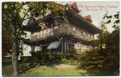
In a big lot of old postcards that I picked up on eBay I found this – a postcard featuring “The Japanese House, Flatbush, N. Y.” It looks like this wasn’t the only time this house was featured on a postcard: here’s another one.

Don Wiss of the Brooklyn photo store photo fame graciously allowed me to use his picture of the Japanese House, which turned out to be
Frederick S. Kolle House at 131 Buckingham Road.


Here are Don’s notes, mostly gleaned from the AIA Guide to New York City.

I did a little bit more digging and found a New York Times article, which somehow is fully available.

The house was built by a developer in order to promote Prospect Park area.

Alvord advertised the house in Country Life in America in the summer of 1903, calling it ”a faithful reflection of the dainty Japanese art from which America is learning so much.” But the house was ”thoroughly practical,” the ad continued, with a ”porcelain Roman bathtub, also needle and shower baths,” and a 22-minute commute to Park Row. It was offered at $26,500.

According to this calculator that translates to somewhere between 600K if you use Consumer Price index to 12 million if you use the relative share of GDP. Stupid Zillow is showing values in $1 million range, which is of course very wrong. I suspect that the current value of the house is much closer to the GDP share range :)

The NYT article goes on to say that Dr. Kolle, the first owner of the house was a pioneering radiologist. It seems like he purchased the house on the cheap after the unusualness of it did not attract many bidders. Also, in 97 the house used to belong (and probably still does) to the director of Flatbush Development Corporation who bought the house in the 70s.

The following quote made me drool:

“Except for the kitchen, the ground floor interior of the Fischers’ house is completely intact, with dragon figures in the stained-glass windows, Japanese decorative detail around the fireplace and a definite feeling of thinness to the partitions — there are leaded glass windows between the sitting and dining rooms. The Fischers have furnished the house with an eclectic mix of furniture and artwork, from Belter to Bauhaus, as well as memorabilia from the Kolle family.”

Apparently the Flatbush Development corporation is holding a Victorian House Tour, that at least in 97 featured the Japanese House as one of the stops. I wonder if they still do – I’d love to see it.

Looking at the butt-ugly condos and renovation in McMansion syle that I see all over, I can’t help but think – will they build houses that are postcard-worthy again in Brooklyn?

More Investment Strategery Talk With Deadprogrammer

Two years ago I wrote about my inept investments and got derisively laughed at by my longtime virtual friend Andrew. “He heh” – he went – “PALM, HAND. You should have tried FOOT and LEG”. Indeed , Foothill Independent Bank and Leggett Platt Inc performed better than Handspring and Palm Inc (they merged back together now).

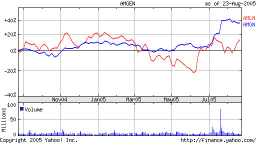
After the Internet Bubble my investment strategy closely followed the baseline advice of “A Random Walk Down Wall Street“: I maxed out my 401K with a no load S&P500 equivalent index and the like. Later I scraped together the remnants from my old non-401K investment accounts, added some money and since I seem to always pick wrong body parts to invest in, asked smartass Andrew what to buy. His recommendations were AMLN and AMGN.

For the most of the next year Amylin Pharmaceuticals was not doing so hot most of the year, and I got to heckle Andrew, saying that even his stock mojo could not overcome my bad luck investment voodoo. Yesterday Amylin popped up 28% because “Phase II clinical trials for a sustained-release formulation of Byetta showed the drug, when taken at the highest dose, could help type 2 diabetics control their blood sugar levels while losing weight“.

Overall, I am up about 30-35% for the year. I never did buy that La Marzocco, settling for a very nice Reneka Techno. La Marzocco is old news anyway, these days the object of my desire is a Syneso Cyncra. If the things go this way further, maybe some day I’ll buy one.


Ad:
Don’t even think about investing without reading “A Random Walk Down Wall Street”.

“Liar’s Poker” and “Ugly Americans” won’t teach you much about investment, but will teach you a lot about traders. Both are highly entertaining and very readable, real thrillers about BSDs. And there’s nothing “free” about them.

How the Starbucks Siren Became Less Naughty

[update] Starbucks logo changes again.

You are probably here because you looked closely at the Starbucks logo and were a little confused about what is depicted on it. Is it a mermaid? What are those things that she is holding up with her hands? Wasn’t the logo different before? What’s the history of it?

I asked those questions myself and did a little bit of digging. My research started with a book that I had, called A Dictionary of Symbols by J.E. Cirlot. In it there was a chapter about Sirens.

Basically, from what I gathered from different sources, including that book, there is a lot of confusion between the different mythological half-women. Typically they are called Sirens – both the half-bird/half-woman and the half-fish/half-woman varieties. The fish type are usually called Mermaids. Both types according to the ancient Greeks were in the business of seducing mariners with songs and promises of sex and then killing them, but Hans Christian Andersen and Disney mostly made everybody forget that.

The whole sex-symbol status of mermaids hinges on the question which part is “woman” – upper or lower. “The other type of mermaid” that hapless Fry was referring to would have problems attracting suitors, of course. And how do you do it with the normal type?

Wise mythologists came up with the answer, of course. And the answer is a two-tailed mermaid sometimes called a Melusine.

The book had an old engraving of a two-tailed mermaid. It reminded me of the Starbucks Siren, but back then I did not realize that the original Starbucks logo had a slightly altered version of that engraving in the original brown cigar band-shaped logo.

Notice that the graphic designer removed the belly button, the unattractive shading around the bulging tummy of the 15th century siren and merged the tail-legs to remove the suggestion of naughty bits. The logo Siren also smiles a little while its 15th century doppelganger is looking rather grim. Other than that it’s clear that this is exactly the image that he or she was using.

According to uspto.gov “[Starbucks] mark consists of the wording “Starbucks Coffee” in a circular seal with two stars, and the design of a siren (a two-tailed mermaid) wearing a crown”.

Here’s the “cigar band” logo from which I took the image above. The original hippie Starbucks owners did not sell espresso drinks, but mostly sold coffee beans, tea and spices. Today Starbucks sells liquor and ice cream, but no spices if you don’t count the cinnamon gum and the stuff on the condiment table.

The next, more familiar green iteration of the logo has a more attractive stylized siren. The chest is hidden, but the belly button is still there.

Here is the current logo. They cropped the siren image so that only a hint of the tails is visible. I asked hourly partners at Starbucks and friends, and none of them could figure out what those things to the side of Siren’s head were.

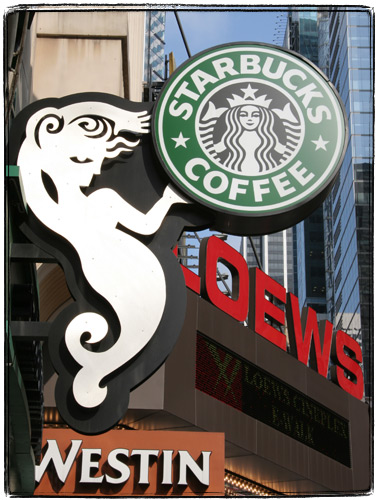
Lately I’ve stopped seeing pictures of the Siren on Starbucks mugs – they seem to favor just the word “Starbucks”. I also started seeing the new type of the siren as part of store decoration and on coffee packaging. She only has one tail. I guess the family-unfriendly image of a fish-woman spreading her tails is on its way out.

[update] Here’s a picture of the new siren:

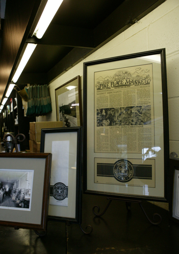
The brown Siren logo can still be found on merchandize sold at the original Pike Place Market Starbucks in Seattle. The logo is altered though – instead of a “cigar band” design it uses just a circle logo. Cigar band logo mugs and coffee jars can still be found on eBay for upwards of $50 per mug and $200 per coffee jar. I am still looking for anything bearing an “Il Giornale” (a company founded byHoward Schultz that later ended up buying out Starbucks with the help of none other than Bill Gates Sr.) logo.

[Update]
Dear Boing Boing readers – you might enjoy other sections of this blog such as Gastronomic Adventures and 100 Views of the Empire State Building.

[Update]
I was alerted to another article that explores the Siren’s symbolism. I haven’t used it in my research, but it is very thorough.

[Update] The whole logo history is described pretty well in Pour Your Heart into It : How Starbucks Built a Company One Cup at a Time. The book is full of other Starbucks trivia: if I remember correctly, it states that Howard Schultz is a close friend of Yanni.

[Update]

I received some information from Doug Fast, the designer behind the green logo. He also graciously sent me some rare examples of the logo, for which I am extremely thankful.

“I am the guy who designed the green SBUX logo. The original brown SBUX logo was designed in 1971 by my employer before I started working for him in January 1974. ( I still work there as a designer) The design company was then called Heckler/ Bowker, here in Seattle. Bowker (the company copy writer) was one of the three original founders of SBUX and left Heckler/ Bowker in 1984 to take on SBUX full time. (there were 5-6 stores at that time) The other two founders were; Jerry Baldwin and Zev Siegal. Heckler/Bowker came up with the Starbucks name and Heckler came up with the first (brown) logo. The other name strongly suggested was Pequod, but lost out to Starbucks.

The original SBUX store was NOT in the Public Market or in the Arcade as people think. It was at the corner of Western Avenue & Virginia, just north, across the street from the Public Market at the foot of the steep hill going up to 1st Avenue, and opened it’s doors in March 1971. I have a photo of it and also a drawing of it that was on an SBUX Christmas card from 1977.

The first retail Starbucks coffee drink concept store was originally called Il Giornale, and located on 4th Avenue in downtown Seattle. There was only one of these stores ever. I designed the logo for that in 1985-86, plus the coffee bag packaging, and still have the stationary, bags, and cup designs in my sample file. Howard Schultz was still an employee of SBUX at that time, not the owner, as I’ve seen said in previous blog info. here.

The reason only ONE Il Giornale store ever existed was because of the purchase of SBUX by Howard and his investers, and because the SBUX name and logo had so much capital already, they changed Il Giornale back to SBUX and wanted a more reproducable SBUX design, to go national.

I did the green “full siren” logo with a stronger, simpler, read for reproduction. The SBUX type was HAND DRAWN and based on the typeface, Franklin Gothic (this was pre-computer, folks) and had to be drawn so it bent well, around the circle. We submitted the logo to Howard, one with a red color and one in a green color. He picked the green color option.

In 1992 we had to blow up the siren to eliminate the spread, so called suggestive tails, so that’s the version you see today.

I still have most of the original concept work for the creation of this logo in one of my big sketchbooks. To me at the time, it was just another logo job to do. Who would have thought I’d be sick of seeing it all over the place. It isn’t one of my best logos.”

Original stores from the old coffee bag:

The original “cigar band” logo:

Il Giornale logo:

Green “bellybutton” logo

One of the newer coffee bags that reimagines the siren:

New “cigar band” logo with covered up nipples and cleaner lines:

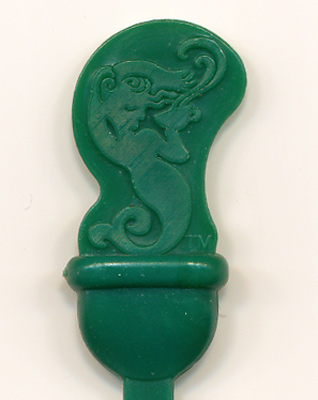
New plastic stirrer / plug in the shape of the siren:

Old logo at one of the first (from what I hear it’s not the “original” location) stores at the Pike Market in Seattle

original-starbucs-logo

starbucks-pike-market

Did reading this article inspire you to write a poem about Starbucks? You can use Rhymebuster, the algorithmic rap generator. Turns out a lot of things rhyme with Starbucks (other than sucks).


Amdahl : Business in the Front, Party in the Back

A few years ago I purchased a strange piece of computing history on eBay. Some guy in Canada was selling what he described as a “model” of an Amdahl processor. He did not include a picture with his listing, and because of that I was able to snap it up for about 30 wing-wangs.

When the package arrived, it turned out to be a real 42 (!) processor board from an old Amdahl mainframe that was “presented to T. Eaton Company for its purchase of Amdahl 5995-3550M processor in June 1992” as the plaque said. T. Eaton Company no longer exists, it was swallowed by Sears. Neither does Amdahl – it is a part of Fujitsu now.

The little cooling towers made it possible to air cool the chips.

The back of the board was very strange though. All the wiring seemed to be done “point-to-point” by hand. Overall, thinking about how many work-hours went into designing and making that board made me shudder.

[update] Thanks to the Boing Boing liks this seems to have become the second popular post on my site – first one being the Revelation post which gained popularity thanks to being the only google result for “omnioum finis imminet” for a while. I’ve got some great information from former Amdahl employees:

Tom: ”
The item is an MCC (multi-chip carrier) from an Amdahl V8, V7 or V6. Many were plugged into either side of a large frame which connected the MCCs to each other and to power, the console, memory, and the IO cables.

The finned gizmos are cooling towers glued to the top of the individual chips. A plastic cover directed cool air over the towers and fans exhausted it out the top of the frame
hese were used in the 470 series computers. The follow on computer, the 580 used much larger boards about the size of a pizza box. They were inserted into a plenum (which became known as the pizza oven) with ZIF connectors on the side. They had black instead of gold cooling towers with more fins.

The board is circa 1980. The back wiring was done in Japan because they couldn’t find enough people in the US who could do it well. I believe the chips were laser bonded on the front with the hand wiring on the back. Note that the circut boards were multi-layer and the back wiring was only used where they couldn’t get enough paths from the circut boards and for engineering changes after production.

NoOneAtAll : “Amdahl used to give out dead hardware and out-of-date engineering samples to their sales guys made into lots of different things. I’ve seen coasters made out of unusable processors, an Amdahl sales binder made from a set of bad carrier boards, a couple of plaques like this one made from DOA MCC modules, pen holders made out of ribbon cable, etc.

An IBM reseller I worked at spent Amdahl’s entire corporate lifetime telling them no. By the time the sales guy gave up, pretty much everyone at the company had been hit up by the guy as a possible lead, and pound for pound there was more dead Amdahl hardware repackaged as kitsch on the desks in sales than we had actually moved in Amdahl equipment. ”

[update] Two similar processors just came up on eBay. The picture quality is ghastly, but they seem like a bigger version of the one that I have, with even more complicated back wiring.

P.S. Don’t forget to take a look at the rest of my blog, or if you are interested in Amdahl, at the rest of my Amdahl-related posts.

Deadprogrammer’s Favorite Skyscraper

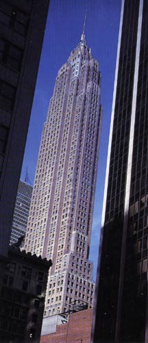
My favorite skyscraper is a little obscure (like many of my favorite things). Today it’s called the AIG building. When it was built, it was called the City Services Building or Sixty Wall Tower.

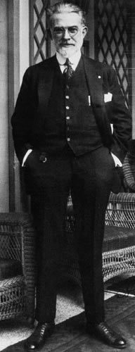
The soaring art deco tower was built for City Services Corporation, a company willed into being by one Henry L. Doherty. Doherty was a thoroughly Randian character. A self taught engineer, he started off by leaving school in 1882 at the tender age of 12 to go to work for a local gas company and went on to build one the biggest electric, oil and gas companies worth 1.3 billion in 1930. A technophile, Doherty traveled around the country in his personal train car with telephone and wireless equipment to keep in touch with his empire. Even his bed had phone connections, and electric fan, heating pads and electric motors that could move it through remote control swinging doors onto a porch of his penthouse apartment. He was a very good executive and salesman, but always took a title of Chief Engineer. He even applied for an official engineering license (as he didn’t have any academic credentials). He did have 150 patents to his name and had many articles about oil refining and economy published.

The architectural firm of Clinton & Russel, Holton & George was given the task of designing City Services Building, but Doherty and his engineers had a hand in it too. The building’s heating and air conditioning system was designed by City Services engineers, and Doherty himself suggested double-decker elevators, and terraces with aluminum railings. The building was planned as an embodiment of Doherty’s vision.

The tower starts of as a chunky block wide “wedding cake“. The reason for that is New York City zoning laws. NYC building had to have “setbacks” that would allow light to reach the ground. This was required so that the shadow of a skyscraper would not permanently block daylight on the street. But higher than a certain level you could build without setbacks though. And that’s exactly what the architects did in this case: above the “wedding cake” is a tremendous tower.
The building is recursive: there are two columns shaped like it on it’s sides.

When I was reading The Fountainhead”, this is how I imagined the Dana Building. Coruscant City towers look very much like the City Services Building.

Doherty was planning to live in a penthouse apartment on top of the building. But his health gave out, and after spending some time in sanatoriums he died. Instead of the penthouse apartment an observation gallery was built.

City Services building also became the final masterpiece of it’s architects, Clinton & Russel, Holton & George. No major work came their way after senior partners Clinton and Russel died, and then one of the junior partners, Holton died and George retired.

City Services Inc was hit hard by The Public Utility Holding Company Act of 1935: they were told that no company could sell or produce both oil and gas. They chose oil and became CITGO. The company moved it’s headquarters to Tulsa selling City Services Building to AIG. AIG renovated the building, but closed off the lobby and the amazing observation deck to the public. Now the observation deck serves as an executive lounge. If you have some juice at AIG and could give me a tour… Well, that would make me happy. Well, it could happen.

Much of my information for this article came from a very good, but poorly organized book called Skyscraper Rivals. I could not find any books about Henry L. Doherty except a $350 “Principles and Ideas for Doherty Men”, a compilation of his articles and letters.

Wegee was a big fan of City Services Building, a book “Weegee’s People” chronicles the life inside the tower. When I get it, I’ll write another article about the double decker elevators, the all-female redhead elevator operators and other marvels of the City Services Building.


Henry L. Doherty and the City Services Building (from “Skyscraper Rivals”)


This is how I get to see the AIG building from a train window.


Coruscant City from Star Wars (image from http://www.wizards.com)