I always liked the concept of branding. There is something very noble in putting your mark on something you created. If programmers were always required to put their name and contact information as a comment in every piece of code they wrote, maybe there would be less bad code. People usually are embarrassed to put their brand on something inferior. And if not, at least the end users would know whose abomination they are dealing with. There is a bank near where I live. It’s called Roslyn. That’s a weird name, right? Ok, I thought. Maybe that’s the name of the founder. The rose on the logo is because of “ros” in the name. Heart? That’s something the graphic designer put into it. But then, during the remodel of the building I noticed the original name plaque which was visible for a short period of time. And it turned out that the name of the bank probably occurred kind of like the “fishbulb” Mr. Sparkle from that Simpsons episode.

Announcer: [in English] Mr. Sparkle. A joint venture of Matsumura Fishworks [a smiling fish appears on the left half of the screen] and Tamaribuchi Heavy Manufacturing Concern [a light bulb appears on the right half of the screen. The two logos meld to form — Mr. Sparkle!] The bank near me used to be called Roosevelt Bank. And then it merged with Lincoln Bank.
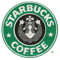
I might be wrong about this though. It’s just that I’ve also seen a Lincoln bank in Brooklyn that became Roslyn. I am also not sure which Roosevelt this was, Teddy or FDR. Anyway, moving on. I noticed for the fist time the special “nibbled” letter “O” in Microsoft’s logo when I was on Microsoft’s campus. At first I thought that it was just a “bug” – maybe the logo manufacturer missed a small piece :). In the cafeteria that was near the artificial waterfall I had a burger called “the blibbet burger”. I only learned what that was much, much later. Apparently the old MS logo featured a funky letter “O” which was called “the blibbet”. In 1982 the new, much more subtle logo was introduced. The programmers were already mightily pissed by marketing people which were starting to play a much more important role and this was the last drop — a huge “Save The Blibbet” campaign swept the campus. I dug this up at uspto.gov:  I am still pissed off that I didn’t see Lake Bill (check out this awesome 3d view) and the Microsoft museum. And our handlers didn’t have any extra coupons for the Microsoft company store. Maybe next time. Now Starbucks. It took me a while to realize that the woman on the *$ logo is a mermaid. You see, I was used to a regular, single tailed variety. But apparently the one on the logo is a two tailed mermaid (or a siren) referred to as Melusine. I’ve read about it in some book about symbolism that I purchased at Barnes&Noble. Apparently the two tails have something to do with the Melusine’s ability to have sex with sailors, and being a sexual symbol. Think about it. I bet the whole thing with spread legs/tails on the logo is what caused the later redesign of the logo, on which you can only see the upper part of the Starbucks siren. The old logo is usually referred to as the “bellybutton logo” because you can see the siren’s bellybutton. Items with the old logo are pretty hard to come by.
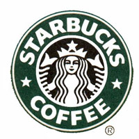
In fact, the first logo wasn’t even green, it was brown. But I’ll write more about Starbucks later. More? You want more? Well, I wrote about the three versions of NASA logo, the Worm , the Vector and The Meatball here.