Please help me to compile a list of ideas for web developer-appropriate tattoos. Here are some to get you started:
1) “It works on my machine”
2) “Have you flushed the browser cache?”
Blogging since 2002
Please help me to compile a list of ideas for web developer-appropriate tattoos. Here are some to get you started:
1) “It works on my machine”
2) “Have you flushed the browser cache?”
These days there are a lot of documentary shows on TV about various professions. I am somewhat addicted to them – I watched whole seasons of shows about hairdressers, crab fishermen, lobster fishermen, tattoo artists in Florida, tattoo artists in Nevada (but not the one about tattoo artists in LA), restaurateurs, ice road truck drivers, custom motorcycle builders, custom car builders, correctional officers and inmates, and the Philadelphia meter maids.
My own profession is mostly untelevisable. Mostly. Well, maybe some TV network might make a show out of Aardvark’d: 12 Weeks With Geeks. I also think that there could be a tiny market for a heavily edited “looking over the shoulder” video on the code writing habits of colorful alpha geeks like Linus Torvalds, Donald Knuth, Brad Fitzpatrick, Dries Buytaert, and maybe even JWZ. I’d buy that for a dollar.
I found that there are two occupations that are unexpectedly similar to that of a software developer: prison inmate and line cook. Both of these are heavily male dominated, involve a disproportionate amount of minorities and are very stressful.
I recognized offices in which I worked all my life in prison layouts. The common criminals usually live in a common area in the center of the prison. This is exactly like a common area of an office, except with bunk beds instead of desks. Some actually have semi-private cubicles. Inmates organize into gangs, just like departments. Gang leaders are usually placed into single or double cells that line the perimeter of the common area to cut down on the communication between them and their reports. Even there you have to be a manager to score an office.
Restaurants are a lot like developer shops. You have your front of the house: waiters (sales people), hosts and managers, food runners (analysts). And then you have your back of the house: chefs (architects and lead developers), line cooks (developers) and prep cooks (producers). There’s no good equivalent for dishwashers in a typical developer shop.
People often assume that a chef primarily cooks and a lead developer primarily codes. Do you know the title of Julia Child’s awesome show? Well, she was neither French nor a chef. Chefs do surprisingly little cooking, they are more like conductors in orchestras. They create menus, divvy up the tasks, check quality, train and supervise cooks. Best chefs, just like the best lead developers do find time to cook, but still spend more time organizing, tasting and researching.
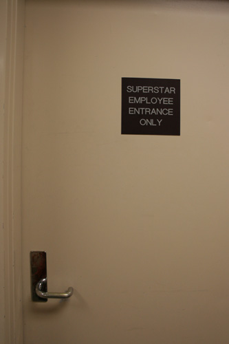
For those not in the know – Superstar is a company, I think they were purchased by TV Guide. In any case, they shared some office space at TV Guide headquarters in Tulsa, OK.
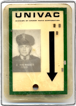
I picked up for a few bucks this Univac security guard’s shield. Like many security badges it’s based on a New York State Great Seal. The proportions are changed and the figures of Liberty – woman holding a Phrygian cap on a stick (well, actually Liberty pole if you want to get technical) and Justice – woman with a sword and scale. There’s sunrise over Hudson inside the shield, but without the two boats. New York State’s motto Excelsior (which is Latin for “Up Your’s”).
![]()
The plastic laminated id is kind of cool, because it’s a miniature punchcard.
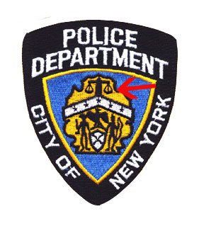
I guess the manufacturers of rent-a-cop badges are trying to make them subtly similar to NYPD logo, yet different enough not to get in trouble. NYPD badge is based on a similar, yet very distinct New York City Seal. Instead of Liberty and Justice it features American Indian with a bow. The other figure is enigmatic – for the longest time I thought that it was another American Indian holding a dead animal or a tomahawk. In fact, it turns out to be a Dutch sailor holding a “sounding line” – a nautical depth measuring rope. Another useless bit of trivia: Mark Twain chose his pen name from the expression “mark twain”, meaning only two fathoms reading on the sounding line.
The five stars on the chevron are for the five boroughs, the windmill is for the Dutch origins of New York City. The most unsettling part, is of course the Justice scales that rest on top of fasces, a bundle of sticks with an axe inside – the ancient symbol of authority. Along with the swastika, fasces has been marred as a symbol of Fascism, to which it gave its name.
Same old album. Here I am, at the shore of the Black Sea wearing my favorite cowboy hat. Man, did I love that hat. It had this feeling about it… The feeling of something a bit forbidden (cowboys after all were an American icon), and a feeling of freedom. My parents only let me wear that hat as a reward for finishing my summer homework assignments on time (which I rarely did), so there was also a feeling of accomplishment.
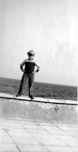
It’s kind of sad that wearing hats is out of fashion these days. Hats make you feel special. A fedora, a cowboy hat, a top hat, a derby hat. Gone, nobody wears them anymore, nobody remembers how special they are.
I keep meaning to buy a cowboy hat like that again, but never get around to it.
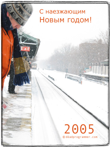
I created some postcards to send out via email, but my contact list is messy, some of the emails are old. I am hungry and thirsty (there’s a bottle of Veuve Clicquot and some Vietnamese food waiting for me), so if you did not get a postcard, here they are:
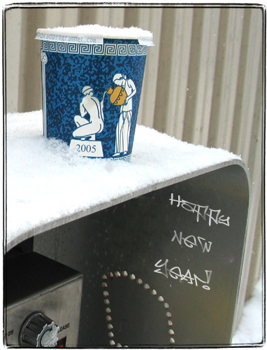
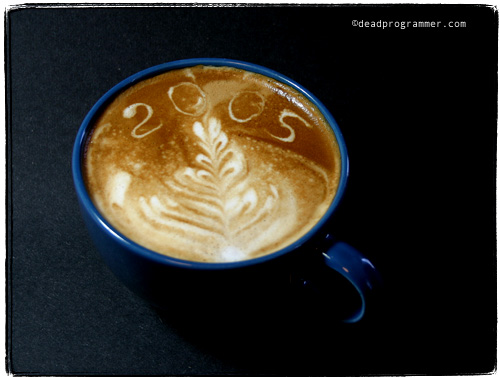
I have to admit that the I copied the idea from a postcard that was sent to me by Reneka – the maker of my coffee machine. I’ve made this latte art pattern with their machine – no Photoshop, so I am hoping they are not going to hold this plagiarism against me. The postcard they sent features a cup with “05” in it – I added a pine tree looking rosette.
Sugar producers must be reeling from the effects of low carbohydrate diets: how else you’d explained this shining example of sugar marketing that I found recently in my hotel room?
That’s right – only 15 calories per serving! It’s a diet food!
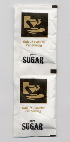
I found another example of sugar marketing innovation in a grocery store where I shop – Dominos Sugar seems to have a wide variety of exotic sugar products, like Organic Sugar, Brownulated® Sugar (a perfectly cromulent word for high-tech brown sugar) and these ultracool sugar stick packets that upon closer examination turned out to be even more exotic:
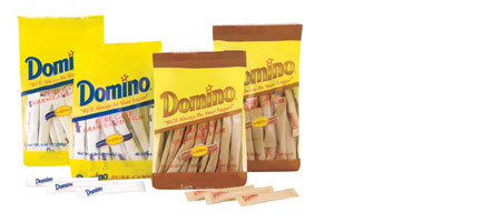
“Available in two varieties: pure cane granulated and Demerara – a golden brown crunchy sugar grown and harvested on the island of Mauritius, off the African Coast.”
Ahhh, that set off a whole bunch of childhood memories for me. First of all, growing up in the Soviet Union where most sugar was made out of beets, upon reading about cane sugar in Mayne Reid’s books I thought it to be something super exotic, like the books themselves. Because of that I always associated it with America and adventure, and found the common explanation that cane sugar tasted exactly like beet sugar, except a bit less sweet, (which is indeed the cast) inadequate.
Mayne Reid, by the way is one of that breed of writers that are extremely obscure in America, but famous in the former USSR. There Reid was considered to be on par with Jack London, just like Robert Sheckley enjoys popularity equal to that of Ray Bradbury. I mean, come on, Sheckly basically invented the concept of reality television, but this seems like a topic for a whole different post.
Back to our exotic sugar. “Grown and harvested on the island of Mauritius”, huh? Generally horribly ignorant of geography I immediately recognized the isle of Mauritius as the location that produced two of the most famous rare stamps known as “Post Office Mauritius” stamps.
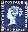
The highly romantisized story goes something like this: the governor of the tiny British colony wanted to issue some of those newly invented “postal stamp” thingies and ordered a batch from local engraver Joseph Osmond Barnard. The engraver allegedly forgot what copy needed to go on the left side of the stamp and went looking for the postmaster. When he was approaching the post office, he suddenly remembered – “Post Office”, went back and put that on the stamp. The postmaster was massively pissed off – it should have said “Postage Paid”. Most of the stamps from the “error” batch went onto the governor’s wife’s fancy dinner invitations.
There is a lot of controversy (read further down) weather “Post Office” was actually a mistake, but mistake or not, the story captured collectors’ imaginations and the invitation envelopes sell in multimillion dollar range today.
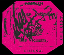
The postmaster of nearby Mauritius used handstamps to “cancel” postage, but back in those days stamps were sometimes “cancelled” by hand, with a strike of a pen or sometimes with a signature. For instance, the postmaster of nearby colony of British Guiana placed his autograph on every single stamp along with a stamped “cancel”.
His autograph on the famous “Penny Magenta” was sold for just under 1 million dollars in the nineties. What makes the story more interesting is that the original owner, Vernon Vaughan, 12, of Demerara (aha!), British Guiana sold the ugly, dirty stamp that had its corners clipped by somebody probably out of boredom, for an equivalent of a couple of bucks to a stamp dealer.
I remember reading about the last sale in the philatelist magazine and wondering who the anonymous buyer was. Only now I learned that it was the crazy du Pont heir that was convicted of killing an Olympic wrestler.
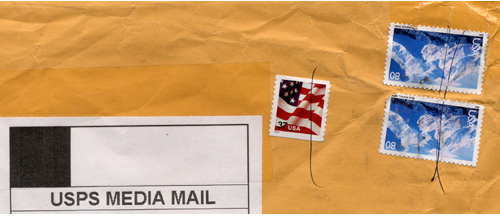
In this age of book superstores and computer processed mail, recently I was pleasantly surprised to see a real pen “cancel” on an USPS parcel containing shipment of books from a small bookshop. Maybe there is no automatic sorting machine at that remote little town and the postmaster could not locate a handstamp :)
Speaking of the color. Here’s a magazine that was thrown out by some professor at my college:
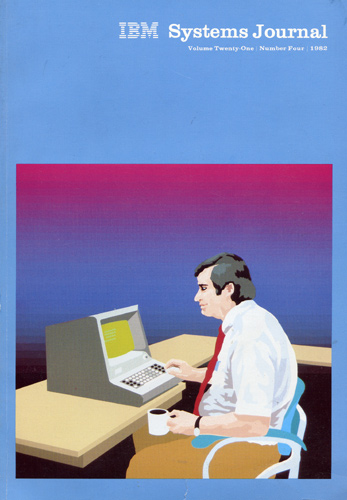
IBM Systems Journal Volume 21 #4 1982:
“With the use of the computer as the art tool, our cover symbolizes the interaction between man and machine. Two of the papers in this issue discuss usability considerations for the design and development of interactive systems”.
There is no credit for the cover art, but my guess that it would be attributed to J.F. Musgrave who is listed as Art Director.
Screen closeup:
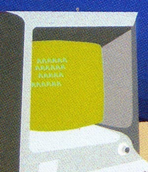
I like a lot of things about this picture. The sleeveless white shirt, the ugly tie, the beer gut, the coffee mug, the expression on the headcount’s face. The ASCII art on the screen. The eery transition effect in the background.
Don’t you think that “Armonk Blue” would be a good name for a Benjamin Moore paint?
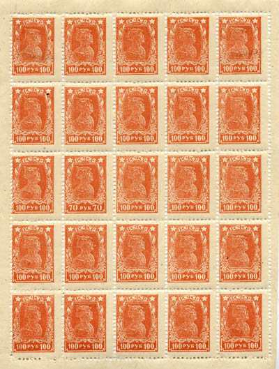
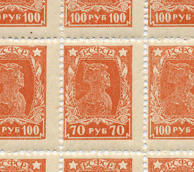
What’s unusual about this sheet of 100 ruble RSFSR stamps?
Because of printers mistake a single 70 ruble stamp made it into a 100 die plate. A regular 70 ruble stamp is purple.
I’ve purchased this sheet for $20 on ebay.
Yes, I am a nerd. It’s very possible that I have a very mild case of Asperger’s. I have to confess: I collect stamps. More than that. I don’t just collect any stamps. I inhabit a very very obscure and narrow niche in stamp collecting. It will probably take a paragraph or so to explain what kind of stamps I collect.
I collect stamps of RSFSR (РСФСР). You see, familiar to everyone USSR (CCCP) was not formed right after the Bolshevik Revolution. That revolution transformed Russia into RSFSR – Russian Socialist Federated Soviet Republic. RSFSR was created in 1918. In 1922 it became a part of the USSR.
It was a post-revolutionary time. Time of confusion, reform, destruction, civil war, hunger, commissars. Lenin in charge, St. Petersburg is called Petrograd. The whole country is in convulsions. But the post continued to function. More than that, very talented engravers created stamps of amazing simplicity and striking beauty. As a reflection of the times the stamps are sometimes printed imperfectly. A stamp might have had hundreds of small variations, which may or may not affect their value. People spend their entire lives researching this stuff. The cool thing is that these stamps are in their majority very affordable because they were printed in large numbers.
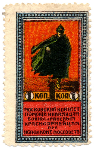
More recently I started collecting another weird type of stamps. This category of stamps is even narrower and they are not even technically postal stamps. They are charity stamps of something called VSEROKOMPOM. As you might have noticed, Bolsheviks very much liked acronims and shortened pharases. VSEROKOMPOM is a shorter version of “Vserosiyskiy Komitet Pomoschi Bol’nim i Ranenim Krasnoarmeytsam i Invalidam Voyni pri Vserosiyskom Ispolnitel’nom Kommitete Sovetov”. I’ts can be roughly translated as “All Russia Comittee for Helping SIck and Vounded Red Army Soldiers and War Invalids with the All Russia Executive Comittee”. VSEROKOMPOM seems easier in comparison, right?
Well, in any case, it was a charity that helped sick and wounded Red Army soldiers (and there were lots of those around after the revolution and the civil war). These stamps were sold all over the country. It would work approximately like that. A boss in some office, store or factory would get a quota of these stamps to distribute. He or she would distribute those stamps among all the workers. And they in their turn would try to sell them. Cashiers often forced customers to accept the stamps instead of change. A bureaucrat would affix these stamps next to revenue stamps on government paperwork and charge the person who submitted the papers. The stamps would be added to movie and theater ticket stubs, money transfers. Well, you get the idea.
The cool thing about those stamps was their design. Bright, expressive these stamps speak to you. They scream at you. They are real works of art. This stamp would make a pretty good poster, don’t you think?
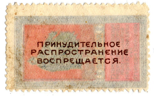
The text on the back of the stamp says: “Forced Selling Prohibited”. Yeah, right.