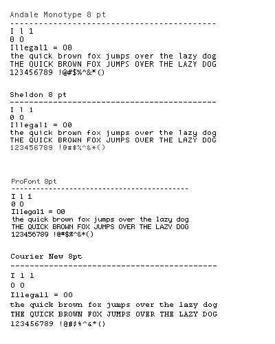
Yesterday I spent a good deal of time searching for a good font to use with Ultraedit. There are three well-known requirements for a font to use in programmer’s editor:
1) It has to be a fixed width font.
2) Visual distinction between letter “O” and zero. Usually zero is “crossed”.
3) Visual distinction between Capital lower case letter “l”, capital letter “I” and number “1”.
In general such a font should be super legible in small point sizes.
I used to use Courier New, but finally found a font that I like much better, Andale Monotype. Microsoft used to distribute that font with IE 5, but now it’s not available for free download anymore.
And next day the most famous Joel on the Web wrote a post about another very nice programmer’s font called “ProFont”. I tried it along with another similar font called “Sheldon”. I think I still like Andale better.
UPDATE: This seems to be a holy war in the making. I especially like the guy who uses “Comic 12 pt “. If it is what I think it is, this dude’s code must read like a comic book. Bam! Pow!