On the Importance of Lube

As a response to meaningless discussions about microformats, standards, widgets and other unimportant web gunk I wrote an article Deadprogrammer’s Hierarchy of Web Needs. The gist of that post is that what matters the most is text and images, and that the importance of everything else above it falls in geometric progression. Things high on the pyramid get too much consideration.

There is one modifier that does not fit on the pyramid: lubrication. You see, there’s a lot of friction associated with putting content online. It’s a major limiting factor to the growth of the internet. Those who focus on the base of the pyramid and apply enough lube succeed.

Twitter succeeded because it is the ultimate lube, the equivalent of a major dose of oil-based laxative. It lets you put little pooplets of thought at the speed of diarrhea. Text alone is enough – it’s the very base of the pyramid. Because of that people forgive Twitter the url shortening pandemic – the very thing that is poisoning the exchange of links, the terrible handling of images, and the procrustean shortening of the information that you can share.

My ideal twitter feed is kind of like now defunct memepool.com, but with inline images. I want good copy, I want good images and I want good links (and not the terrible shortened crap – this is not what hypertext is about).

Besides lube, there is stuff that seems like a good idea, but is actually adding friction. The days of black backgrounds and blinking text are behind us, but the new enemies of eyeballs are more subtle. Hashmarks in Twitter are terrible. I can’t read shit like “ugh, bad #weather in #hoboken #today #firstworldproblems”. Another thing that acts as sand in my eyes is “winerlinks“. They are little hashmarks that let you link to every paragraph in the story (which is a great idea), but at the same time they look like a bunch of bedbugs and scrape your eye with every saccade.

The year is 2011 and we are walking with supercomputers attached to digital cameras more powerful than the ones that went into space probes. Yet sharing an image is still a huge pain in the ass. It just takes too many steps. Iphone apps do it relatively well, even if too many people mangle their perfectly good pictures with a totally un-fun “a fun & quirky way to share your life with friends through a series of pictures” (whatever that means).

Here’s Vannevar Bush talking about “memex trails” in “As We May Think“:

“The owner of the memex, let us say, is interested in the origin and properties of the bow and arrow. Specifically he is studying why the short Turkish bow was apparently superior to the English long bow in the skirmishes of the Crusades. He has dozens of possibly pertinent books and articles in his memex. First he runs through an encyclopedia, finds an interesting but sketchy article, leaves it projected. Next, in a history, he finds another pertinent item, and ties the two together. Thus he goes, building a trail of many items. Occasionally he inserts a comment of his own, either linking it into the main trail or joining it by a side trail to a particular item. When it becomes evident that the elastic properties of available materials had a great deal to do with the bow, he branches off on a side trail which takes him through textbooks on elasticity and tables of physical constants. He inserts a page of longhand analysis of his own. Thus he builds a trail of his interest through the maze of materials available to him.

And his trails do not fade. Several years later, his talk with a friend turns to the queer ways in which a people resist innovations, even of vital interest. He has an example, in the fact that the outraged Europeans still failed to adopt the Turkish bow. In fact he has a trail on it. A touch brings up the code book. Tapping a few keys projects the head of the trail. A lever runs through it at will, stopping at interesting items, going off on side excursions. It is an interesting trail, pertinent to the discussion. So he sets a reproducer in action, photographs the whole trail out, and passes it to his friend for insertion in his own memex, there to be linked into the more general trail.”

Stinging together these trails is still too cumbersome. Have you ever tried to post a picture of two items (what JWZ calls “ exhibit A, exibit B” (this particular link leads to a collection that is totally worth your time)? What if there are no pictures of these items on the internet and you have to scan or photograph it, upload it, crop it, post it? And what if like Vannevar Bush’s bow and arrow researcher you’d like to add a comment in longhand, your own handwriting. Or how about a little hand-drawn diagram? This simple task will likely take at least half an hour.

But enough bellyaching. It’s 2011, and the flying cars are almost here. There’s Skitch and Evernote (Phil Libin seems to be making the dream of Memex a reality in a less lame way than anyone else). And as an alternative to Twitter there is Google+ – I can drag an image from Skitch into a text area and it automatically uploads! When they’ll open up the API doing A/B posts will become finally possible there. Please, please leave the suffocating, hashtag strewn stinkhole that Twitter became. Join Google+. I’ll be hanging out there.

Hunting Heads and Developing Back Ends

I’d like to share with you a few thoughts about tech recruiting. This is not a post about how to write resumes, read resumes, ask or answer tech interview questions. Enough is written on the subject by people who are better at all of this than me. No, it’s about that email that arrives in almost every developer’s inbox about “a full-time, permanent position with a very competitive salary” for “a very prestigious company located in mid/down/up-town” which is looking for “an alphabet soup of technologies”. Half the time it’s a phone call. These happen during the times of boom and bust in the tech sector, although with varying frequency.

Now, people who are not programmers would probably think that this is spammers or scammers who will ask for a fee. Well, there is a fee involved, but this is not scammers: every time there’s a reasonably well paying job involved. A huge number of programming positions gets filled this way.

There’s always a shortage of decent software developers, project managers, system administrators and allied tradespeople. This was true back when I was starting my career, in 1997, but it only got worse. First of all the cost of running a startup came down from hundreds of thousands of dollars to thousands, and many talented programmers with ideas, tolerance of Ramen-heavy diet, slumming, and a little risk exited the corporate workforce to build url shorteners and travel sites for hipsters. Top notch people with kids and/or love of brightly colored furniture and fridges stocked with fancy sodas were vacuumed up by Google, Microsoft, Facebook, Yahoo and other modern Xerox Parc-wannabees. The hedge funds sucked in all those who are good at implementing complicated formulas and algorithms in code that can make a Kessel run in 12 parsecs or less.

The biggies look for a healthy mix of specialists, but they can easily afford to hire jack-of-all trades hackers. Everybody else usually looks for a person who has proven experience with a certain “stack” – an alphabet soup of languages, operating systems, and servers. Sometimes stacks are ageless like COBOL, CICS, DB2 – even today typing it into dice.com brings up 155 results. Some come out of favor: LISP – only 16 results though. Somer are old standbys: Php MySQL Apache – 370 results: C# SQL Server IIS – 439 results. Some, like RoR are up and coming – 93 results.

If you are relatively young(cheaper that way) and have done some work with a fashionable stack your phone will be ringing weekly with recruiter calls in the dreariest days of a tech bubble burst. If you are a specialist who deals with a particularly gnarly piece of hot tech – it will ring a few times a week.

Now here we come to a somewhat interesting phenomenon. Most of the time the person calling is a “headhunter”. Here’s what’s happening:

Web department in company Webco Enterprises has an opening. It could be caused by a number of things, but most commonly

1) after gettig tired of incessant complaining of the VP of Web Things, the Bean Counter finally agreed to budget in Y dollars for another headcount.

2) an experienced headcount who was making Y dollars accepted an offer of Y + $30,000 + an office with a door from company iWeb 2.0 and left.

So here is VP of Web Things with a budget of Y dollars. She’s swamped with work. In the next team meeting she tells her nerds to ask all of their friends if they know somebody and offers a referral bonus. Next she puts together a typical job ad complete with technological alphabet soup and takes it to the Master of HR. The Master of HR posts it on the company intranet, on the corporate site and on monster.com, dice.com, etc. Next VPoWT goes to the same sites and looks for candidates who posted their resumes there. It’s mostly drek, and the one person who might be ok wastes a lot of her time because he has another offer for Y + $10,000 from another company.

Now more desperate, she starts using “headhunters”. They send a couple of somewhat crappy candidates, followed by one barely ok one, followed by one who’s good enough. After a little song and dance the good one accepts Y dollars per year minus – 15% that silently go to the recruiter. The next few years he’ll be getting modest raises and maybe even a bonus or two that will not break the budget: the Bean Counter approved Y dollars, and it stays in the budget like that, and the headhunter only gets paid once.

Now, here’s what was happening on the other end: headhunters start pounding searches into their computers. LinkedIn, all recruiting sites, internal databases, etc. They might not understand what those letters in the alphabet soup mean, but they sure can try to match them up with what comes back from searches. Then they start shooting in the dark – it’s easier to get people who are currently looking for jobs, but it’s the shallow end of the pool that VP of Web Things already explored somewhat. They start pinging people who are working at the moment – this is where the good heads are.

Finally someone hunts up the the right head for VPoWT’s headcount and pockets the 15% of a yearly salary of that head.

Now, here comes the interesting part: most of these headhunters who are calling are trying to line up publicly available job listings with people on LinkedIn. For instance, I recently received two emails about a rather awkwardly named position “Director of Back End Development” (second recruiter spelled it “Backend”).

I looked it up on one of the recruiting sites (I think dice.com), and it was an old and infamous pre-dot-com-boom company that chose such a unique job title for what I do for a living. It was literally the only one with that creative title. I could have applied directly, bypassing the 15% headhunter’s fee. This is the reason why headhunters rarely name the company name.

In the past, through my random and numerous connections I’ve heard stories about what the setup is like at that place, and it’s a doozy. I’m pretty sure that the person who will take that job will take a lot of development up his or her back end.

The moral of the story is this: it’s easy enough to bypass recruiters – they are just engaged in arbitrage: the hiring manager is busy, the potential headcount is not even looking. That 15% is OPM (other people’s money) to the hiring managers, but not so much to the headcounts.

Memex is Here

I think I finally found a piece of software I was searching for all of these years, the Memex that Dr. Vannevar Bush predicted. Too bad that the  good ol’ leader of the Majestic 12 is not around to see it.

Evernote is almost everything that I ever wanted in a Memex. It now even has a web component which will let me use it on Linux. The text recognition actually works and is useful, unlike what the retards at Riya were trying to do.

Evernote seems to be rapidly improving, in leaps and bounds. It was around for a while, but without web storage and access I wasn’t interested enough.

This is best symbolized by what I presume is an old logo, which is pretty lame:

The new logo, with an elephant (they never forget), a dog ear ear – now that’s recursive, and an overall look that would not be out of place on an early 20th century pencil box just simply rocks. There’s more hidden imagery in the elephant’s head. In any case, looks like a real pro made this logo.

Mu

I’ve been shopping for Japanese calligraphy scrolls lately. I wanted to purchase a scroll with a kanji “yume“, but instead ended up with “mu” instead. I purchased it without knowing what the character meant, just on the aesthetics of the brush strokes.

The concept of “mu” is touched upon in both Zen and the Art of Motorcycle Maintenance and Gödel, Escher, Bach. I’ve read both books (even if skipping large chunks) and understood maybe 5% of what the authors had to say. I really need to reread them a few times.

In the past I really hated graffiti and abstract art because they seemed meaningless to me. Now I like both, because Japanese calligraphy taught me that art can be both abstract and super specific at the same time.

My new calligraphy scroll is both a character that conveys a very specific word which has carries a meaning that Buddhist monks and computer programmers find very special, but is also a multitude of Rorschach test shapes. I see a woman’s head with flowing hair, a jumping fish, a Daruma doll’s head.

I wish I could read the three characters on the left as well as the information on the seals, find out who made this and when.  My guess is that it’s Showa era, after the war, and that the calligrapher is very skillful.

How the Starbucks Siren Became Less Naughty

[update] Starbucks logo changes again.

You are probably here because you looked closely at the Starbucks logo and were a little confused about what is depicted on it. Is it a mermaid? What are those things that she is holding up with her hands? Wasn’t the logo different before? What’s the history of it?

I asked those questions myself and did a little bit of digging. My research started with a book that I had, called A Dictionary of Symbols by J.E. Cirlot. In it there was a chapter about Sirens.

Basically, from what I gathered from different sources, including that book, there is a lot of confusion between the different mythological half-women. Typically they are called Sirens – both the half-bird/half-woman and the half-fish/half-woman varieties. The fish type are usually called Mermaids. Both types according to the ancient Greeks were in the business of seducing mariners with songs and promises of sex and then killing them, but Hans Christian Andersen and Disney mostly made everybody forget that.

The whole sex-symbol status of mermaids hinges on the question which part is “woman” – upper or lower. “The other type of mermaid” that hapless Fry was referring to would have problems attracting suitors, of course. And how do you do it with the normal type?

Wise mythologists came up with the answer, of course. And the answer is a two-tailed mermaid sometimes called a Melusine.

The book had an old engraving of a two-tailed mermaid. It reminded me of the Starbucks Siren, but back then I did not realize that the original Starbucks logo had a slightly altered version of that engraving in the original brown cigar band-shaped logo.

Notice that the graphic designer removed the belly button, the unattractive shading around the bulging tummy of the 15th century siren and merged the tail-legs to remove the suggestion of naughty bits. The logo Siren also smiles a little while its 15th century doppelganger is looking rather grim. Other than that it’s clear that this is exactly the image that he or she was using.

According to uspto.gov “[Starbucks] mark consists of the wording “Starbucks Coffee” in a circular seal with two stars, and the design of a siren (a two-tailed mermaid) wearing a crown”.

Here’s the “cigar band” logo from which I took the image above. The original hippie Starbucks owners did not sell espresso drinks, but mostly sold coffee beans, tea and spices. Today Starbucks sells liquor and ice cream, but no spices if you don’t count the cinnamon gum and the stuff on the condiment table.

The next, more familiar green iteration of the logo has a more attractive stylized siren. The chest is hidden, but the belly button is still there.

Here is the current logo. They cropped the siren image so that only a hint of the tails is visible. I asked hourly partners at Starbucks and friends, and none of them could figure out what those things to the side of Siren’s head were.

Lately I’ve stopped seeing pictures of the Siren on Starbucks mugs – they seem to favor just the word “Starbucks”. I also started seeing the new type of the siren as part of store decoration and on coffee packaging. She only has one tail. I guess the family-unfriendly image of a fish-woman spreading her tails is on its way out.

[update] Here’s a picture of the new siren:

The brown Siren logo can still be found on merchandize sold at the original Pike Place Market Starbucks in Seattle. The logo is altered though – instead of a “cigar band” design it uses just a circle logo. Cigar band logo mugs and coffee jars can still be found on eBay for upwards of $50 per mug and $200 per coffee jar. I am still looking for anything bearing an “Il Giornale” (a company founded byHoward Schultz that later ended up buying out Starbucks with the help of none other than Bill Gates Sr.) logo.

[Update]
Dear Boing Boing readers – you might enjoy other sections of this blog such as Gastronomic Adventures and 100 Views of the Empire State Building.

[Update]
I was alerted to another article that explores the Siren’s symbolism. I haven’t used it in my research, but it is very thorough.

[Update] The whole logo history is described pretty well in Pour Your Heart into It : How Starbucks Built a Company One Cup at a Time. The book is full of other Starbucks trivia: if I remember correctly, it states that Howard Schultz is a close friend of Yanni.

[Update]

I received some information from Doug Fast, the designer behind the green logo. He also graciously sent me some rare examples of the logo, for which I am extremely thankful.

“I am the guy who designed the green SBUX logo. The original brown SBUX logo was designed in 1971 by my employer before I started working for him in January 1974. ( I still work there as a designer) The design company was then called Heckler/ Bowker, here in Seattle. Bowker (the company copy writer) was one of the three original founders of SBUX and left Heckler/ Bowker in 1984 to take on SBUX full time. (there were 5-6 stores at that time) The other two founders were; Jerry Baldwin and Zev Siegal. Heckler/Bowker came up with the Starbucks name and Heckler came up with the first (brown) logo. The other name strongly suggested was Pequod, but lost out to Starbucks.

The original SBUX store was NOT in the Public Market or in the Arcade as people think. It was at the corner of Western Avenue & Virginia, just north, across the street from the Public Market at the foot of the steep hill going up to 1st Avenue, and opened it’s doors in March 1971. I have a photo of it and also a drawing of it that was on an SBUX Christmas card from 1977.

The first retail Starbucks coffee drink concept store was originally called Il Giornale, and located on 4th Avenue in downtown Seattle. There was only one of these stores ever. I designed the logo for that in 1985-86, plus the coffee bag packaging, and still have the stationary, bags, and cup designs in my sample file. Howard Schultz was still an employee of SBUX at that time, not the owner, as I’ve seen said in previous blog info. here.

The reason only ONE Il Giornale store ever existed was because of the purchase of SBUX by Howard and his investers, and because the SBUX name and logo had so much capital already, they changed Il Giornale back to SBUX and wanted a more reproducable SBUX design, to go national.

I did the green “full siren” logo with a stronger, simpler, read for reproduction. The SBUX type was HAND DRAWN and based on the typeface, Franklin Gothic (this was pre-computer, folks) and had to be drawn so it bent well, around the circle. We submitted the logo to Howard, one with a red color and one in a green color. He picked the green color option.

In 1992 we had to blow up the siren to eliminate the spread, so called suggestive tails, so that’s the version you see today.

I still have most of the original concept work for the creation of this logo in one of my big sketchbooks. To me at the time, it was just another logo job to do. Who would have thought I’d be sick of seeing it all over the place. It isn’t one of my best logos.”

Original stores from the old coffee bag:

The original “cigar band” logo:

Il Giornale logo:

Green “bellybutton” logo

One of the newer coffee bags that reimagines the siren:

New “cigar band” logo with covered up nipples and cleaner lines:

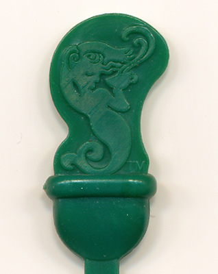
New plastic stirrer / plug in the shape of the siren:

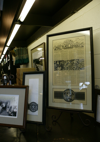
Old logo at one of the first (from what I hear it’s not the “original” location) stores at the Pike Market in Seattle

original-starbucs-logo

starbucks-pike-market

Did reading this article inspire you to write a poem about Starbucks? You can use Rhymebuster, the algorithmic rap generator. Turns out a lot of things rhyme with Starbucks (other than sucks).


The Fantom Photo Album

Being a fan of photography has its upsides and downsides. On one hand photographers notice more things. Beautiful things. Unusual things. Things that only can be seen through the lens of the camera that lives inside your brain.

On the other, if they don’t have a camera handy, or the batteries are dead, or there’s too little light, or if taking photos is prohibited or just simply not wise – photographers become agitated and miserable. Oh, the most wonderful moments that should be simply enjoyed can be poisoned by worrying about lighting, f-stops above all — the lack of camera in your hands.

The shots that did not happen – those are the worst. They linger in your head for a while, but then the moment passes, and the fata morgana of the perfectly composed and exposed picture dissolves into the bitterness of a missed shot. It’s even worse if you just did not have the guts to take out your fully charged, properly equipped camera and point it’s soul stealing eye at the situations, people, things and places that simply must be photographed.

Let’s see, off the top of my head, three shots that did not happen and still drive me nuts:

1) A young woman occupying the two-person seat of the R40 train (you know, the one next to the cab), bathed in the unearthly greenish glare of fluorescent lights, opposite a guy reading a newspaper and another one dozing. She is as pissed off as can be, the expression on her face a mask of anger, sadness and disgust. Yet she is dressed in a brilliantly colored butterfly costume, with big transparent wings. I just did not have the heart to take out my camera from my bag.

2) A bum sitting in the street, slumped in a cheap computer chair, kind of like the guy on the logo of my website. He rested his head on the handle of a shopping cart filled with ivory colored computer towers and topped with an old CRT monitor, a keyboard and even a couple of mice and modems. I think I even noticed a hub in there somewhere. The yellow plastic of old equipment and the depressed, bearded and unwashed guy would have looked ordinary in a cubicle farm, but outside in the midday New York sun they looked sad and alien. My camera was with me, but I forgot the flash card at work.

3) Japanese museum, a glassed in stand containing a samurai’s suit of armor, surprisingly small in size. The ghostly reflection of a petit Japanese girl’s face just would not line up with the dark opening in front of the horned helmet. The museum was closing, the lighting was dim, and I just did not feel like waiting for the perfect shot.

But then again, there are times when you take a picture, and then feel that you probably should not have. Those primitive people that feel that a photograph steals one’s soul might be onto something. It sure feels that way sometimes.Being a fan of photography has its upsides and downsides. On one hand photographers notice more things. Beautiful things. Unusual things. Things that only can be seen through the lens of the camera that lives inside your brain.

The Deadprogrammer Tarot Project

For a very long time I wanted to create my own Tarot deck. Complex symbolism of classic Tarot decks such as the Rider-Waite-Smith makes it next to impossible to recreate them faithfully in photographic format without posing people and items (which would look lame of course). I do want to stay relatively close to RWS canon though, so I am thinking about digitally altering my images to add swords and other things not commonly found in XXI century New York.

Please treat these as sketches, because final versions will probably be way different.

The Tower: Brooklyn College heating plant’s smokestack is as good a Tower as any. Maybe I’ll shoot it some day in a lightning storm.

The Moon: I need to reshoot this with the Moon between the towers and with the pond visible in the picture, but I think this is the right location for the card. The towers are Pierre Hotel on the left and Sherry Netherland Hotel on the right.

The Magician: I saw what is probably a bicycle inner tube rolled up in an infinity symbol along the glistening subway rails one morning, and the first thing that came to my mind was the Tarot card. Theoretically this should be a man with an infinity symbol over his head, but I really like this photo.

WML : Screw You, Computer Hardware Manufacturers!

Continuing with the screw theme, let me share with you another piece of fastener lore that I’ve learned over the year. As any person who ever cut her hands on ragged edges of cheaply made computer cases knows, when you buy a filthy overpriced little baggy of computer screws there’s a weird and confusing variety inside.

Here are the most common, left to right: chassi screw, cd-rom screw, floppy screw and hard disk screw. Now here’s the confusing part – The hex headed chassi screw is a bit bigger than the very similar cd rom screw. But the soft metal of computer components makes it possible to use it to fasten everything – floppy drives, cd roms, hard disks. It is the most useful screw of the four. I get the feeling that the hard drive screw is just a tad bigger, which makes it almost as useful, but it will get stuck if you try to attach a floppy drive with it. The cd rom screw and the floppy screws are next to useless – without knowing the proper type of screw to use, most people already embiggened the holes with chassis screws, and the little cd rom screws end up pretending to go in, but then falling out. They end up filling up all the useful space in the little box where I store my accumulation of computer screws.

Since I mostly buy cases with motherboards already mounted in them, I am not going to delve into the whole plastic vs. metal motherboard standoffs. I’ll just mention that the metal ones sometimes cause shorts by themselves, and plastic ones are sometimes not strong enough to prevent shorts from flexing. There, I said it. Now I’ll merrily continue my screw rant.

But at least the computer screw weirdness makes peoples life harder not on purpose. But some fancy pants computer (cough Hpaq cough) and consumer device (cough TIVO cough) manufacturers use torx screws and tamper proof torx screws. For that exact reason I own a whole bunch of torx screwdrivers. That is a bit sneaky.

But not as sneaky as the hardcore tamper proof screws made by Tamperproof Screw Company of New York:

Snake Eyes®, which I see a lot in elevator button panels, Tri-Wing® that I hear is used in GameboyTM devices, OpsitTM, which is which is built to make mockery of the holy mantra of “Righty Tighty, Lefty Loosey” – it tightens conterclockwise (just like MTA lightbulbs). Тhere are other weird things like philips or torx screws with a pin in the middle and one way screws.

Also there seem to be a whole bunch of Pozidriv screws around. I think that the last cam out fiasco that I had was caused by me trying to use a Pozidriv bit on a Philips screw or the other way around. It’s very hard to tell them apart. Luckily I had screw drill out set similar to this one. It works ok on easy cases, but for every screw that I remove with it there seem to be a couple where I end up just completely breaking down the head of the screw leaving the rest under surface.

Wow, it looks like Philips screw company has special aerospace screws, like this wicked looking ACR Torq-Set. I would be way cool to get a box of those.

This is just like one of my favorite Russian sayings – “Ð?а каждую хитрую жопу еÑ?Ñ‚ÑŒ хуй Ñ? винтом. Ð?а каждый хуй Ñ? винтом найдётÑ?Ñ? жопа Ñ? лабиринтом”.

WML : Mr. Squeek No More

Here’s yet another edition of WML – What Michael Learned. And the subject of today’s post is one of the things that I hate as much as I love hardwood parquet floors – squeaks. In SAT-speak I am somewhat corpulent and nocturnal. And a sonorous squeak of a parquet floor in the dead of the night is not one of my favorite sounds. I am certainly not one of those people who think that squeakiness adds character to an old floor.

A few years ago I searched for a way to repair squeaky floors and kept finding advice for those who could access the floor from below – in cases of houses with basements that expose the underside of the upper floors. Then recently I found a solution in an episode of Ask This Old House that works for me. It is marketed as “Squeeeeek No More“. That’s right – 5 e’s. Luckily Google suggests the “correct” spelling even if you use less e’s.

I bought my kit over here. It came with 50 snap-off screws, a square driver bit, a special stud finder screw (he heh) and a depth control/snap-off tool that looks like a Klingon weapon or instrument of torture.

Here’s how it works :

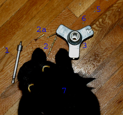
First of all you shoo away the cat (7). Then you need to find a parquet plank that squeaks. You do that by first finding the general location of the squeek and then with your foot sideways pressing on individual planks. Usually it’s only one or two loose planks that generate the noise when they move. Each one of the planks is nailed individually and it’s the nails that make the sound . You don’t need to worry about finding a stud – just drill a few pilot holes (so that the wood won’t split). Then using the square driver bit (1) you drive the screw (2) a few turns into the pilot hole. Then you drop a depth tool (3) over the top of the screw and continue driving the screw into the floor with the driver bit. The driver bit has a fat section at the bottom which will prevent it from driving the screw further than necessary when used with the depth tool.Then you use a T-shaped hole in the depth tool to gently break off the head of the screw (2a) by rocking it side to side. The screw will break off under the surface of the wood leaving a small hole (5) and (6) in the floor that can be filled in with wood repair sticks.

I found that it takes about three to five screws per squeaky plank. The Klingon device is not really necessary for parquet floors without carpets.  The screw breaks easily with the tool, and doesn’t when you screw it in. It would be a good idea to practice on some scrap wood (which I didn’t do of course), but I’ve had no accidental snapoffs so far. It would become a problem if the screw would break off above the surface. I guess the best way to fix that would be to pound the crew in with a nail set (which is not an easy matter for sure).  If you do not predrill the hole a split in the plank would not be an easy fix as well. On the plus side, the holes are not very visible even unfilled. I guess the best time to do this fix would be right before floor refinishing.

There is a cheaper version of the kit marketed as “Countersnap“, which seems to be exactly the same thing, except the depth/snap-off tool that comes with it can’t be used on carpets. Actually I think that’s the one I’ve seen Tommy use on Ask TOH.

Of course this system will not work for people with radiant floor heating, pipes and electric wires that run under the floor, super expensive museum quality floors with highly polished astronomical mirror grade finishes and landlords who do not allow driving screws into the wooden floors no matter how squeaky you or the floor gets.

Oh, right. 50 deadprogrammerTM points to the reader who can tell me the sci-fi author who inspired the title.

Straight From The Horse’s Head

My wife pointed out this unusual plaque over the entrance of a skyscraper in lower Manhattan.

This thing just begs so many questions. Is it made out of zinc? Is there a lot of zinc in Jersey? Is zinc mining a profitable enough business to warrant building a skyscraper?

Turns out that New Jersey Zinc is now called Zinc Corporation of America after it was swallowed by Horsehead Industries.

But this only brings more questions. Was Horsehead Industries named after the hometown of the person who holds the leadership in number of comments in my blog according to ‘s LJ Comment Stats Wizard 1.1? Does Neil Kurlander, Esq., Senior Vice President, General Counsel & Corporate Development of Spafinder.com who spent 10 years working for Horsheads industries enjoy his new job better?

Let this be a warning to you. Googling is a game nobody can win.