Nepso

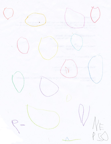
I present you my four year old daughter’s latest creative output. While other kids are drawing useless doodles, Natalie is mastering the steps of NPD, brainstorming, advertising, and graphic design.

This is a rather detailed concept for “Nepso” brand candy (here seen “falling into a basket”).

Note the unique brand name, the pleasing overall layout, and a fine, fine logo work in the bottom right corner.

While this work might be considered derivative of products of Mars, Incorporated, I still feel that this is a fine first foray into marketing.

Zoomfly Test: Capitalist Monkey

I frequently want to post images that don’t make a lot of sense to post in smaller format. I’ve been meaning to build a custom zoomer similar to Zoomfly, but gave up and just installed an off-the shelf module.

Here’s a sample file – a scan from a Soviet “Youth Technology” magazine circa 1961. A bought a couple of these on eBay – and I got to tell you, they really took me back… While growing up I was constantly reading back issues of these magazines, and now, in these few random issues that I purchased I found a few illustrations that I remembered, like the one that is at the end of this post. It’s a very strange feeling – remembering a picture last seen 20 years ago.

Another very strange feeling is noticing the lack of ads and Photoshoppery – all illustrations are either photographs or drawings, and they look so much better than what you’ll find in most todays magazines.

The article that accompanied this full page illustration was titled “Bourgeois Ideologists on the Future of Mankind” and was about doom and gloom that proliferated amongst western philosophers. In the illustration robots are going Abu Gharib on their creator’s ass, Martians are running for cover from Pentagon’s missiles, labour bosses are exploiting monkeys, dour looking generals are growing artificial goose-stepping soldiers, hippies are going back to stone age, and Malthusians are working on biological warfare. The top hat wearing capitalist monkey in the background is just darling.

Meanwhile, on the next page simple Soviet people are partying in the light of aurora Borealis.

Photoshop Disasters

Seetharaman Narayanan did more to alter reality than 99.99999999 percent of people in this world. It’s ridiculous how much the look of everything changed after Photoshop. All the ads, illustrations, all the graphics in the world look different than they did in the 70s and 80s.

If you wish, Adobe website will give you a number of useful lessons on how to use Adobe trademarks, such as:

“CORRECT: The image was enhanced using Adobe® Photoshop® software.
INCORRECT: The image was photoshopped.”

and

“CORRECT: The image was enhanced with Adobe® Photoshop® Elements software.
INCORRECT: The image was photoshopped.
INCORRECT: The image was Photoshopped.
INCORRECT: The image was Adobe® Photoshopped. ”

Meanwhile everything I see around me in printed form has been photoshopped to death. These days when a professional digital camera is cheaper than a copy of Adobe® Photoshop® software and the streets of major cities are full of starving young models, the photoshopers out there would rather spend hours doing unnatural things with expensive stock photos.

I could understand this if the companies who would be doing this were short on money. But you know, when the same crappy stock photo is used in an ad for Vagisil and an O’Reilly book cover? That’s ridiculous.

There’s this blog that I’ve been reading lately called “Office Snapshots”. Recently they showed pictures of the offices of Vertrue. The seem to have spent more on a single chair than on the design of their “about us” page. Take a look: the title of the graphic boldly states “WHO WE ARE”. Judging by the graphic the answer is: “We are some smiling office drones from a crummy stock photo.”

Another fun blog that I’ve been reading is Photoshop Disasters. They mock crummy designers. After reading it I started paying a bit more attention to the small details of various ads. It’s crazy how many disturbing details there are. For instance, just now, I picked up a copy of some magazine that my wife was reading. Literally the first ad that I saw had a 6-fingered model:

Alteration of reality in photographs is not a new phenomenon, of course. There’s a great book called “The Commissar Vanishes” about the way photographs were altered in the Soviet times, especially to disappear repressed individuals. Besides sequences of photos of Stalin together with “disappearing” commissars, there’s a portrait of Stalin done by a pretty incompetent painter. Stalin, upon seeing the picture, crossed out the ear and wrote the following:

“This ear says that the artist is not well schooled in anatomy. J.Stalin.”

“The ear screams and shouts against anatomy. J.S.”

I don’t have a scan of that page, but believe you me, that ear was almost as disturbing much of the photoshopped models in today’s ads.

“If You Paid Attention, You’d be Worried Too” or Finit Finis Finish Omnious Omnium Shmomnious

The very special 47-50th Street/Rockefeller Center station has some very strange advertisements posted in the decrepit old clock boxes. You know, the ones overhead, the ones to which nobody pays attention too because the clocks are usually way off?

For some reason I thought that the ads that I’ve seen for a long time were cigarette ads. But recently I looked at them a little bit more carefully and realized that something was odd. The ads show a sunset over the forest and a flock of birds in the air. The caption says “Omnium Finis Imminet”. Huh. Hello conspiracy theories.
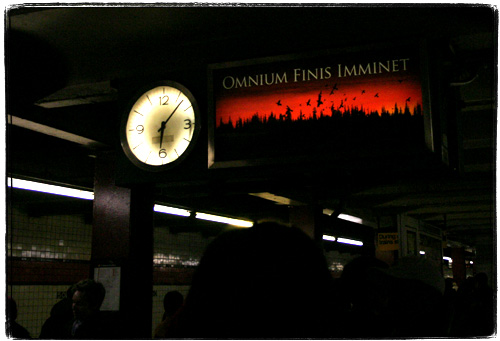
Well, my crappy knowledge of Latin tells me that “omnium” means “all”, “finis” means “end” and “imminet” since it sounds just like “imminent” means “is coming”.

Apparently graffiti with this nice apocalyptic message has been popping up in other places. On the other hand, this is not graffiti, is it? At the very best this is a well executed hack.

Come Monday (well, if the end of the world is not going to happen before then) I am totally giving a call to Gannett Transit (formerly New York Subways Advertising Co) at (212) 297-6400 to figure out what’s up with this.

Update.
I called Gannett Transit just to be kicked to voicemail, but it looks like the ad is legit. I’ve seen a whole bunch in West 4th Station and comments are rolling in about TV spots too. As commenters pinted out this is probably a “guessing game” ad for the new War of the Worlds movie or some stupid Sci-fi Channel movie or series. Well, at least nobody seems to be paying attention to the ads. None of the people I asked were able to recall what it was about.

Well, at least it seems that my humble blog ranks high in the very sparse search results for “omnium finis imminet”, “omnium finis imminent” and the other creative ways to spell this slogan, so hopefully I’ll gain some readers along the way.

Now, if this were an ad for Darren Aronofsky’s Flicker, that would be way cool. But I am not even sure that he is filming it at all.

Another update
Wow, it looks like New York Times fact checkers are in hot water as the reporters totally pulled this out of their butts (or read on this in my blog as it was the top result on Google for a while) :

“The advertisements portray a flock of birds against an angry red sky, with a single phrase: Omnium Finis Imminet, Latin for The End of All Things Is Near. The advertisements, for Steven Spielberg’s movie version of H. G. Wells’s “War of the Worlds,” cost about $50,000. The film is to open in July.”

They did post a correction later on. Here’s the full ad from a recent Scientific American that my wife brought me today.
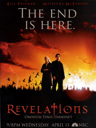
Note the Photoshop lens flare and the horrible font. Looks like their art director is about as competent as their marketing director. The letter “T” is probably made to look like the Orange County Choppers dagger logo to capitalize on the popularity of that show.

He heh, the show seems to have a stupid “X-Files” marries “Millennium” premise. The end of the world is approaching, and investigators are a physicist instead of Scully and a nun instead of Mulder. That’s some sexy and original stuff. Just get a bad 80s rock ballad for a theme song and all the geeks mourning Star Trek will flock to see this.

Expensive Book

So far, the most expensive book in my collection set me back $250.
Maybe some day I’ll be able to purchase things like this too. Drooool.

Capek, Karel. R U R ROSSUM’S UNIVERSAL ROBOTS: KOLEKTIVNI DRAMA… [Praha]: Aventinum, 1920. Octavo, pp. [1-6] 7-96 [97] [98: blank] [99: colophon] [100: blank], original decorated lavender wrappers, printed in brown and black, all edges untrimmed. $12500

First edition. 2000 copies printed. Signed by Capek on recto of first leaf.