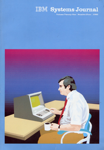
Speaking of the color. Here’s a magazine that was thrown out by some professor at my college:

IBM Systems Journal Volume 21 #4 1982:
“With the use of the computer as the art tool, our cover symbolizes the interaction between man and machine. Two of the papers in this issue discuss usability considerations for the design and development of interactive systems”.
There is no credit for the cover art, but my guess that it would be attributed to J.F. Musgrave who is listed as Art Director.
Screen closeup:

I like a lot of things about this picture. The sleeveless white shirt, the ugly tie, the beer gut, the coffee mug, the expression on the headcount’s face. The ASCII art on the screen. The eery transition effect in the background.
Don’t you think that “Armonk Blue” would be a good name for a Benjamin Moore paint?