The Devil in the Details

Working most of your adult life in a cubicle is like being in sensory deprivation chamber. You start noticing more details. I took this series of pictures without a tripod, just walking around town with my long lens.

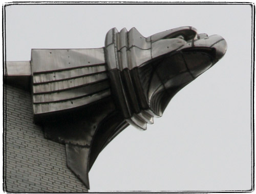
Looking at the steel eagles on the Chrysler Building up close, it’s easy to imagine yourself a superhero, standing on it with a cape billowing behind you.
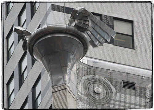
It’s a little harder with the eagles’ less popular neighbors – flying hubcaps.
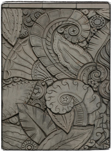
The decorations of the beautiful Art Deco Chanin Building are so very Lovecraftian. Tentacles, pentacles, tentacles with pentacles.
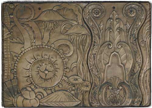
More tentacles and jellyfish on the copper parts.
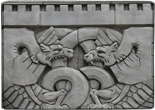
The fighting dragons. An allegory of retaliation or something?
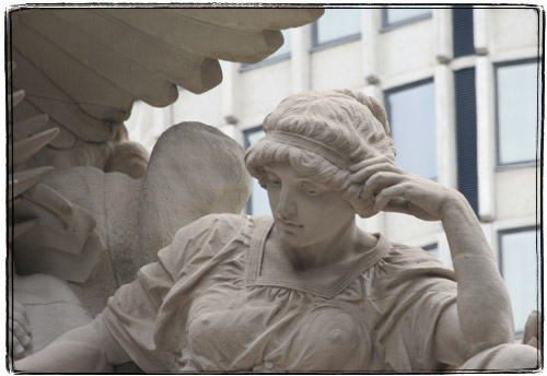
Minerva on the top of the Grand Central Terminal has a very modern look favored these days by Conde Nasties and the like. Must be cold up there.
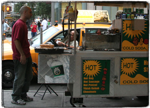
It’s pretty cool to see how cabbies order hot dogs without getting out of their Crown Victorias.
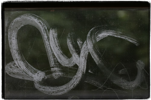
I hate graffiti, and especially train graffiti. That said, I must acknowledge that an infinitesimally small percentage of graffiti tags is actually cool. Here’s one that caught my attention. It looks like instead of the usual gobbledygook and gang symbols, this tagger painted “NYC” in a manner highly reminiscent of Japanese calligraphy. I still mind having it blocking my view, but I would not mind purchasing something like that on a scroll.

Ad:
These are my two favorite NYC photography books. “Drive by Shootings : Photographs by a New York Taxi Driver” is a collection of photographs by a taxi driver with a Yashica T4 from behind the wheel.

“New York Changing: Revisiting Berenice Abbott’s New York” is a collection of photographs of New York originally taken by Bernice Abbot in the thirties, and then retaken with the same camera, lenses and at the same angles by Douglas Levere in the nineties.

Time to Get on the Top of the Rock
or
Can You Smell What’s Cooking at the Top of the Rock?

There’s one thing that I hate about Chrysler Building. It does not have a public observation deck. I feel that any major skyscraper needs to have two things at the top: a restaurant and an observation deck.

To the owners the public areas at the top are usually a pain in the ass and rarely pay for themselves. Having a lot of people from the street come up to the very top of the building, adding to the overall traffic is not fun for building management from the security standpoint. I remember reading about the co-op board of a posh building at 30 Central Park South trying to evict Nirvana, a top floor Indian restaurant with amazing views of Central Park. They complained about the traffic and the cooking smells.

Because of this most buildings that used to have observation decks and restaurants closed them. Over a the Tishman Building Top of the Sixes turned into an exclusive cigar club. At the City Services Building the public observation deck, which was actually planned as the owner’s penthouse, was turned into a closed lounge for AIG brass. An at the Chrysler Building, the observation deck became Schrafft’s Restaurant, then it morphed into posh and private Cloud Club, and then closed altogether.

When I was younger, I was not particularly attracted to the views from high vantage points. But for some reason at the turn of the Millennium found me deeply fascinated with skyscrapers and views from them. To this day I can’t forgive myself not visiting the observation deck at WTC. I probably did not have enough money to eat at the perished Windows on the World, but not visiting Top of the World still fills me with remorse.

Because of this upsetting tendency of restriction and destruction public spaces high in the skies, I find this very joyous news: the rocket-like 30 Rockefeller Plaza will be opening an observation deck to the public. It’s going to be called “Top of the Rock.”

Rockefeller Center has an interesting distinction of being one of the very few Rockefeller family projects that carry their name (the other big one being Rockefeller University). Most people also think that it’s built and named after John D. Senior, the Mr. Burns prototype and semi-crazy hander outer of nickels, when in fact, it was the mellow John D. Junior who built it.

Since the Rockefeller name is not that popular, it’s common to see “Rockefeller Center” to be shortened to sexier “Rock Center”, as for example the menu of Yummy Sushi contains several sushi combos named Rock X, where X is a number of the combo.

As much as I tried, I could not find out a more definite date than “sometime this fall”, but one of the free booklets that you can get in the lobby of the GE (former RCA) building has a little blurb and the logo. I like the logo. It’s all Art Deco-ey.

Phi, Spongebob?! Phi !?!

Probably the easiest way to dramatically improve your snapshots is to learn about the rule of thirds. You know, divide what you see in the viewfinder by two lines into thirds horizontally and vertically and try to get more interesting parts to roughly be either where the lines cross or on the lines themselves. If your picture did not come out like that, you can usually fix it later with a crop.

Rule of thirds is actually a rough approximation of the golden ratio which is very well explained at Wolfram’s website. The pictures will look even better if you will use lines that are conforming to the golden section.

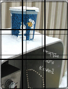
Just a crack of a difference: fat lines are thirds, thin lines – golden mean (I did not use the plugin when I cropped the photo).

I was playing around today with a plugin that renders golden rectangles, spirals and triangles. I checked some of my old photos – many seem to follow golden mean rather than the rule of thirds.

I was also thinking about writing my own Photoshop plugin like that (that one does not look like it’s worth 32 bucks to me), but Adobe has draconian new rules about who gets the SDK. So instead I decided to write this post.

I ordered a book about golden mean and related stuff from Amazon. Helpful Amazonian electrobrain is suggesting the movie Pi. The dang thing is pretty smart.

Meanwhile I got kind of curious as to how appealing the golden rectangle actually is. Let’s see.

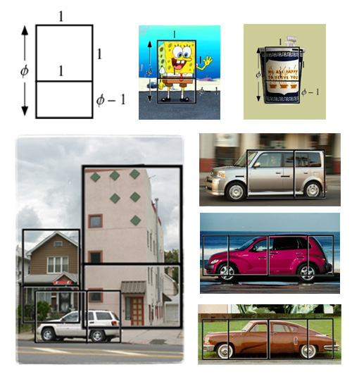
Things that are strangely appealing. Spongebob Squarepants. Yep, the golden section cuts straight across his weird little belt. It’s also interesting to note that he is almost always drawn kind of sideways – in front projection the proportion would be off.

The Greek cup (about which I wrote at length before and mentioned in probably the only poem which I ever wrote. Yep, it roughly conforms to the proportion and “to serve you” is right at the division.

Now, let’s see. Ugly things. That picture of one of the ugliest buildings in Brooklyn. It’s waaaaay off. And so is the SUV in front of it. The older house on the left is good though.

Cars are tricky though. The most beautiful car that I know is Tucker Torpedo. It does not fit a golden rectangle either. But it roughly fits two. I tried to fit two rectangles onto the SUV in the picture and to the Scion xB, which is jarringly boxy. No go. Let’s see, but Chrysler PT Cruiser, a car which I actually like, fits two rectangles also.

This is all terribly crude and unscientific, but might hopefully be useful to you.