Seetharaman Narayanan did more to alter reality than 99.99999999 percent of people in this world. It’s ridiculous how much the look of everything changed after Photoshop. All the ads, illustrations, all the graphics in the world look different than they did in the 70s and 80s.
If you wish, Adobe website will give you a number of useful lessons on how to use Adobe trademarks, such as:
“CORRECT: The image was enhanced using Adobe® Photoshop® software.
INCORRECT: The image was photoshopped.”
and
“CORRECT: The image was enhanced with Adobe® Photoshop® Elements software.
INCORRECT: The image was photoshopped.
INCORRECT: The image was Photoshopped.
INCORRECT: The image was Adobe® Photoshopped. ”
Meanwhile everything I see around me in printed form has been photoshopped to death. These days when a professional digital camera is cheaper than a copy of Adobe® Photoshop® software and the streets of major cities are full of starving young models, the photoshopers out there would rather spend hours doing unnatural things with expensive stock photos.
I could understand this if the companies who would be doing this were short on money. But you know, when the same crappy stock photo is used in an ad for Vagisil and an O’Reilly book cover? That’s ridiculous.
There’s this blog that I’ve been reading lately called “Office Snapshots”. Recently they showed pictures of the offices of Vertrue. The seem to have spent more on a single chair than on the design of their “about us” page. Take a look: the title of the graphic boldly states “WHO WE ARE”. Judging by the graphic the answer is: “We are some smiling office drones from a crummy stock photo.”
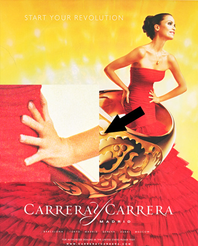
Another fun blog that I’ve been reading is Photoshop Disasters. They mock crummy designers. After reading it I started paying a bit more attention to the small details of various ads. It’s crazy how many disturbing details there are. For instance, just now, I picked up a copy of some magazine that my wife was reading. Literally the first ad that I saw had a 6-fingered model:

Alteration of reality in photographs is not a new phenomenon, of course. There’s a great book called “The Commissar Vanishes” about the way photographs were altered in the Soviet times, especially to disappear repressed individuals. Besides sequences of photos of Stalin together with “disappearing” commissars, there’s a portrait of Stalin done by a pretty incompetent painter. Stalin, upon seeing the picture, crossed out the ear and wrote the following:
“This ear says that the artist is not well schooled in anatomy. J.Stalin.”
“The ear screams and shouts against anatomy. J.S.”
I don’t have a scan of that page, but believe you me, that ear was almost as disturbing much of the photoshopped models in today’s ads.


