There are those movies that keep you actively thinking about them for days and weeks after you see them. Primer, which I watched with my wife yesterday is one of those. If you are one of those who are afraid of “spoilers” – this is your warning, although I believe it’s really impossible to create a “spoiler” for this movie. You’ll watch it once, twice, three times, then with director’s commentaries, then read the entire message board and still will not be able to figure it out entirely.

Primer is a story about time travel paradoxes, but not really. It’s about innovation, competition, trust and inability to see the entire picture.
Without the science fiction element, the movie is about garage innovators. The core of innovative group is almost always two people. Sometimes it starts out with more people, but then boils down to two. Jobs and Wozniak, Hewlett and Packard, Gates and Allen. You need to have your John and your Paul, George and Ringo are not that important. So you have these two people who together are destined to create great things. Can they trust each other? Would they do screw each other over?
We know for a fact that the alpha geeks are often ruthless. Steve Jobs gets a design job from Atari, gives it to Steve Wozniak, promising 50/50 spilt, and after Woz delivers the work gives him $300 while pocketing a few grand, saying that the fee was $600? When Apple becomes a success he deserts Wozniak. Then gets forced out himself. Then he majorly screws over founders of Pixar. Then takes back Apple. Typical preppy high school drama, except with higher stakes. And realize this – he does all that instead of enjoying his money and free time.
Anyway, the movie has two protagonists, Abe and Aaron, engineers talented like Woz and a bit less ruthless than Jobs. Abe creates a time machine that can use to travel back in time to the moment when the machine is powered up for the first time and then explains its use to his friend. That opens endless possibilities for them: make money in the stock market, prevent bad stuff from happening. Which they do for a while, but then their competitive instincts kick in. Can you really trust your partner not to go into the past and put you out of commission?
Worse of all — if you go back in time and then prevent your second self from entering the time machine all of a sudden there are two of you. The biblical names of the characters are significant in this context – Abraham – the “Father of Many” and Aaron – the “Bearer of Martyrs”. They become involved and a four-dimensional battle for control with each other and their paradox-born doppelgangers. “Failsafe machines” — extra time boxes set up in hidden locations that allow for extra “entry points” or “save points” become important weapons in this game. Can you really trust yoursef becomes the real question.
Abe and Aaron are competitive and very, very smart. They create a crazily complicated situation, with time machines, time machines inside time machines, doubles that have all recorded audio track of the timeline provided to them by future selves, extra timelines and resets via failsafe machines. “Are you hungry? I haven’t eaten since later this afternoon” sounds absolutely normal in the context.
A similar, buth much less complicated situation transpired in Stanislaw Lem’s 7th voyage of the Star Diaries of Ijon Tichy..
That sci-fi story went like this: Ijon’s rocketship ends up in a “space storm” with a broken rudder. Fixing a rudder is a two person job, but luckily the space storm brings together Ijons from different times. All he really needs to do is put on a space suit, wait for a later him wearing a space suit to appear, cooperate and fix the rudder. Instead he ends up arguing with his future and past selves, hitting and being hit by them and eating his own supplies of chocolate. Here’s a quote from what seems to be a full text of the story that somebody probably illegally posted on the web:
“I came to, sitting on the floor of the bathroom; someone was banging on the door. I began to attend to my bruises and bumps, but he kept pounding away; it turned out to be the Wednesday me. After a while I showed him my battered head, he went with the Thursday me for the tools, then there was a lot of running around and yanking off of spacesuits, this too in one way or another I managed to live through, and on Saturday morning crawled under the bed to see if there wasn’t some chocolate left in the suitcase. Someone started pulling at my foot as I ate the last bar, which I’d found underneath the shirts; I no longer knew just who this was, but hit him over the head any how, pulled the spacesuit off him and was going to put it on–when the rocket fell into the next vortex.
When I regained consciousness, the cabin was packed with people. There was barely elbowroom. As it turned out, they were all of them me, from different days, weeks, months, and one–so he said–was even from the following year. There were plenty with bruises and black eyes, and five among those present had on spacesuits. But instead of immediately going out through the hatch and repairing the damage, they began to quarrel, argue, bicker and debate. The problem was, who had hit whom, and when. The situation was complicated by the fact that there now had appeared morning me’s and afternoon me’s–I feared that if things went on like this, I would soon be broken into minutes and seconds–and then too, the majority of the me’s present were lying like mad, so that to this day I’m not altogether sure whom I hit and who hit me when that whole business took place, triangularly, between the Thursday, the Friday and the Wednesday me’s, all of whom I was in turn. My impression is that because I had lied to the Friday me, pretending to be the Sunday me, I ended up with one blow more than I should have, going by the calendar. But I would prefer not to dwell any longer on these unpleasant memories; a man who for an entire week does nothing but hit himself over the head has little reason to be proud.”
One other main themes of the movie is the inability to know certain things no matter how smart you are. Too many things are open to too many interpretations. The geeks on the web are obsessively putting together timelines, diagrams and theories of what really went on. I don’t even think that the author of the screenplay completely understands the whole sequence of events. And he directed and played in the film! How many timelines are there? How many Abes and Aarons? What do they mean by “recycling” the machines? What the hell happened with Tom Granger?
There is also an interesting recursive theme in the movie: cheapness. The actor/director/screenwriter, shooting on what is described as $7000 budget and making it look very good, has done some ingenious things. So do the inventor in the movie – he keeps his day job instead of throwing it away to follow the dream, too cheap to have a steak for lunch, and even at some point he cuts copper tubing needed for the project out of a refrigerator. I don’t know if building a time machine is that much more difficult than making such an awesome movie on a 7K budget.
By the way, if you are looking for hints about the movie, the commentary track on the DVD is a pretty horrible place to start. It’s full of jems like “That sound effect – yeah [background laugh] – that was George Forman Grill”.
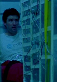
All I know, is that I want an Emiba Devices t-shirt. And a garage.
