My and my wife’s bathrobes look exactly the same. So I decided to put a patch on my robe’s sleeve to identify it.
First I was thinking about getting this one.
Then I changed my mind in favor of a simple NASA patch. That’s where I learned an interesting little fact. Turns out that there types of NASA insignia:
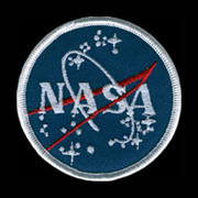
the Meatball
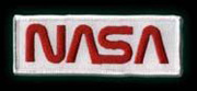
the Worm
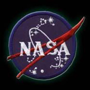
and the Vector
The following was taken from http://www.nasaproblems.com/
The NASA Worm vs. the Meatball
NASA has had two insignias that it has used as its official logos. The first insignia dates back to 1959 when NASA was first originated. The round circle with blue background, stars, planet and airfoils was a nightmare design to print. Many referred to this insignia as the “meatball”. In 1975, NASA decided a more modern logo was in order and switched to an insignia now known as the “worm”. It was a red, stylized rendering of the letters N-A-S-A and it has never been very popular with the employees. I remember, just after the worm logo was introduced, attending employees “all hands” meeting with the NASA-JSC Center Director. During the question and answer period, one employee asked if NASA could reverse their decision to replace meatball logo. The Center Director said the new logo was a “done deal.”
In 1992, Administrator Dan Goldin brought NASA’s meatball back from retirement to invoke memories of NASA’s glory days and to show that “the magic is back at NASA.”. Nevertheless, nostalgia has its price. Since 1975 the worm logo had been carved in stone and cast in bronze on NASA buildings and entrance signs. It adorns the Hubble spacecraft in space. There are many thousands of places and documents that still have the worm logo. In the June 7, 1999 Centers Directors and Headquarters staff meeting it was reported that, “He (Mr. Goldin) is frustrated that the phase-out and conversion process is not yet complete, as it has been 7 years since he directed the reinstatement of the NASA “meatball” insignia.”