The Devil in the Details

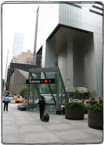
Working most of your adult life in a cubicle is like being in sensory deprivation chamber. You start noticing more details. I took this series of pictures without a tripod, just walking around town with my long lens.

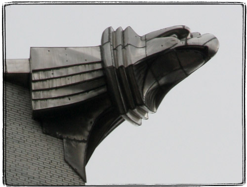
Looking at the steel eagles on the Chrysler Building up close, it’s easy to imagine yourself a superhero, standing on it with a cape billowing behind you.

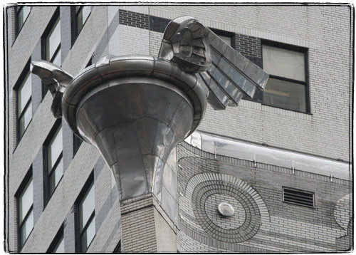
It’s a little harder with the eagles’ less popular neighbors – flying hubcaps.

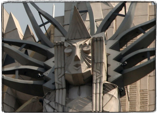
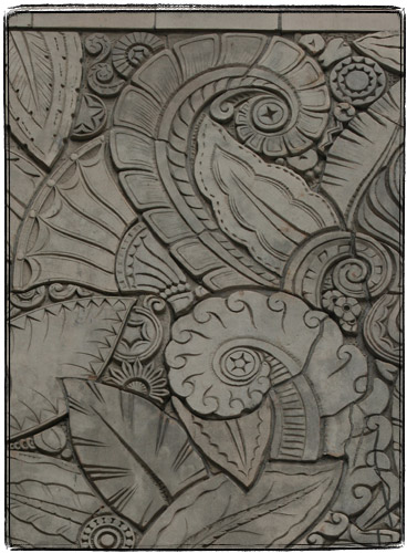
The decorations of the beautiful Art Deco Chanin Building are so very Lovecraftian. Tentacles, pentacles, tentacles with pentacles.

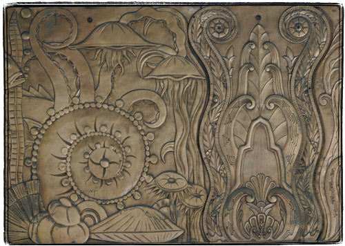
More tentacles and jellyfish on the copper parts.

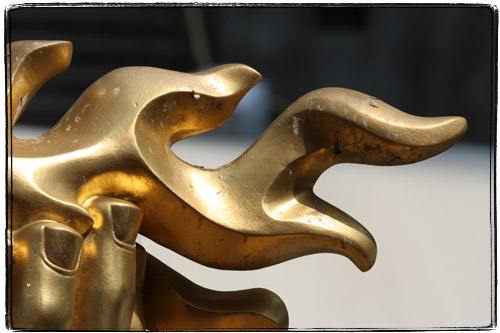
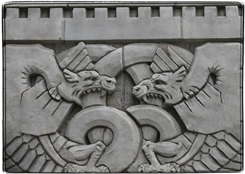
The fighting dragons. An allegory of retaliation or something?

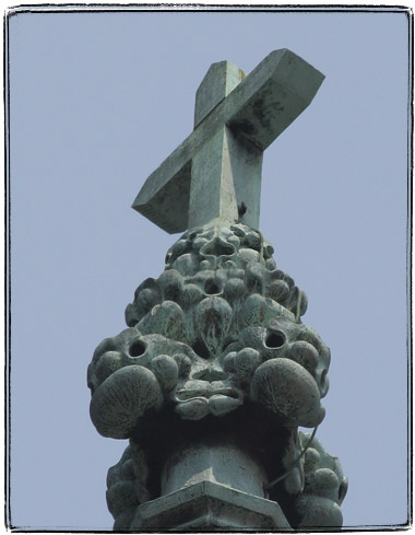
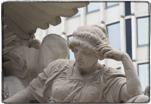
Minerva on the top of the Grand Central Terminal has a very modern look favored these days by Conde Nasties and the like. Must be cold up there.

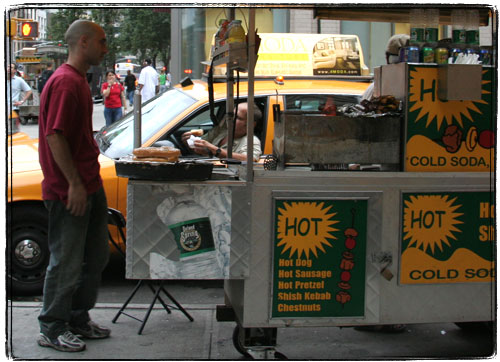
It’s pretty cool to see how cabbies order hot dogs without getting out of their Crown Victorias.

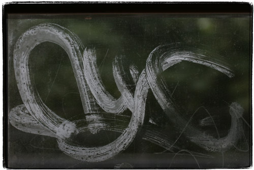
I hate graffiti, and especially train graffiti. That said, I must acknowledge that an infinitesimally small percentage of graffiti tags is actually cool. Here’s one that caught my attention. It looks like instead of the usual gobbledygook and gang symbols, this tagger painted “NYC” in a manner highly reminiscent of Japanese calligraphy. I still mind having it blocking my view, but I would not mind purchasing something like that on a scroll.


Ad:
These are my two favorite NYC photography books. “Drive by Shootings : Photographs by a New York Taxi Driver” is a collection of photographs by a taxi driver with a Yashica T4 from behind the wheel.

“New York Changing: Revisiting Berenice Abbott’s New York” is a collection of photographs of New York originally taken by Bernice Abbot in the thirties, and then retaken with the same camera, lenses and at the same angles by Douglas Levere in the nineties.

Four Stations of New York City

Some people like saying “the Internets”. I like saying “the Subways” (as in Ms. Subways). The subway system in New York City is really a patchwork of different systems, all built by different companies during different times with different philosophies. Because of that subway kiosks and stationhouses are so different in style.

Usually the kiosk is built to blend in with the surroundings. For instance one in front of the Citicorp building echoes its slanted shape.

The one in front of the over the top Art Deco RCA building is also thoroughly Deco.

On the other hand right in front of the dignified Victorian station kiosk with its cast iron ornamentation you will find a supermodernistic “Sculpture for Living“.

Avenue H stationhouse (aka Fiske Terrace Station) of the Brighton line is an altogether different animal, not found anywhere else in the system. It’s an old shingled railroad stationhouse, hailing back from the day when Midwood was really just that – woods in the middle of Brooklyn.

[update] By the way, just in case I ever find a way to travel back in time, I have a ticket for that railroad ready:

Maybe when I finish One Hundred Views of the Empire State Building I’ll pay homage to Hiroshige. We’ll see.

Blast From the Past

Boing Boing, with it’s love of red and anti-red comics made me remember Herluf Bidstrup. You see, for some reason in the Soviet Union multiframe format comics were seen as a western influence, despite their usefulness as a propaganda tool. Single and two-frame caricatures were common though. One glaring exception to the rule were comics of a Danish illustrator Herluf Bidstrup, who worked for a Danish communist newspaper. His work was published in a 5-volume set of coffee table books.

The fifth volume was all political, and thus particularly interesting to the Soviet reader. But the other 4 were full of amazingly drawn multi-frame comics that showcased Bidstrup’s eye for little things in life and his crisp, flowing line. I spent hours upon hours looking at his cartoons. Unfortunately we left the books behind, but I will absolutely replace them (I’ve seen them for sale in a Russian bookstore, but balked at the price).

Here you can find some political editorial cartoons and everyday sketches, probably from the last volume at pretty good resolution. These include sketches from his visit to the Soviet Union.

This site, on the other hand has a lot of the good stuff from the first four volumes, alas at a terrible resolution that absolutely destroys Bidstrup’s elegant line. Here’s a similar site.

Bidstrup was pretty much anti-US. Here’s Denmark scared by the Soviet menace joins the Nato. These are just few frames out of a longer sequence.

I absolutely love Bidstrup’s take on the generational conflict and his other cartoons about families. This is another favorite of mine.

Sometimes he just could not help himself and drew pinup girls, and the editors of his books were forced to add politically motivated copy: this cartoon’s title said something about how “this Bulgarian Eve is safe in the Garden of Socialism” or some such nonsense. I think it’s just that Bidstrup liked exotic women in bikinis (forgetting to thank Uncle Sam for the bikini, of course).

I bet that if he were born in the US Bidstrup would have become one of the finest pulp illustrators. I wonder if he illustrated any sci-fi at all…

Oh, and another thing. To this day I prefer cigars that taper on ends because they were prominently featured in Bidstrup’s cartoons. These are collectively called “figurados” and are rather uncommon in the American market. The type that tapers on both ends is called “perfecto” and the one that tapers on one end is called “torpedo”. These are hard to roll, so usually only experienced rollers venture to make them.

Polishing the Jewels

When you run a classy joint, like Tiffany & Co, you can’t just board up your windows and start renovating. No, you board up your windows and hire an illustrator to draw a mural on it. Tiffany & Co execs seem to have a pretty good sense of humor though. The mural looks like an illustration from Cosmo or some other chick young woman oriented rag publication. On the side a legend says: “Welcome to Tiffany. Please use our 57th Street entrance while our crown jewel gets a polish.”

Here’s a detail from the front: bow tie boldie has this annoying expression on his face: “he heh, I am surely getting my crown jewels polished tonight.”

This, by the way would have been an interesting photography project – camping out with a long lens across from Tiffany’s and discretely (otherwise Trump and Tiffany security personnel will probably drag you away for this) taking pictures of men walking out with those robin’s egg blue shopping bags. I would not want to do something like that though, as on occasion I walked out of that store carrying the shopping bag and the expression. I am a fan of the 1837TM line.

The New Lens

I went ahead and bough myself a rather expensive 100-400 zoom lens for my camera. I am still kind of thinking that I should not have any equipment that expensive (and heavy), but now I find it rather hard to bring myself to return the damn thing. I can afford it, but I still feel guilty about it.

I took it out for a spin and here’s a sampling of pictures taken in a couple of humid, hazy days without the use of tripod:

The sign on top of the UBS building used to say something else:

Rockefeller Center Prometheus could use a bath:

The crosses that top St. Patrick’s Cathedral look like they were designed by HR Giger. What’s up with that?

This is what the Wireless Maiden on the top of the old RCA building actually looks like:

Deadprogrammer Visits Japan or Sakura in Partial Bloom Part I

Part I : The Roots Of Russian Japanophilia

What are the roots of Russian (I should really be saying “Russian-speaking Generation X”, but that would be too long, wouldn’t it?) Japanophilia? Honestly I have no idea, but the fact is that it plays an important role in the huge number of high quality Sushi restaurants in Brooklyn, tremendous popularity of Japanese themed blogs in the Russian-speaking Livejournal community and the popularity of Erast Fandorin Mysteries.

Kitya, the author of the above mentioned outstanding blog, whom I met in Tokyo, thinks that the reason is probably the same as with the US Japanophilia – anime cartoons. I have a different theory. Before the first anime shown in the USSR,Flying Ghost Ship, made it’s appearance, I was already fascinated with Japan. The reason for that was the excellent book called “Branch of Sakura” that I found in my dad’s library. As it turns out, 30 years later the author of the book, journalist Vsevolod Ovchinnikov was invited back to Japan to write a second installment of the book. Ovchinnikov’s writing still has the same lucidity, simplicity and attention to detail. I think that he is one of the major reasons why Soviet Generation X is so interested in everything Japanese.

Some time during Perestroika there was a week of Japanese TV in USSR. They showed the most amazing stuff : how they make Japanese water sharpening stones (I own a set these days) and how a skillful sharpening master can sharpen a carpenter’s plane so that he could make a micron thick shaving with it. They’ve shown how chasen whisks (I have one) used in a tea ceremony are made by splitting bamboo by hand. They’ve shown a fisherman who could tell exactly how many trouts his net was catching and a master bamboo fishing rod maker. They’ve shown an awesome game show called Takeshi’s Castle. Oh, how I wish someone would make a DVD of that show! There was the usual exotic stuff like Sumo wrestling, Sakura festivals as well more unusual stuff such as a few clips of Japanese reporters walking around Moscow (a part of which I described earlier.

Before coming to America I thought that there must be hundreds of channels on TV there, and specifically a few that showed only cartoons (as opposed to 3 or 4 channels in the USSR with one to two old cartoons shown per day). My expectations were overly optimistic as the Cartoon channel came into existence significantly later. Now I hope and pray that there will be a channel of Japanese TV with English subtitles, Sumo, news, Abarenbo Shogun and other Chambara. And Takeshi’s Castle reruns. Ah, one can only dream. For now all I have is the couple of hours of Japanese shows on Fujisankei Lifestyle which airs for a couple of hours. Actually while writing this post I learned that there is a Japanese channel on the Dish network, but it’s $25 a month.

I never anywhere abroad since I came to the US and me and my wife did not have a decent vacation in years. So I decided to pleasantly surprise my wife, who knows and tolerates my extreme hate of traveling, and proposed that we have a vacation in Japan. Thanks to her diligent planning we had an amazing 10 day trip to Japan, spending 6 days in Kyoto and 4 days in Tokyo.

My camera died in Gion, Kyoto’s geisha district. But still me and my wife managed to take about 2500 pictures. I took a lot of 3d pictures. 3d picture technology is very simple : I have a lens that takes two slightly offset pictures at the same time. To view the image you can either learn a special technique and really, really strain your eyes or obtain a rather simple viewer of which there are many varieties, some very cheap, some a bit more expensive and some are pretty expensive. I find that the cheap viewer made by the same company that makes the lens that I use work very well.

[update] : due to the lack of interest there won’t be many 3d pictures in my posts.

[update] Ok, I did get one request for a 3d viewer. So maybe someone out there cares. So if you want one, send me your postal address to

“If You Paid Attention, You’d be Worried Too” or Finit Finis Finish Omnious Omnium Shmomnious

The very special 47-50th Street/Rockefeller Center station has some very strange advertisements posted in the decrepit old clock boxes. You know, the ones overhead, the ones to which nobody pays attention too because the clocks are usually way off?

For some reason I thought that the ads that I’ve seen for a long time were cigarette ads. But recently I looked at them a little bit more carefully and realized that something was odd. The ads show a sunset over the forest and a flock of birds in the air. The caption says “Omnium Finis Imminet”. Huh. Hello conspiracy theories.

Well, my crappy knowledge of Latin tells me that “omnium” means “all”, “finis” means “end” and “imminet” since it sounds just like “imminent” means “is coming”.

Apparently graffiti with this nice apocalyptic message has been popping up in other places. On the other hand, this is not graffiti, is it? At the very best this is a well executed hack.

Come Monday (well, if the end of the world is not going to happen before then) I am totally giving a call to Gannett Transit (formerly New York Subways Advertising Co) at (212) 297-6400 to figure out what’s up with this.

Update.
I called Gannett Transit just to be kicked to voicemail, but it looks like the ad is legit. I’ve seen a whole bunch in West 4th Station and comments are rolling in about TV spots too. As commenters pinted out this is probably a “guessing game” ad for the new War of the Worlds movie or some stupid Sci-fi Channel movie or series. Well, at least nobody seems to be paying attention to the ads. None of the people I asked were able to recall what it was about.

Well, at least it seems that my humble blog ranks high in the very sparse search results for “omnium finis imminet”, “omnium finis imminent” and the other creative ways to spell this slogan, so hopefully I’ll gain some readers along the way.

Now, if this were an ad for Darren Aronofsky’s Flicker, that would be way cool. But I am not even sure that he is filming it at all.

Another update
Wow, it looks like New York Times fact checkers are in hot water as the reporters totally pulled this out of their butts (or read on this in my blog as it was the top result on Google for a while) :

“The advertisements portray a flock of birds against an angry red sky, with a single phrase: Omnium Finis Imminet, Latin for The End of All Things Is Near. The advertisements, for Steven Spielberg’s movie version of H. G. Wells’s “War of the Worlds,” cost about $50,000. The film is to open in July.”

They did post a correction later on. Here’s the full ad from a recent Scientific American that my wife brought me today.

Note the Photoshop lens flare and the horrible font. Looks like their art director is about as competent as their marketing director. The letter “T” is probably made to look like the Orange County Choppers dagger logo to capitalize on the popularity of that show.

He heh, the show seems to have a stupid “X-Files” marries “Millennium” premise. The end of the world is approaching, and investigators are a physicist instead of Scully and a nun instead of Mulder. That’s some sexy and original stuff. Just get a bad 80s rock ballad for a theme song and all the geeks mourning Star Trek will flock to see this.

There’s No Cleopatra And There’s No Needle

Central Park contains an amazing artifact commonly referred to as “Cleopatra’s Needle”. It’s one of the many Egyptian obelisks scattered all around the world, and one of the two that used to stand in front of the Sun temple in Heliopolis. A second obelisk is located in London these days.

In general, Egyptian obelisks were moved around the globe by different governments kind of like a college statues by drunken frat boys. The Romans moved the two Cleopatra’s Needles to Alexandria, and then as gifts from the Egyptians to the Great Britain and the US, the were moved by British and American engineers to their current locations. Overall the moves turned out to be amazing feats of engineering, especially with the British overcomplicated scheme of building a pontoon around the obelisk and towing it with another ship.

You can find it right across from the Met, on the 5th Ave. side approximately between 81st and 82nd.

The pillar does not give an impression of being an element of the Sun god’s temple. The 3500 year old monolith is gloomy, foreboding and downright Lovecraftian. The shadow play at sunset is especially spooky (that’s what I tried to capture in the above picture).

Cleopatra has very little to do with either obelisks. They were built by king Tuthmosis III (well, the king probably had some help from his slaves). Later everybody’s favorite pharaoh, Ramses II, seeing how there was a lot of space left on the obelisks added some of his own “press releases” to it:

The writing looks like a story of an alien abduction (with the flying saucers and wavy tractor beams), but as it turns out these are normal hieroglyphics. “Bird , Bird , Giant Eye … Cat Head , guy doing this” and so forth. I thought that there were thousands of glyphs, but it turns out that they are just an alphabet. So the flying saucers on the picture are “R” sounds, and the “tractor beam” is an “H”.

I was surprised to see the pharaoh being referred to as “Lord of the Two Lands, User-maat-ra”. What was he a user of? Well, as it turns out all pharaohs have ridiculous system of 5 different names. I mean, come on, a Horus name and the Golden Horus Name!? (Horus happens to be the Sun god, the one with the falcon head ) User-maat-ra happens to be the throne name, the one that one that the Greeks transcribed as Ozymandias.

So he’s the king from Percy Shelly’s “Ozymandias” sonnet. Yup, good ol’ Ramses was kind of like Donald Trump – liked to build things and put his names on things. Also, like a rockstar or an NBA superstar he had sex with hundreds of women, siring hundreds of children as Durex Ramses condoms were apparently not available back then. Last but not least he was apparently the “7 cows dream” and “let my people go” pharaoh of the Bible.