Deadprogrammer’s Hierarchy of Web Needs

I recently received a phone call from a recruiter. He wanted to lure me away to some “big company” that still had “small company feel” to participate in a “redesign of a major website”. He felt like all of these things, as well as “a well stocked kitchen” were big selling points.

I am a veteran of many website redesigns, major and minor. I’ve come to dread the word “redesign” because very frequently it meant taking a perfectly good website and making it significantly worse, and then through major struggles making it marginally beter. In the past I wrote a rather bloated article titled “The Russian Tea Room Syndrome” about this. Today I would like to write a bit more about this, as this topic rarely leaves my mind and my life.

Earlier in my career, I had very little influence over the redesign process, but this is changing. This is the primary reason why my job title has the shameful word “Architect” in it: I write code and configure servers, but I want my say in strategery as well.

So, Michael, you might ask, what is the problem with redesigns? Aren’t redesigns about making websites better? Well, many redesigns suffer from not following IBM’s famous motto.

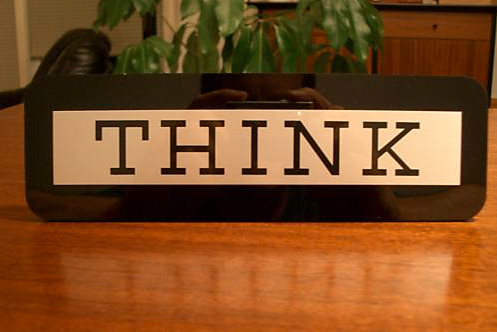
IBM has one of the best corporate mottos ever: CRUSH and DESTROY. Uh, I mean THINK. They even give out props with the word “THINK” on it and publish THINK magazine.

Many redesigns happen simply as a knee jerk reaction: oh, look company X is doing Y and using Z. When you sit in a meeting and somebody is describing a redesign purely in terms of things other people do, you are likely in trouble. No thinking is involved at all.

But sometimes it’s the type of thinking that is going on that is the problem. You have to think about the relative importance of things.

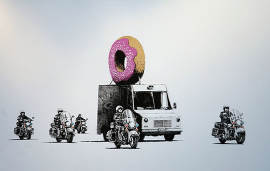
I have a picture by famous graffitti artist Banksy hanging on my wall. It is a metaphor about true and false importance.

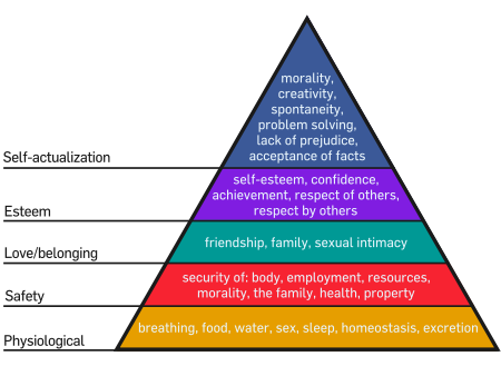
In 1943 a Brooklyn College professor Abraham Maslow outlined what is now known as Maslow’s Hierarchy: a pyramid that ranks human needs. It looks like prior to him nobody really gave a lot of thought to relative importance of pooping and morality. Well, maybe a little – there’s a Russian idiom for a person of untrustworthy nature that originated during WWI when soldiers relieved themselves in rows, next to specially dug trenches: “I would not take a dump next to this person”. Also see “I hope they serve beer in hell

Here’s Maslow’s pyramid in all of its glory:

I decided I’d come up with the hierarchy of web needs:

standard adherence: strict XHTML, CSS, etc

choice of technology: language, CMS, OS, cloud/servers, etc

other features: widgets, games, microformats

multimedia: video, podcasts, interactive flash

design: graphical elements, typography, pleasing layout

semantic web: metadata, tagging

usability: text size, image size, logical layout, uncluttered interface, site name/urls, browser support

community features: comments, ratings, feeds

googliness: search, speed, security

content qualities: usefulness, interest, freshness, uniqueness

content: text, images, links

In my opinion unsuccesful redesigns happen when people start from the wrong end of the pyramid (always skipping the first step: I’m yet to meet anybody with power who thinks about these things are important).

I will expand on this in my next post.

Nepso

I present you my four year old daughter’s latest creative output. While other kids are drawing useless doodles, Natalie is mastering the steps of NPD, brainstorming, advertising, and graphic design.

This is a rather detailed concept for “Nepso” brand candy (here seen “falling into a basket”).

Note the unique brand name, the pleasing overall layout, and a fine, fine logo work in the bottom right corner.

While this work might be considered derivative of products of Mars, Incorporated, I still feel that this is a fine first foray into marketing.

Amazon Ads in RSS Feeds

A while back I’ve added an advertising module to my site that allows me to inject amazon item ads both into the site content and into the rss feeds. I hand pick the items, which most of the time fall into one of the three categories: stuff that I would probably want myself, stuff that I already have, stuff that I mentioned in the post, and stuff that is just funny. Four categories.

This is not “punch the monkey”, not the same one ad that some bloggers stuff into their rss feeds and keep there forever until you are sick of it. From time to time the amazon items are really funny.

On the other hand, at my level of readers, the princely 6% commission that I get on Amazon purchases that come through the site, it’s not really a major financial incentive. The ads do cover my hosting expenses, but I do kinda feel guilty of thrusting the ads on my readers.

So, tell me, what do you think about the ads? Should I just junk them? I already replaced some of the ads on the site with links and ads for products that I simply like, without getting any payment, just as a way to say “thank you” to the people who make these products. I might do the same thing with the rest of the ads.

Tolomeo Mini Table Task Lamp by Artemide

The Tolomeo Mini Table Task Lamp is a standing luminaire for orientable direct task lighting. Fully adjustable articulated arm body structures in extruded aluminum. Joints, tension control knobs and base in Polished Die-cast Aluminum. Tension cables in Stainless Steel. Diffuser in stamped, Anodized Matte Aluminum, rotatable 360 degrees on lampholder with incorporated on/off switch. Available in Polished Aluminum, White or Black finish. Shown in Aluminum finish. One 100 Watt 120 Volt E26/G16Cl incandescent lamp (not included). Also available with Fluorescent lamping and in a smaller and larger size. Designed by Michele De Lucchi and Gerhard Fassina in 1987-1991. UL Listed. Made in Italy. Shipping: Shipping information will be emailed to you within two business days after placing an order. Dimensions: Base: Diameter 7.75 in. Fixture: Overall Length 40.5 in. Height 21 in. Reach 26.75 in.

The House of Lamps or Lamp Lust

I firmly believe that expensive and well designed office chairs like Aeron or Mirra make a very good investment. On the other hand my friend, a very successful entrepreneur, tells me that much cheaper 300 dollar chairs are just as good, and that his most prized employees, when asked what kind of a chair they want said that it does not matter. My friend is very smart, very rich, and probably right.

People who have chair lust, like me, sometimes have an even more irrational desire – to buy expensive table lamps. When Joel Spolsky visited me at work, i pointed out to him that everyone at my office had a four hundred dollar Artemide Tolomeo desk lamp. Joel, famous for his office architecture fetish, was not impressed — oh yeah, we have a whole bunch of them too at Fog Creek, — he said.

I noticed that the set designer of the hit show House, MD also has an obsession with lamps. Even more interestingly, I noticed that Dr House’s office has three very interesting lamps.

Lamp A is a paragon of British design, Bestlite, a lamp that I always wanted, and never bought because it’s crazy to spend that much money on a lamp. Designed by Robert Dudley Best and made famous by Winston Churchill, who had one in his office, it’s the Bentley of expensive designer lamps. It’s just crazy to spend over $600 on a lamp, innit?

Lamp B is the Artemide Tolomeo, a floor version of the lamp that I have at work. It’s a beautiful lamp that works very well. The desk version is about half the price of Bestlite, but it’s crazy to spend $300 on a lamp, right? Even if it’s designed by Michele De Lucchi and Giancarlo Fassina?

Lamp C appears all throughout Princeton-Plainsboro Teaching Hospital and gets the most screen time. It’s a 25 dollar Antifoni work lamp from Ikea, and the one that I have on my desk at home. Who designed it? I don’t know, it says “Ikea of Sweden”. What does Antifoni mean? According to Nordic Names, a website for translating crazy Ikea names like Bjöberg and Drömma, it means “antiphony“.

By the way, apparently Ikea founder Ingvar Kamprad has a Nazi past and chose to name all the furniture because SKUs were hard for him to keep track of due to his dyslexia. Also Gillis Lundgren, besides being famous for designing the Billy bookcase (I have 12 of these in my apartment) , actually invented the concept of flat pack furniture when he sawed off legs from a table that would not fit into a car.

Also on the subject of Ikea lamps:

Design Precognition

I am known to fanboy design firms. Yes, I used fanboy as a verb. Sue me. In any case, the three companies that I most admire, sorted by coolness in descending order are: IDEO, Art. Lebedev Studio, and frog design.

On my bookshelf I had a coffee table book called Frog: Form Follows Emotion, which is sadly, just not very well designed. It does have a lot of design eyecandy, but provides very little information about the design process and philosophy, about the story behind the beautifully designed objects.

The book is already 8 years old, so some of the projects seem dated. It’s still worth a read, especially since it sells for only 65 cents, used, on Amazon.

I was looking through it recently, and found a very interesting picture.

Looks pretty similar to the “table lamp” mac, which itself is pretty dated now, doesn’t it?

Design Out of Reach

One of my favorite coffee shops, Joe The Art of Coffee, recently opened a new branch in an Alessi showroom at 130 Greene Street in Manhattan.

Alessi is one of those funny companies that sell expensive “design”. There are really three approaches to selling “design”. You can go the Ikea way: hire really good designers, mass-produce their designs, use cheap materials and sell them cheaply. On the other end of the spectrum is stuff like the concept pieces, like the magnetically floating bed that recently got all the gadget blogs very excited. The scale model will set you back over 100K euros, and the real one is so fricking impractical that it’s not even built. You can’t deny the coolness aspect though.

There’s the middle way that is tread by companies like Design Within Reach and Alessi. While a more proper description would be “Design Just Outside Most People’s Reach”, they do have a few items that are a relatively good value even for not particularly rich people like myself.

For instance, I really want an Alessi steam pitcher. But while a perfectly well made knockoff costs 35 bucks, a genuine item costs 114. Ouch. I have the knockoff, and it’s my favorite steam pitcher right now.

But when it comes to something that I use constantly, there’s really no alternative to getting the real thing. A Herman Miller Aeron chair is significantly better than most knockoffs that I’ve seen and usually sells only for 1/2 as much.

There’s another chair that I really want, the Eames “Time-Life Chair”. Manufactured and sold by Herman Miller, it was created for the lobby of the Time-Life building in Manhattan (where I used to frequently have lunch in the company cafeteria before they stopped letting in people from other Rockefeller Center buildings). The chair was made famous by Bobby Fisher who required it as one of his numerous conditions when he played in the world chess championship against Boris Spassky. These days it cost about $2,500 new (about $1000 for a vintage one on eBay). Back then it used to cost about 700 bucks, and made all the newspapers whine about Fisher’s expensive tastes. I really don’t see a reason why someone who earns his living while sitting down does not deserve an expensive chair. Dot com companies got a lot of flack for purchasing Aeron chairs – but those were probably the most prudent investments they’ve made. Putting computer programmers in cheap chairs will literally cripple them, while the chair’s resale value is still pretty good.

Eames Executive Chair made famous by Bobby Fisher / Time-Life Building

Another “high design” item that I really salivate over is the Bestlite lamp. Bestlite was made famous by Whinston Churchill who had one on his desk. While the price finally went down on the floor model from $748 to $349.95 at Levenger, it’s still out of reach for me.

Bestlite lamp

I see a lot of companies putting famous Barselona® chairs in their lobbies. These are pretty expensive at $3,499 a pop (a friend of mine slept on two of these during the big blackout of 03. Anyway, these chairs are classy, but are becoming a cliche. Wouldn’t a Frank Gheary living room set look much cooler? It’s also much cheaper – the sofa is “only” $1200.

But the item that really made me scratch my head is the Philippe Starck-designed fruit juicer sold by Alessi. It costs about 80 bucks. I really don’t know what to think here.

The juicer is definitely cool-looking and original (well, unless you count T4 Bacteriophage Virus, lunar lander and Spaceship Moya, etc) which resulted it being featured as a prop in several movies.

Interestingly enough, it usually ends up in the bedroom somehow. Here it is, masquarading as a lamp in the infamous puppet sex scene from Team America World Police:

Team America World Police Juicy Salif Lamp

I really don’t have 80 bucks to trow away on a Philippe Starck design, the question that bothers me is this: are all of those who say that the juicer is impractical right? From the looks of it, the juicer should work just fine and even be ergonomic. Also, is “Salif” even a word? And if so, what does it mean?

Eyeballs vs Clicks

I really don’t understand why Internet advertising industry is so centered on clicks. Everywhere else advertisers pay to put ads on billboards, magazine pages, TV and movie screens, all unclickable. They will even pay crazy money for tiny little logos on very fast cars going in circles. Or on outfits of athletes and even golfers. Yet when it comes to web advertising – eyeballs do not matter, it’s all about clicks. For instance, Vonage gets a really sweet deal – I never click on their ads, but every ad is a reminder to me that Verizon is ripping me off and I should really think about an IP telephony solution. When I will finally see that they have done something about providing a 911 service that is as reliable as a regular phone company’s maybe I’ll finally succumb. Or maybe their ads will do their dirty deed, I won’t have much problems finding them – their company name is also their web address.

The Ugliest Building In Brooklyn

Inspired by Howard Kunstler’s Eyesore of the Month, which currently features Frank Gehry’s Museum of Tolerance  that looks like robot’s puke ,  I decided to start my own section on architectural monstrosities.

Behold – The Six of Diamonds Building.

Just the first look at it puzzled me immediatly. Is this a residential or a commercial building? How many floors are there in the structure? What is the function of the small square windows on the facade?  Is there a windowless torture chamber on the top floor beautified with the green diamonds? It seems like pepto-bismol would have been a better choice of color, but then that’s probably what it was before fading out.